[FfH II Art Team Blog]

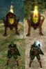
Here is Human High Priest of Kilmorph with fire above his staff. And I also included in this pack Dwarven Priest and High Priest without googles and black hammer in his back.

BTW, since the priest units now become more varied, how about deleting the religious symbol from priests' head? So the religious symbol only exist behind high priests? Then, we can use the high priests' staff for priests too. Seeing priests wield spears made me want to stab someone :D
 

Attachments

  • kilmorph high priest.rar
    432.5 KB · Views: 76
Those do look nice, but not all that Shadow-y.

Actually, I might consider one of them for Losha Valas rather than the current, vanilla spy based graphics.
 
Oh yeah, that would work too. We just have to add the (what is the thingie that attached behind her head? Cape? Cloak-upper-end?) and she will looks like Losha in her button.
 
I think the Ljosalphar adept would make a better ljosalphar mage.
 
Nah, the current Ljos mage is fine. The Ljos adept is at equal level of posh-ness with the Svart adept. So, I think she should be fine as an adept :D

Another reskins, today is Vampire package. We have a Vampire-on-the black menu and Vampire-Lords-with-red-cape menu. I hope you like them :D

Spoiler :
Vampire Lord


Vampire


Download here.
 
Thanks.

I reskinned them from Chalid and Elohim Spearman. Doing evil with good units always felt wonderful :rolleyes:

Hey there!
Just some minor constructive comments:
somehow your units look really "blurry", maybe you should use higher resolution photosources, or stuff from my 256*256 textures. I had a look at the texture and it seems as if you copied stuff from a 128 texture and simply made it twice as large which leads to weird un-sharpness :)

If you want, I can also send you a photoshop file with my layers (with masks) which I use for leather, clothes, metal, etc. ?
send me a pm with your email adress and i can prepare something for you :)

I have sent a PM for you.

Yes, I think the units' quality might be improved. Do you have any tips in working with nifscope and gimps? Thanks in advance :D
 
I have sent a PM for you.

Yes, I think the units' quality might be improved. Do you have any tips in working with nifscope and gimps? Thanks in advance :D

Have never used gimp, i use photoshop. I hope you can use the file i sent you :/
Anyway, there should be a lot of tutorials for gimp around the web. and it is really worth reading them, as you will learn a lot of stuff which you can apply right after.
 
Wait, unique Civ art for Shadows? I'd think you would want to avoid that, on account of the hidden nationality thing. Unless you can have it use the unique art only when unveiled.
 
But IIRC you see it if they attack, don't you?
 
The Empyrean halo for the new Vicar and Luridus disappears when viewed from behind.

Also, a request: With the switch (in patch K) of several units to newly reskinned versions, the buttons no longer match the unit. It would be great if matching buttons were made for these units.
 
only a small fix for the Beast of Agares and Govannon (nothing serious, i didn´t changed the models - only changed the visibiltiy order of the attached particle effects and the model) - only the nifs are in the zip

edit: same for the seraph (flaming sword - without pic)
 

Attachments

  • BoA.zip
    55.4 KB · Views: 93
  • Govannon.zip
    31.3 KB · Views: 87
  • difference.jpg
    difference.jpg
    72.2 KB · Views: 404
  • Deathangel.zip
    41.6 KB · Views: 108
Top Bottom