- Home
- Forums
- CIVILIZATION IV
- Civ4 - Creation & Customization
- Civ4 - Project & Mod Development
- Civ4 - Caveman 2 Cosmos
You are using an out of date browser. It may not display this or other websites correctly.
You should upgrade or use an alternative browser.
You should upgrade or use an alternative browser.
C2C Graphics
- Thread starter Toffer90
- Start date
JosEPh_II
TBS WarLord
I like both but from a button standpoint I think the top would show better.
JosEPh
JosEPh
Some more alternatives:
@Liquid: The alpha channel is the one that is color-less (black-white). Completely white is opaque and completely black is 100% transparent. DXT1 does not take gray tones (like a boolean only 0 or 1), while DXT3 stores gray tones in the alpha as a transparency between 0-100%. I attached an example psd for making button that you can use as a template later on. ;p View attachment example.zip
@Liquid: The alpha channel is the one that is color-less (black-white). Completely white is opaque and completely black is 100% transparent. DXT1 does not take gray tones (like a boolean only 0 or 1), while DXT3 stores gray tones in the alpha as a transparency between 0-100%. I attached an example psd for making button that you can use as a template later on. ;p View attachment example.zip
Attachments
Liquidated
Goofed Up on Cough Syrup!
Ok, well I tried!
I'm out for half the day, so I'll look into dds3 and alpha's later
Cheers!
-Liq'd
I'm out for half the day, so I'll look into dds3 and alpha's later
Cheers!
-Liq'd
Liquidated
Goofed Up on Cough Syrup!
Btw, Icon theory wise: the reason I picked the strip mine for the modern_mine and not some internal shot is because modern mines really are destructive enough to deforest entire regions.
Cheers!
-Liquidated
Cheers!
-Liquidated
The Open pit mine and quarries looks the same and are only differentiated by what they excavate.Btw, Icon theory wise: the reason I picked the strip mine for the modern_mine and not some internal shot is because modern mines really are destructive enough to deforest entire regions.
Cheers!
-Liquidated
But there are true modern mines that still requires tunneling, and since the graphic on the map indicates a tunneling mine (I assume; haven't reached modern era in some years now ^^) rather than an open pit mine I think the button graphic should be in line with that.
Liquidated
Goofed Up on Cough Syrup!
Well you have all the original icons right Toffer90? Are you able to add them into the worker actions for working build actions with minimal fuss, so long as people like Modern_mine.ddds3, I have no issue using that. I like the original shaft mine image though.
This is the newly proposed modern mine more inline with the graphic I have yet to see (am playing in the industrial currently).

People like it YAY or NAY?
Cheers!
-Liq
This is the newly proposed modern mine more inline with the graphic I have yet to see (am playing in the industrial currently).
People like it YAY or NAY?
Cheers!
-Liq
Dancing Hoskuld
Deity
It is s blob to me also.
It is s blob to me also.
http://www.reedmission.com/wp-content/uploads/2013/08/g.jpg

Liquidated
Goofed Up on Cough Syrup!
That one looks as much an exit corridor in a subway to me.
I've always found button graphics to be the hardest to get right.That one looks as much an exit corridor in a subway to me.
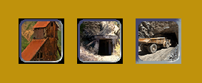
This one?
 A
AEDIT: This One?
 B
BEDIT3: ??
 C
CEDIT2: Early Mine?

Liquidated
Goofed Up on Cough Syrup!
Lets be comically brutal here ")
The early mine edit2 is a step back from the vanilla mine icon imo, last thing I want in a sedentary era mine icon is something that looks like it belongs on a street sign.
A is too washed out, that glare ruins it and I'm not sure what I can say about C, it looks more Pokemon than mining icon.
I like B, the Tonka Truck one, it's a good compromise between my vision of a modern strip mine and your insistence that subway stations make perfectly fine locations to dig for ore.
Btw while we are at it, what about the beacon and light house improvements having the same icon? We could start branching off trying to bottonize new lighthouse designs, I'll suss around about that tomorrow.
Oh btw, looking at the core mine icon and I really do not like it, looks more like a marble cutting quarry.
Another thought came to mind that the edit 2 early mine reminded me of, I hate the geology icon! If anything should be its icon, it's that effing jewelers loop they carry with them always, cause with geologists, you never know when they might run into some interesting rock formations.
Cheers!
-Liq
It was mostly meant as a joke, but in afterthought it could replace the mining tech icon, the mining tech icon could replace the early (vanilla) mine improvement icon, and the early (vanilla) mine icon could become the mountain mine icon.The early mine edit2 is a step back from the vanilla mine icon imo, last thing I want in a sedentary era mine icon is something that looks like it belongs on a street sign.
This was also meant as a joke btw.

Sparth
C2C Team Member
- Joined
- Oct 6, 2013
- Messages
- 2,314
Liquidated
Goofed Up on Cough Syrup!
Agreed, the new crater look is a vast improvement.
As for the effing mine buttons, it's been a harrowing week of VA related stuff for me so lets but an end to the mining icons.
shaft_mine-> mountain_mine->modern_mine
early, default and core are fine enough as is unless people are really unhappy with some of the defaults.
I personally think the modern_mine3 Toffer put up is a good compromise on surface strip mining and sub-surface tunnel mining, my original icon was too detailed to translate well at button size.
If everyone is fine with this, do you want to do the honors Toffer? I will look into the nimbly bits but no way am I committing anything to the SVN.
Btw, I have a sneaking suspicion might need a new mountain_quarry improvement icon
Cheers!
-Liq'd
I might.If everyone is fine with this, do you want to do the honors Toffer? I will look into the nimbly bits but no way am I committing anything to the SVN.
")
Thunderbrd
C2C War Dog
At the moment you wouldn't be able to. Not without commit access. But you are beginning to stand out as a positive contributor who would be worthy of it.If everyone is fine with this, do you want to do the honors Toffer? I will look into the nimbly bits but no way am I committing anything to the SVN.
Similar threads
- Replies
- 7
- Views
- 2K
- Replies
- 4K
- Views
- 243K