Better and I like the shade differences of the roofs but can you apply some different shades to the Pagoda and Brighter Reds? Would like to see differences for the Pagodas so they stand out from the other structures.
You are using an out of date browser. It may not display this or other websites correctly.
You should upgrade or use an alternative browser.
You should upgrade or use an alternative browser.
One Series -- Preview thread
- Thread starter Kyriakos
- Start date
nick0515
C7 Fanatic
Looks great!


ShiroKobbure
Still modding Civ3
very impressive
Kyriakos... Graphically, the cities could look MUCH Better with some contrast and separation of structures. These are just too dark and bland... This appears over worked as an artist that is not ever satisfied or knows when the art is finished so to speak. I do Understand that situation but I am sure you are far passed that.
As I have posted before, I do not understand why you Post your Work and ask for Opinions then do as you want anyway, regardless of what people post. Just make what you want and Upload it. Please yourself and forget asking for opinions of others.
You have done some Very Nice City Sets and I just wonder if you are really putting these Posts with images out in jest to be humorous or if you are are Sincerely wanting Opinions that you will take into consideration.
Regardless, You have done some Good Work and that has benefited everyone that has used it.
This is no slam or cut as it may appear... Simply pointing out that players take what is made that they can use and IF you really want to please people who use your work, listen to what they say as you post wanting to know their opinions...IF that is True.
Well??
(and i FINALLY have web at home again...).

I think the above is almost complete")
Vuldacon, pls note that gfx are for me (i think for you as well, although you are better at them ) only a hobby, and naturally i am annoyed at not being as awesome in them as i am in my literary art. So i am never really pleased with the gfx, and they do take time as well...
(and i FINALLY have web at home again...).
I think the above is almost complete
Vuldacon, pls note that gfx are for me (i think for you as well, although you are better at them
) only a hobby, and naturally i am annoyed at not being as awesome in them as i am in my literary art. So i am never really pleased with the gfx, and they do take time as well...Kyriakos... I understand you are endeavoring to depict your Graphics work, in essence, as you do your literary work and it all looks Great.
Literary Artists "paint" an image with their writing that conveys images in the minds of the reader... because readers can extrapolate from words, different images, it may be easier to paint the images in literary work than the end results of Graphics work.
That said, You do excellent Graphics city sets and we all think they are excellent.
I did not mean to cause you any grief or upset with my post... You are a perfectionist at heart and I understand that but if you take a look at your record, I believe you will see that you have done extraordinarily well.
Concerning this latest set... I still prefer more Red and especially in the Pagoda. The orange brown roofs seem a bit off. I like that you have different contrasts and subtle colors. Some roofs could be Darker and more Red and Grey would be the nice touch to accent and depict the set, like Post #32. That continues to be the best set to me.
... my opinion aside, Please yourself")
Literary Artists "paint" an image with their writing that conveys images in the minds of the reader... because readers can extrapolate from words, different images, it may be easier to paint the images in literary work than the end results of Graphics work.
That said, You do excellent Graphics city sets and we all think they are excellent.
I did not mean to cause you any grief or upset with my post... You are a perfectionist at heart and I understand that but if you take a look at your record, I believe you will see that you have done extraordinarily well.
Concerning this latest set... I still prefer more Red and especially in the Pagoda. The orange brown roofs seem a bit off. I like that you have different contrasts and subtle colors. Some roofs could be Darker and more Red and Grey would be the nice touch to accent and depict the set, like Post #32. That continues to be the best set to me.
... my opinion aside, Please yourself

The Lay Out Looks Great
Would still like to see Red rather than Orange/Brown in the areas where located.
Breaking up the Dark Roofs adding Grey ones looks better.
The Pagoda could be Darker to stand out from the other Dark Roofs. That and more Red Still seems over all Dark. Post #32 had the right amount of color, Contrast and Brightness. The Combination of the Grey Roofs with the Other Colors really stood out and I think adding some lighter Grey Roofs and the Same Red as on Post #32 would be exceptional on this one.
Would still like to see Red rather than Orange/Brown in the areas where located.
Breaking up the Dark Roofs adding Grey ones looks better.
The Pagoda could be Darker to stand out from the other Dark Roofs. That and more Red
Still seems over all Dark. Post #32 had the right amount of color, Contrast and Brightness. The Combination of the Grey Roofs with the Other Colors really stood out and I think adding some lighter Grey Roofs and the Same Red as on Post #32 would be exceptional on this one.
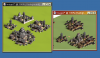
Yes, lighter is better but look at the comparison here :
Diffuse colors and the Separations are distinct.
I think you are not satisfied with what you are seeing and this has you Over working what was finished long ago.
At this point, you are digressing due to not being sure . Believe me... Other than lay out and fine points, #post 32 was BEST. This one is just all more Bland and lacks color and Clarity by comparison.
Attachments
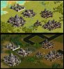
Kyriakos... Both Look Good, I simply liked the colors and separation of structures better on Post #32.
Naturally, it is always best to please yourself.
IF you are striving for authenticity and a stand alone City Set just for the City images themselves, I understand that but remember that the Cities will be used on Terrains and the Backgrounds the Cities are seen on also affect the images.
Here is a Light and Dark Terrain comparison example:
Attachments


ShiroKobbure
Still modding Civ3
The Japanese set is looking nice, but the details are looking a little flat, that might just be the lighting.


What happened to the Japanese set?
Similar threads
- Replies
- 14
- Views
- 1K
- Replies
- 0
- Views
- 338