New NESes, ideas, development, etc

That was already done, sadly it died too quickly...
 
Yes it was too complex with the bunch of maps and all.
 
Only it died because stalin hadn't time or interest.
 
That's way too large a time period for a NES focused on single individuals. Also, if I could actually get some input on that image from somebody, since I asked...
 
Symphony D. said:
That's way too large a time period for a NES focused on single individuals. Also, if I could actually get some input on that image from somebody, since I asked...

Whats it about.I don't understand.

edit: also world war 1 or 2 wouldnt be that hard.You command troops.Like divisions. As a genral for one of the major powers. Russia,UK,Germany,Italy,Japan,USA.. It wouldnt be as hard as you might think.Just a bunch of armies.
 
As I said, look up Toukon NES I.
 
Luckymoose said:
Whats it about.I don't understand.

edit: also world war 1 or 2 wouldnt be that hard.You command troops.Like divisions. As a genral for one of the major powers. Russia,UK,Germany,Italy,Japan,USA.. It wouldnt be as hard as you might think.Just a bunch of armies.


:lol: That was nesing experiment #2133. The concept is not as easy as one might think. On ther other side i think i figured out how to fix some of the shortcommings it had.
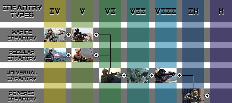
However with a nes as complex as that one needs more than 25% of commited nesers that actually send orders that make sense or send orders at all. :lol:

As i said, Toukon III, is still on the works.
 
This is the second take on this idea. I demand opinions. Better, worse? You like pastels more than dark colors? It's too big? Something.


Buttons were recolored, spaces in between reduced down to 20x20, and the colored stripes given darker hues and reordered. Most of the unit images are fairly final for this project too.
 
Much better, But I demand that you change the font to something more readable.
 
Master chief?
 
Actually, for the record, it's 'Tex. Preceeding her is an ODST, and a UNSC Marine who I'm still not quite happy with. Meanwhile, on the far left are Sergeant "Joker" and "Animal Mother".

In slot X will, when I get around to it, appear a nice rendition from everybody's favorite Heinlein novel.
 
Put in Sgts. Johnson, Cracker, and more Helljumpers! :ar15: :sniper:

Perhaps you should also update the Slot VII image to include a HALO 2 Marine, not one of those ugly-looking HALO ones. ;)
 
andis-1 said:
Much better, But I demand that you change the font to something more readable.
^seconded.
 
Dachspmg said:
Perhaps you should also update the Slot VII image to include a HALO 2 Marine, not one of those ugly-looking HALO ones. ;)
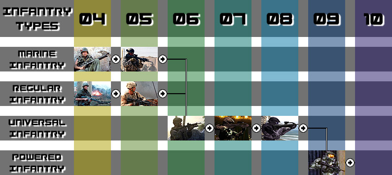
I would if not for the fact there are exceedingly few screens of them available anywhere. The only ones I have that function are either a very dark render, or a not very active pose. Regardless, I'm spending more and more time in photoshop so it might happen eventually.

Also, you guys are no fun for fonts. Just for this insubordination I should use Nyet Condensed. I'll look into such.
 
And lo, a scant few did offer opinion, and their opinions were considered and toyed with, and then, many cycles of computation there after, the one deigned "Mk.3" was delivered unto them.


You have no idea what a pain it was carving that UNSC Marine out of a black field. None at all. He looks like a comic book drawing now, at least to me anyway...

Numbers at the top too big? I think they're sort of overwhelming. Might lower the font point later. I decided to switch from Roman numerals because it's slightly easier to figure out at a glance, plus they were pretty space consuming.
 
If you can't be bothered to do something well, you should never bother doing it at all. You know, unless it's absolutely required, or something.

As I've said several times, it's a tech demo. Though our little gun-totting friends will likely show up again sometime in the not too terribly distant future.
 
Top Bottom