Hi!
The only thing that doesn't look perfect to me is the title (both pergament and text font seem suitable but not perfect)
By the way, I actually liked agaro's font! It was kind of bloody.

Your's Ray was quite good too!
Would you mind experimenting a little with different fonts and different underlying pergaments to present us some alternatives ?
Let me explain my position.
1. I can change/edit all part of the collage including both pergament and fonts practically "on the fly". However, I need to understand the direction of changes.
2. "underlying pergament"
Whan exactly I have to change? Size, color?
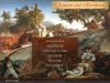
To my opinion the size of this pergament is rather optimal. Title is very difficult to read on the pergament of smaller size. Even on this pergament I cannot use the font from post
#7. It looks too small. At the same time the larger pergament covers a large part of top image.
The color of pergament is also cannot be too different from the top image. Moreover, it should be yellowish taking in the account the age of pergament.
I edit a little bit the color of pergament and now it looks as a color of original Declaration of Independence.
3. "fonts"
I agree with Ray, when he asked to change a modern font (see post #
44.) on the older one.
Pardon-moi Robert, however, your variant of "
agaro's font" cannot be accepted exactly due to "bloody".
To my opinion, all parts of collage should be in harmony. We used old-style art paintings as top and lower images. This means that a text also should be also of "old-style" or closed to "old-style", as we have on two last variants (previous one and this post).
Unfortunately, Gimps program has rather limited number of old style fonts.
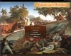
Here the next variant of starting screen
- with another "old-style" font
- with slightly changed pergament.

"Perfection" is not easy to achieve, especially as there are always different tastes involved if you have several team members.
")
I agree.


")

 )
)