pholkhero
Deviant Mind
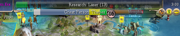
i have a question: what is that little arm doing in my top left corner, near the sliders ~ i have 47/90 what??
what do you think it is? look at F5 ... and stop bugging us ... people are trying to sleep!i have a question: what is that little arm doing in my top left corner, near the sliders ~ i have 47/90 what??

that's what I had in mind when i suggested it ~ even the icon for Military Instructor might do ~
You wouldn't even need ot make the GP and GG bar split the room evenly. if it was something like 66-33, that would work since, imo, the GP is of more importance.
also, i wonder if you get %'s displayed on the GP bar ~ since you can get the next city, i wonder how hard it would be? sounds like a job for ruff, methinks (who's still not sleeping).
")

 thanks for listening ~
 I like this option."Great Scientist (54%): Thebes (2)"
@robuck - So the game plays normally as if BUG weren't installed at all?
Thanks for the help, I got it working by renaming customassets folder to "assets".
GREAT compilation of mods by the way !


![[pissed]](/images/smilies/pissed.gif "Pissed [pissed]")


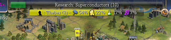 7%" in the screenshot. Also, it sorts them in decending %.
BTW, I'm resisting the %s in the label simply due to space issues, but how about this: use the icons for various things instead of the full unit name.
Does this look too confusing?
- Engineer:
- Scientist:
- Merchant:
- Artist:
- Prophet:
- Spy:
I have it so that it cuts off whenever it would overflow past the end of the bar. If we make the bar wider (possible now, definitely for wider screens), it will show more icons and %s. If you rename the city longer, it drops the "