Z-Eras -- Reality alternatives

Hi there Nutty, hope everything is fine on your side of things.

I've just finished re-creating the Eight Eras Screens to remove the trios of Icons from the top-middle trim set. These will then be used as final versions i'm guessing.
The only other changes (compared with the previous set you got from my One-Drive earlier) is the adding of all Magic-Buttons to their top-right corner locations *AND* the inclusion of the Espionage "concept" Icon at bottom-left corner of the Renaissance screen.

I also see you've probably took the Zip of "Workflow assets" above. Good stuff to have handy while you develop the Center code.

Need anything else -- just ask!

;)
 
Sorry, had real life crop up, and I'd been frustrated with the code. First, I couldn't get the other popups to come up, then I couldn't get information from one to the other; then, after switching from the "right way" to the way that works (by including most of it in the base game NewEraPopup files, I got it to work, but then at some point I broke it such that the center of the new era popups won't take input or display tooltips.

I'm unclear about the workflow you wanted between the 3 screens (the "NewEraPopup," the "ChooseEraMenu" with the 8 arrows, and the (at this point mostly blank) "EraDetail" popup where the mockup of post #53 would reside. You can now open the Eras Center from a new entry to the Additional Information menu (which Enhanced UI makes into a new button), or by right-clicking on the turn/date counters. However, I'm not sure which of the 3 screens should pop up by default in that case. I'm thinking EraDetail (set to the current era). Frankly, ChooseEraMenu isn't needed if there are buttons (or a simple dropdown) in the EraDetail. A dropdown is also preferable for mod support since the number of eras (and the appropriateness of symbols that might represent them in the ChooseEraMenu) could be changed. Regardless, does the "Magic" button always advance to the EraDetail screen? Do you want a way for a user to preview/review a different NewEraPopup?

Game Concepts pod: I'm still not quite sure what you had in mind for this, but I've added a framework with a new SQL table (Era_GameConcepts) that allows you to assign a list of TXT_KEY entries to each era for this pod. By way of example, I've added 2 dummies to each era.

Icons: The popup adds the Magic button, so it need not be on your era picture. It now adds the focus icons in the top left as well, but the icons from the base game I found are apparently smaller than the ones you used. I never went back to figure out which ones you're using, so that'll need some tweaking either way. I also wanted to make the center bottom ones dynamic as well by moving and hiding them as appropriate, and adding a similar table as the Game Concepts to designate the icons to be used [but that can wait].
 
Very satisfying to ear from you again!

Of course when life concerns strike, anyone should attend to these issues FIRST. I'd be the last to suggest otherwise. Modding is fun (at times :)) and getting good results (after that much work) is certainly a great incentive to pursue further and eventually, obtain rational success(es). ;)

Alright then, let's go through your comments and questions in detail;

-- Hoping you won't mind my confusion or off-shoot answers in some cases... this has more to do with the language barrier. Of french Quebec origins, i sometimes struggle with specific English context or (para-)phrasings. Okay, let's try to be thorough and as clear as possible!

1--)
...by including most of it in the base game NewEraPopup files, I got it to work, but then at some point I broke it such that the center of the new era popups won't take input or display tooltips

Considering how indirectly independent "Eras PopUps" & "Center" are from each other, i'm guessing the charting flow (if we had one!) would split apart both their processing methods and activation systems in the easiest way possible;

a) A New Era has just triggered -- PopUp shows up for quick consultation of your multiple ToolTips on each images. A simple preview of the upcoming gameplay assets.

b) A bit later, player would want to consult it (or another, btw) again... he can access a "Central" device that offers the (as you defined it) "8 Arrows" Menu-Wheel with their individual buttons. By clicking on any of these buttons, the corresponding PopUps are (re-)shown.

c) The "Eras Center" principle is activated only with the central (Magic) button. Which leads to the "MockedUp" stuff (what you're refer to as ErasDetail, right?) exposed in post #53. That process is also a stand-alone factor within the Mod. It just raises the bar on gathering gameplay facts by ways similar to Civilopedia but in a more concise (although heavily compressed but still cool, IMO!) manner.

In general, if you approach these three concepts as "unique", i suppose the code-work decisions would be much easier. Knowingly isolating their resources and screens should make their activities less confusing or accidentally prone to mutual "buggy" situations -- IMHO.

2--)
...You can now open the Eras Center from a new entry to the Additional Information menu (which Enhanced UI makes into a new button), or by right-clicking on the turn/date counters. However, I'm not sure which of the 3 screens should pop up by default in that case. I'm thinking EraDetail (set to the current era). Frankly, ChooseEraMenu isn't needed if there are buttons (or a simple dropdown) in the EraDetail. A dropdown is also preferable for mod support since the number of eras (and the appropriateness of symbols that might represent them in the ChooseEraMenu) could be changed.

a) I would want to have an extra entry straight in the Info-Corner section (45+HL icons were given for that) for specific reasons...

Firstly, Diplo-Corner is such a messy gathering of multiple items that i feared it would get buried into (even if EUI methods are used, btw) too much busy features.
Secondly, it made sense to add that stuff to an already obvious group of elements. Research, Units, Resources, GreatPeople, etc... then, Eras!
Thirdly, to prevent it from being misinterpreted as the only (alternate) way to access various data -- in a different context than almost anywhere else. Case-in-point... the Diplo-Corner ways or even, Civilopedia via the usual Top-Panel HELP shortcut.

b) If the Info-Corner method is used (wish!!)... then, the only premise of its Menu-Wheel(with 8-Arrows +1 in the Middle) was explained above. You can actually access 9 different (temporary) screens with it as a result. One at any given time, close, next or simple exit all via some regular "Close Button" right underneath the magic-icon in the middle.

c) Thus a supplemental drop-down list isn't even necessary when we consider the Wheel 8 buttons (maybe add a tooltip to name the Eras) fulfill such a task by themselves. Auto-Setting to the current Era wouldn't be that "essential" either since the player's need to access such a menu is based on general curiosity about all Eras at once, i gather.

d) The case for a drop-down function is well understood... but ONLY if someone plays with other mods that add or restrict the actual number of Eras. Coding some form of "blocking" routine would possibly be required of course. Unless you'd be willing to provide the extra "Drop-Down" feature. But, let's set some priorities... make *our* code work with "Vanilla" principles at first. Safety net for other conditions, later, AFAIC. ;)

3--)
...Game Concepts pod: I'm still not quite sure what you had in mind for this, but I've added a framework with a new SQL table (Era_GameConcepts) that allows you to assign a list of TXT_KEY entries to each era for this pod. By way of example, I've added 2 dummies to each era.

Here's a copy/paste of my current list of Gameplay-Concepts;
****
1) ANCIENT: Barbarians, Ruins, Trade, Religion Beliefs, Embassy, Tradition, Liberty, Honor, Piety
2) CLASSICAL: Patronage, Aesthetics,
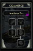
3) MEDIEVAL: Wealth, Research, Commerce, Exploration
4) RENAISSANCE: Espionage, World Congress, Rationalism
5) INDUSTRIAL: Antiquity Sites, Ideology Tenets for Freedom, Order or Autocracy,
6) MODERN:
7) ATOMIC: United Nations, ((PROJECTS: Manhattan Project, Apollo Program))
8) FUTURE: Spaceship Parts, Victory Conditions,
****
Just the names, that's all. Pulled straight from TXT-KEY_** entries within a SQL-Table is -indeed- the most efficient way to handle that tricky Pod.

4--) Icons;

a) Magics on each Eras -- these were added as a reminder where simple custom Tooltips could recommend a few "Mod" tricks and provide some direct hints about a few features otherwise unknown.

b) Focus -- were customized by using the Yield sheets and fiddling with some other Icons (ex;Modern-Espionage). Leaving them as is on the Era pictures would somehow be a much easier way to deal with those, i'm guessing. Unless, you'd want the extra DDS files if necessary. They're anchored to their (0,0) corners and are on a 128x128 file (actual image is proportionally reduced to be a regular 48/-/64 in some cases!)... while being aligned to slightly overlay the "colored banner" edges. I would agree that dispatching already available pictures could allow for proper custom variations (just as the toptrim trio of Icons) and that fine-tuning their "alignment" to fit could be done. Future's Trophy isn't a default file though.

c) Center Bottom -- of the Eras Popups, i presume. I noticed also that it's thinner than the Wonder sections. So, a default 128 is still a bit wider and would touch the dividing bar. Dunno if the framework could be adapted to compensate that visual flaw. Up to you to determine... but ideally, the 128 defaults would need to be used for that location. Quote(s) to the right and maybe, commentaries to the left-side. But as you say -- these can also wait.

--
Hope i was clear enough. Many deeply felt Thanks for all your work!

PS; Please upload (or attach in a Zip, or PM whatever) the most recent (valid!) version so i can witness what we're speaking about. If ready and you feel it would be constructive for our next development stages.

PS2; The Gift? Which game would you want to (still) play from your Steam wish list? Cuz, i'm certainly ready to spend a few bucks on you, buddy. I might even gain a free-copy of Defense-Grid1 in a few days... and, it's YOURS! As long as it won't interfere with our Eras+Center tasks though... :) :D
 
...or by right-clicking on the turn/date counters.

This specific comment reminded me of something "important" to me.

Did you mean the Turn-Timer? Middle-Bottom on the UI, right?
If so... that thingy gimmick seriously needs a TRUE pause function.
Imagine that one of our new Eras PopUp is on screen. Players start hovering and reading out the ToolTips data.
On average (ex;Classical) 40+/- seconds later, gameplay restarts!!

I'd say -- people (who actually use that very cool lapsing restriction!) will want a way to interrupt it, somehow.
:scan:
 
Sorry it's taken so long... the bug was very dumb; a ConsumeMouse="1" in the wrong spot (I could have sworn that I looked for that, but I think I was mistakenly searching for "CaptureMouse" instead). Anyway, I've attached something that you can play with...

Hoping you won't mind... the language barrier.
Not at all. It's sometimes a puzzle to figure out what you're saying, but that's part of the fun! :lol:

Considering how indirectly independent "Eras PopUps" & "Center" are from each other...
...except it's easier that way, and the information gathering remains largely the same. Anyway, I did split the Lua into different files, but it's only for keeping my sanity by dividing it into discrete chunks, as they're all includes to the newerapopup.lua--the only exception being the couple of lines to provide for the ancient era popup.

Regarding workflow: a click on the "Magic" button on the NewEraPopup and the ChooseEraMenu goes to the EraDetail popup. Based on your feedback, the item in the Additional Information menu (or the button added when EUI is active) takes you to the ChooseEraMenu, as will a right-click on the Date or Turn counter [in the upper right of the game's title bar]. I'll look into moving it from Diplo corner to Info corner--I wonder if EUI will be an issue?

Note I've temporarily made a click on the topper in the NewEraPopup and EraDetail go to the ChooseEraMenu (I even thought about making the colored dots in the topper activate that era directly, but it's a bit odd to use a topper as part of the interface), but that was for my initial testing and I haven't bothered to take it out yet.

Regarding the EraDetail popup: at the moment, it's pretty useless, but there's some checkboxes and dropdowns with a dual-panel layout so I could play around with getting the information in there before I start in on making dynamic button stacks and your crazy circular meters and what-have-you's. [By the way, I figured out what most of the letters stand for; I just realized that "P" must mean policies, but what does "@" stand for?]

The Norton Commander-style dual panel layout itself isn't too hard to do (though I'm not sure how easy it will be for users to use effectively), but it would make my job rather easier if we constrain the user to one era at a time on the EraDetail popup (rather than having one panel on one era and the other on another era). I do understand why you might want to compare, e.g., a unit to its upgraded version, so I'm willing to attempt it if you say it needs to be done. As far as how the user chooses the era (dropdown, colored buttons, or returning to the ChooseEraMenu), I'm happy to give my advice but let you make the executive decisions.

Re: Game Concepts, I've added your list to the database and given them optional categories as well.

Re: Focus icons, just tell me what size you want. The 64x64 that come with the game are smaller than the ones you're using, but the 128x128 ones at the bottom of the yield atlases are too large and look a little different (e.g., a basket of apples instead of just one apple). However, if that's OK with you, I've cropped them out and added them to the mod (and stuck victory64.dds onto a circular background). Feel free to shrink those or provide versions for me so I can place them and make some appropriately sized mouseover glows. The code's there, but at the moment it's disabled.

As for center bottom, I was referring to the icons at the bottom of the New Era Popup picture section, not the section where text currently goes. As for that section, if you give me content, I'll add it. As for the icons I was referring to, I haven't done anything about them yet, but I'd still like to add them dynamically (so they should also be removed from the picture, along with the top icons, the focus icon, and the magic button). It'll be good practice for the kinds of things I'll need to do for the EraDetail.

The Gift?
Thanks, but that's not really necessary. Time constraints aside, I'm not really in the market for a new game (not until a certain game comes out in October, anyway ;) ).

Did you mean the Turn-Timer? Middle-Bottom on the UI, right?
As I mentioned above, no, I meant the turn and date counters in the upper right. But your idea is quite another kettle of fish. I don't know if it's possible, but you can certainly throw the question out there to see if anyone bites.
 

Attachments

  • ZN-Era Popups (v 1).zip
    6.8 MB · Views: 255
W-O-W!
You really are making some amazing progress with the current task. I really feel privileged to be able to have you as collaborator for this project... more than ever after witnessing the latest build. :D

Before i go through your post, i'll comment a bit on the present state of what i could click on while indicating a few small "changes" that need to be adressed if you please;

1) The Unit & Building Icons (from the TopTrim_Trio) were deployed 2 pixels too high. So i edited the XML lines with their (-102,29) or (102,29) accordingly.

2) Glowing assets certainly add a nice feeling to the UI as expected. Didn't realize you'd need multiple sizes though. It works so it's alright.

3) The Focus corner (TL) "inserts" didn't render on my PopUps. Thus, i could see that Glow_64F (or is it?) was bigger and off-center relative to the current Screens (as they still had the custom *128* images ON). I still will have to erase them all to make room for (now) my files which i have attached in the Resources_Package2.zip below. In it, you'll also find the exact Magics_64 (for each individual Eras) that should be coded in a similar way than the Focus to fit as 128x128's anchored to the L-or-R corners.

4) The ChooseEraMenu is friggin' cool while on the UI. I could see you discarded the Buttons and their Highlights versions by pasting them on the 8-Arrows-Wheel_Grid. If it's easier that way, we might as well used the "Colored-HL" files as they would look waaaayyy more distinct on that wheel, no? The Close-Button should be smaller too. Dunno, maybe about 75% of the current size.

5) I understand the Era-Center screen is somehow seriously :D temporary. Very early stage of (code)design and not exactly as the intended MockUp. The top512centertrim version was replaced by the ErasPopUpTop300 file, most probably a pending issue. Interaction "features" are different, etc.

I'm extremely happy with the results, so far. Starting to believe we could reach a release status (even if without a working Center popup!) very soon. I wouldn't mind just splashing a simple teaser image to that incomplete screen. Maybe i'm just being impatient for people to experience the Eras-Popups as we do. Oh, well... what's your trusted opinion?

Next post will be about answering your initial comments.
 

Attachments

  • Resources_Package2.zip
    102 KB · Views: 209
...but that's part of the fun!
Arrrrggghhh! :cool:

I'll look into moving it from Diplo corner to Info corner--I wonder if EUI will be an issue?
Honestly, i would prefer it there **IF** and only *IF* it is not too much troubles code-wise. Don't want to impose you something that would be pointlessly tougher to implement. EUI is already too crowded with multiple buttons (on my screens anyway), so i doubt an issue would creep up if we move the essential access-point to Info_Corner (with our own custom buttons, btw). The Turn-Date hovering shortcut (ToolTip should be written as Eras Information) could even be kept as a secondary extra way to the ChooseEraMenu.

Note I've temporarily made a click on the topper...
No longer needed, i suppose. These Magics (per Era) would preferably be tied with custom ToolTips giving hints about the Mod itself or somethin'.

I just realized that "P" must mean policies, but what does "@" stand for?
Yep... and, in all their gameplay Info-Glory! They'll even have (hopefully thanks to your code-magic-work) a specific R1-DSP panel (see attachment below), you certainly can guess what for! @:lol:=TUBW (or WBUT;))... together.

...so I'm willing to attempt it if you say it needs to be done. As far as how the user chooses the era (dropdown, colored buttons, or returning to the ChooseEraMenu), I'm happy to give my advice but let you make the executive decisions.
Again (HOPING), if it can be done as some fully dual "scanning" with two Eras simultaneously, great. Limiting the dual scope range within ONE era at a time, good also. Just try in a rational coding "time restriction" and if you rationalize such a feature is waaaayyyyy too complex to even bother -- just stick with a Dual set in a single Era only. Eras should be choosen with Colored-Buttons exactly as shown by the Mockup, Left&Right or in just one Control-Panel with two uniquely driven lists underneath (TUBW@P--P@WBUT) . You have my executive ;) blessing and comprehensively smooth decision -- anytime, anywhere.

Re: Game Concepts...
We could always return to these later if we must.

Re: Focus icons...
Answered in the post above.

As for center bottom...
1) IIRC, i've already given the ErasAtlas128.DDS file in a previous post above. That's the only external resource (ours) necessary for that bottom "banner" section. Text and_or quotes should be pulled from ingame stuff, or some TXT versions should be customized by us eventually.
2) The bottom section Icons can certainly be dynamically added. The Actions are numerous on the Ancient popup though and it will take some tricky framework acrobatics to squeeze them all in tight and nice visuall at least. But, i'm willing try if your are. You can thus expect some new Resources_Package3.zip a bit later this week with everything ready to be referenced by the code as you'd wish for.

(not until a certain game comes out in October, anyway )
Don't even think about pre-ordering "Beyond Earth" yet... i know someone who will BUY it just for you, buddy. Count on me.

I don't know if it's possible, but you can certainly throw the question out there to see if anyone bites.
Shootttsss! Better luck next time... but, i reason you're already too busy with a tricky mod. :scan:

So far, so good, so fun, so magical!! :goodjob:
 

Attachments

  • Panel_R1-DSP(Commerce_TEST).png
    Panel_R1-DSP(Commerce_TEST).png
    65.4 KB · Views: 238
Nutty,

Something odd i just noticed with the Top-Trim trio of Icons... the third to the right (Buildings & Wonders) doesn't load on start-up (leaving a strange empty darkened box) for certain Eras (Industrial for example).

Maybe this is caused by me still having the temporary "blank_texture.dds" file (64x64) activated as true in the ART folder which i originally inserted in the Mod structure to fix the earlier issues we had with Numeric text layer(s) on the Pods. Should it removed from there too?
Strangely other Eras work... but some of their images get "transfered" to the location when other eras are inspected via the ChooseEraMenu and used as a transit selection between different Eras.

Or it could be something else in the code, i wouldn't know.
 
Dunno what the problem is; I didn't notice it here, so maybe it is your errant blank_texture.dds.

As for the rest, it's a holiday weekend here, so I don't know how much I can get done in the next couple of days, but I'll see what I can do.
 
Take a well deserved break, as i do. Such precious days-off should be used for R&R for every good reasons.
ZN-Eras+Center will always be there for us to return to if & when.

I'll just try deleting that tricky blank file directly from the Mod folders and rebuild. Pick the pieces from there.

Not sure yet how you want the entire set of "Icons" that need to be dynamically inserted in the bottom areas of every Eras.
I have most of these as individual PNG files which i dropped on their Layer. Easily transfered as proper DDS and will be included in Package3 later on. The only "missing" stuff are the Worker's Actions (many in Ancient, etc) which i initially copy/pasted straight from the UnitAction64(Atlas) sheet while adding a (relatively important) drop-shadow for better contrast on the many differently colored bottom (1920) stripes.
Thus... will you be grabbing such images straight from the In-Game process or should i simply re-create local assets *with* the proper drop-shadows added?
Bof -- i'll just joined all of them in the Package3 anyway.

Speaking of Worker-Actions... i remember planning to add the other Units-Actions to that same pod in another category group. Such as shown by the presence of Missile and Parachuting in the Atomic Era screen or the Exploration icon in Ancient, for examples.
Can't recall if you had maybe skipped that comment in some earlier posts. This is just a reminder, then.

I will also give you the exact framework coordinates for everything as usual.

Sometimes later this week since i'm currently having a blast with some wild Mod for XCom-EW -- LongWar. Nothing like pure fun for the mood... reminds me -- still dropping cute little Towers in DG1 against waves of tiny Aliens, are you? ;)
 
Nutty,
Great news... i'll have the necessary funds to pre-order both our copies of Beyond-Earth by next Friday. So, you can expect a well deserved (again) gift in your Steam inventory - soon! ;)

I've tried deleting the "blank-texture.dds" from the Mod to test if the Top-Trim 3rd Icon would properly load but it had no effect. I should mention that this behavior happens when starting games in any different Eras other than the normal Ancient setting.

The Bottom-Area set of multiple icons will probably be ready for you by this Sunday afternoon.

See ya later 'gator!

PS; I'm trying to reduce your workload as much as possible. Soooo if i were create the "list" using this formatting template to insert all DDS file names and Offsets (coordinates and anchored to the L,T corner) for everything in place of the underlines below;

Code:
<Image Anchor="L,T" Offset="__,__" Size="64,64" Hidden="0" Texture="_.dds" ID="_Icon" ToolTip="_">
<Image Anchor="L,T" Offset="__,__" Size="80,80" Hidden="0" Texture="_.dds" ID="_Icon" ToolTip="_">
<Image Anchor="L,T" Offset="__,__" Size="110,80" Hidden="0" Texture="_.dds" ID="_Icon" ToolTip="_">
<Image Anchor="L,T" Offset="__,__" Size="140,102" Hidden="0" Texture="_.dds" ID="_Icon" ToolTip="_">

Would that be valid and faster when you'll be coding the XML simply through copy/paste for each items?
 
Re worker actions:
I think I can automate a drop-shadow, but we could also just put the icons in semi-transparent darker circles (with or without a frame around them).
I'll think about the best way to automate adding other unit actions to the pod...

both our copies of Beyond-Earth
That's incredibly generous, but I would feel really guilty about the work to reward ratio.

I've tried deleting the "blank-texture.dds" from the Mod
What happens if you just use the version I gave you without making any changes to it?

if i were create the "list" using this formatting template... Would that be valid and faster...?
Even if we were making some different assumptions, it would still help me, yes.
 
1) Auto-drop-shadowing? This would lower the DDS file count drastically. Currently the pack has all the 42 files including "Actions". The only other obstacles to a formal dynamic insert (of ingame assets) are; UnitedNations and FirstSpy (which are using specific trail-glow effects) and the Victory Conditions as they are "doubled" left & right of the Future Era.
You'll also need special Icon-Frames for a few; Greys for Resources, Red of Industrial, World's congress Yellow, Blue projects and SpaceShipParts Magenta. I'll still package everything (already assembled) just in case you can't deploy any of the Atlas versions with shadows or inside the special frames.

2) Work to reward? Only time will tell if my risky investment will pay off! ;)

3) I always compile and use your versions, only. Maybe, it's the cache or ReallyAdvancedSetup by GenTso. Just weird that the flaw occurs at the same location and dispatches icons from other eras it seems at random. Cannot detect a clear pattern for now.

4) Will do, then.

Expect that stuff, sometimes this week.
Thanks for your (costly :lol:) work... but i'm still the boss of ZN-Eras+Center that holds control of the financial side. Money isn't a concern.
 
Alright, i've got everything ready.

Thorough instructions are included in the Zip along with all DDS files (currently) necessary. As you'll read - there's a very good chance we might only need 7 items to dispatch everything to the bottom areas.

I will also re-create all the screens without the Top-Right & Left corners (Focus & Magics) items and also leaving the bottom section completely empty to receive your dynamic process (hopefully!).
These are most probably the final splash screens and will be made available to you via my One-Drive as before. Once done, i'll PM the correct link to the Zip itself.

Have fun! :)

PS (EDIT); All 8 splash screens (almost totally empty!) are finished. Check your PM for the usual link.

-----
 

Attachments

  • Resources_Package3.zip
    371.8 KB · Views: 188
Nutty... Got the splash screens from my One-Drive?
And, i see you D/L'ed the Package3 file above. Hope everything is going fine in the coding task for these too! ;)

Comes the 28th (next Sunday afternoon) we'll both have our pre-orders for Beyond-Earth filled up, btw!! :D
 
Top Bottom