Platy's Peculiar Pleasant Posh Python

Awesome improvements Platy!
 
Last Updates

1) Added Vote Sources to Game Info (P.S. Votes only appear in games)
2) Allows Customisation of Title Color
3) Added respective icons to Titles
4) Added different icons to distinguish between Vanilla Concepts and BTS Concepts
5) Simplified some codes in Main File

I guess by now, all necessary stuff are already added, so I don't intend to add more stuff.
I know the main file is pretty long and so is History file, some of which are repeative codes, but I don't intend to define new functions to simplify them.
Defining new functions just shorten the codes, but do not make them run faster anyway, so that is not of top priority to me.

Unless there are requests for new items to add into Game Info, or new sorting methods, I guess this is finalised.
 

Attachments

  • Civ4ScreenShot0000.JPG
    Civ4ScreenShot0000.JPG
    123.6 KB · Views: 109
  • Civ4ScreenShot0001.JPG
    Civ4ScreenShot0001.JPG
    105.5 KB · Views: 124
  • Civ4ScreenShot0002.JPG
    Civ4ScreenShot0002.JPG
    117.3 KB · Views: 135
Specialist Count Update


Angry Citizens now also displayed with a Count directly
 
how about adding them into the "normal" specialists. It would give a line more for those mods with insanely amounts of resources ;)

Also, I have a request : Scoreboard :D

Instead of the "Name of Leader" I would like "Pic of Leader+Flag of leader", and instead of "Name of Tech" I'd like "Pic of tech".
Pics should be same size as those in civilopedia.

Just if you get bored ;)
 
Hmm specialist one can be easily done.
I was thinking of adding 1 more set of +- buttons to control max num of specialist per column.

Scoreboard depends how the codes are done

Edit:
If you are so desperate for more specialist slots, there is actually another way.
Add a dropdown with all the visible specialists, and just 1 set of +- butt
 
Tada

Spoiler :


1) Angry Citizens merged into Specialist list, freeing up one additional row.
2) Added 2 buttons to adjust max rows per column
I didn't bother to set a minimum row value (except min 1), so in theory you can have a super long 1 row if you are bored.

Only issue is that this value reverts to default value upon loading.
I can avoid this by adding a new graphic option like Hidden Promotions, but I rather keep this simple to just 1 file.
The CvGameUtils file is just to display the help tag, ignore it if you like.
 
Platy ScoreBoard

Features:
1) Shows buttons instead of words for leader and tech.
2) Adjustable length of score board.


Adjust length with "+" and "-" signs.
Pretty obvious so didn't bother to add hover text.
 
Niiiiice. Im truly impressed by the sheer amount of work you have done lately :goodjob:

5 things :
Can it be right aligned? Maybe even with Pic farthest to the right.
Can it have a flag of the civ after the Leader pic?
Can it be bottom aligned? (but still with lowest score at the bottom)
Can it be max/minimized to the lower part of screen instead of upper, as if the Minimize Popups in options is on, they will show on top.
Would it be possible to add Attitude like BUG, with smileys?

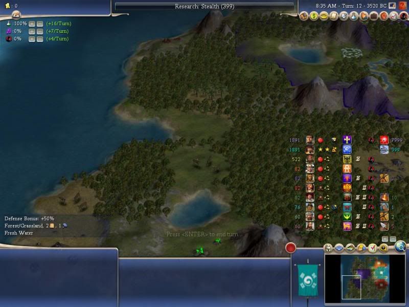
If its right aligned with leaderhead starting to the right (which, same as your pics, would give a nice overview/organized view of the leaders) which would be a good order for the info?

From right to left :
(Attitude), Flag of civ, Leader, Religion, Tradenetwork, Open Borders, Espionage and Tech'ing (turn), War/Cease Fire.

Did I miss something?

Comments :
Love the min/max & Scrollbar. Sometimes I think you read my mind :lol:
Love the coloring of score. Sometimes I think you read my mind :lol:

I really wish I had your skills and talent. :king:
 
Hard because it is done using table format copied over from Pedia, which unfortunately, seems to be the only table format.

It can only be like this:
X number of columns
Every column can have 1 button and a string
Button will always be left side, string can be aligned as you like.
Every column will have the same width.

As such, it will look like this:
Button, String, Button, String, etc

Conclusion:
If you want 3 buttons, leader, civ and tech. It looks weird because there must be a big chunk of space between leader and civ

Bottom alignment is doable but troublesome :D
Adding extra symbols is doable because Score to Espionage are all part of one string

Setting as table format as 2 benefits
1) Allows buttons
2) Fix the scrollbar problem with old scoreboard with many many civs
 
This is how right aligned looks.
Does that look better :D
 

Attachments

  • Civ4ScreenShot0005.JPG
    Civ4ScreenShot0005.JPG
    106.7 KB · Views: 166
oerfect score board!!!

the bot alignment is better indeed.

great work dude,

i think a hover text with either the leader or civ name is kinda better.

but still,
truly awesome.

also, the uuuu is a sweet and thoughtful of you.

also:
Merged Packs
Monstrous Magical Magnificent MegaPack (Wonders and Projects)
Grand Gruesome Gigantic GigaPack (Wonders and Projects)
Talented Trendy Tasty TraitPack (Traits)
Perfect Precious Priceless PromoPack (Promotions)
Thunderous Terrific Titanic TeraPack (Combination)
Ultimate Unique Unbelievable UltraPack (User Interface)

if i want all of the things in pone pack - i need - Thunderous Terrific Titanic TeraPack (Combination) from what i understand?
 
Hover text not needed since the widget comes with it.
Thunder pack is just a trimed pack of old works.

Not sure how bug did it either, too many files to look.

I thought of using multiple columns where each column is simply 1 icon size.
Then it can simply be 1 for leader, civ, religion, and the rest.
Sounds workable till I realise there isn't a holy city button
 
ye just saw the hovers, its fine,
one thing i didnt "like"

the buttons that extend the score board, in my opinion they should be constant, maybe beneath the score board - cause when i click fast clicks on the buttons to enlarge - the buttons go up with the score board and i have to move the mouse with it...
i know its petty a bit and lazy, but just a thought i had.

also - the attitude icons - :), :( :|... maybe move then first b4 the leaders button - those faces are important. maybe even a bit bigger.

:)

another question - do you think your ui mods are multi player compatible?
 
Updates

World Builder
1) Fixed Promotion Page "Back" Button
2) Set Max Size for most pages including Diplomacy Page, according to screen resolution
3) Removed one unused section


Settler Promotions
1) Updated Platypedia
2) Allows sorting of promotions
3) Removed Modnet Message system and use another method to find the settler.
Not 100% accurate but better than the bug due to getHeadSelectedUnit()


Great Works, Artifacts, Natural Wonders
1) Updated Platypedia

ScoreBoard


Set 1: [Score], [Leader], [Star: Active Player, Happy: > Cautious, Unhappy: < Cautious, Face: Cautious], [Star: Active Player, Trade:Trade Route, Fire: War], [Religion]
Hover Text just like Default Score Board, Click will go to diplomacy, ALT click Declare war etc

Set 2: [Civ], [Open Borders], [Defensive Pact], [Espionage]
Hover Text shows civ data, click will go to pedia

Set 3: [Research], [Turns Left]
Hover Text shows tech data, click will go to pedia

UltraPack
1) Updated with all the above
 
Edit

Fix number of rows calculations in Team Games.

P.S.
Refer to screenshot, it seems that in Team Games, Order is listed by Team Rank rather than Player Ranks, whereby Louis is placed higher than me because he belongs to same team as Surya.

Should this be fixed such that it goes according to Player Rank instead? :D
 

Attachments

  • Civ4ScreenShot0000.JPG
    Civ4ScreenShot0000.JPG
    176.8 KB · Views: 119
Top Bottom