raystuttgart
Civ4Col Modder
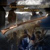
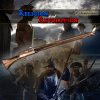
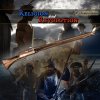
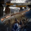
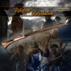
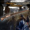
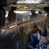
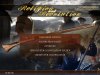
Do we have a version without the pergament in the right corner what I could use?
I have just checked my files and also /transfer.
No, I do not have a version without the pergament.
KJ would probably have one, but he is currently not available.

Did you check the attachments of this thread ?
I am not sure, but maybe such a version is attached somewhere.

Edit:
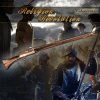
The only thing I could find is the image attached in this post.
")


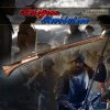
 thank you Willi Tell.
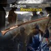
 ?
?

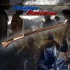
 That could create a really unique atmosphere, but OTOH it's not worth it if too much effort to do or is too difficult to read.