Unit Buttons Standardization

Sparth

C2C Team Member
Joined
Oct 6, 2013
Messages
2,314
C2C units buttons was created by different people and in different graphic styles. My plan is to recreate them in BTS/Civ4 look.
I know that in the begining new buttons can be confusing but in long run C2C gain "professional" touch with this move.

Also I want to:
- check all buttons and remove duplicate ones
- remove useless files
- resize all of them to smaller size
- create ethnic set of buttons as a modmod (future plan).

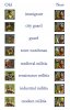
In attachment you can find sample buttons for few units.
 

Attachments

  • buttons.jpg
    buttons.jpg
    46.4 KB · Views: 309
That freaky Gatherer button is the one that really needs fixing - euggghhh! *shudder*

I think with the guards we really need to see the uniform to know they're not the equivalent combatant unit. Imo your immigrant and industrial militia are definitely better, medieval militia and the three guards need to stay as is.

Why does the modern militia have a yellow helmet? Don't you think it makes him look like a worker? And do militiamen in this era wear helmets at all?

And the Renaissance militia is okay, but he again looks very much like a regular combatant - Redcoat or something. I suggest he could be wearing plain peasant's clothes rather than a uniform.
 
I like all the new ones with, yes, the exception being the yellow helmeted Modern Militia. Modern Militia men would be like those guys out in Montana or Idaho that sport camos cuz they're ex military and such. Even a cowboy hat would suit better than a hard hat.
 
I have seen this used to great effect in other mods and I even have the templates used to make this style of buttons. The only problem I have with them is that sometimes it is difficult to tell them apart in game. They are not always the clearest buttons being fuzzy in places. If I remember rightly mounted units have the mount behind the head of the person.

For the units which are not mainly combat like the city guard line perhaps a stylized city or rook behind the head will do. With the red cross or red crescent for medical units. Nor sure what you would use to identify the hunters or recon units, a stags head silhouette and binoculars respectively perhaps.

I like the idea, if the buttons are not fuzzy and not confusing.
 
I like all the new ones with, yes, the exception being the yellow helmeted Modern Militia. Modern Militia men would be like those guys out in Montana or Idaho that sport camos cuz they're ex military and such. Even a cowboy hat would suit better than a hard hat.

YES: YMCA. :lol:
 
I have seen this used to great effect in other mods and I even have the templates used to make this style of buttons. The only problem I have with them is that sometimes it is difficult to tell them apart in game. They are not always the clearest buttons being fuzzy in places. If I remember rightly mounted units have the mount behind the head of the person.

For the units which are not mainly combat like the city guard line perhaps a stylized city or rook behind the head will do. With the red cross or red crescent for medical units. Nor sure what you would use to identify the hunters or recon units, a stags head silhouette and binoculars respectively perhaps.

I like the idea, if the buttons are not fuzzy and not confusing.

Maybe we could use different background colors?

Green: Hunter / Scouts
Braun: Mounted
Yellow: Melee

etc
 
Maybe we could use different background colors?

Green: Hunter / Scouts
Braun: Mounted
Yellow: Melee

etc

Now i like this idea, alot. (Only Melee - Red, like blood for fighting.
 
Ok thank you guys for great feedback
here is preview image after all changes + few new buttons
http://imgur.com/Lft7EuT

Especialy like the colour idea.

SO, look at medieval militia na red colour for melee units. Its ok now?

Only problem is gatherer button. I dont have idea what to give him and for now its a basket :)
 
Only problem is gatherer button. I dont have idea what to give him and for now its a basket :)

can't you just give him the normal Worker Icon but made a bit more PH era? Maybe with a simple stone tool.
 
Alas I fear :( I shall ever be disappointed unless the gatherer button is that hot babe from the nif;). (I can't be the only one feeling this way.) And I personally think that, being the 'gatherer', their 'function icon' should be a bunch of berries rather than a mattock.

All the rest are good except (I don't mean to be rude but) why the clown makeup on the Cyber Soldier?:D
 
I think the red clashes too much with the red background of the Tamed Animals.

Crap your right, i forgot you guys had the red background for them, my bad, what color would best be a better for a fighting class then??

Shouldn't the Space ones, have a light blue in them for the sky??

Also the gatherer with a pitchfork?? rather than a stone tool for fighting, since it does not fight??
 
Here is next batch of icons to discuss
http://imgur.com/lnwdYJ4

With hunter line background (chaser) and "crime" line (sharpshooter)

Also I want to recreate all hero buttons to circle instead standard square
What do you think?
 
Here is next batch of icons to discuss
http://imgur.com/lnwdYJ4

With hunter line background (chaser) and "crime" line (sharpshooter)

Also I want to recreate all hero buttons to circle instead standard square
What do you think?

I am going to leave this up to the other modders, i like it, separates them completely different from the others, which they should be, but /. . . . . .

Course i dont like some of the others either, and actually alot of the first bunch, but thats just me . . . Also when you get :old:er you dont like so many changes, I/they get more confused :crazyeye:
 
I understand you SO :)
But think about this as a cleaning. Its a change but for a better :D
 
Top Bottom