You are using an out of date browser. It may not display this or other websites correctly.
You should upgrade or use an alternative browser.
You should upgrade or use an alternative browser.
Art style reminiscent of civ revolution 1 & 2
- Thread starter s0nny80y
- Start date
- Joined
- Aug 12, 2010
- Messages
- 16,937
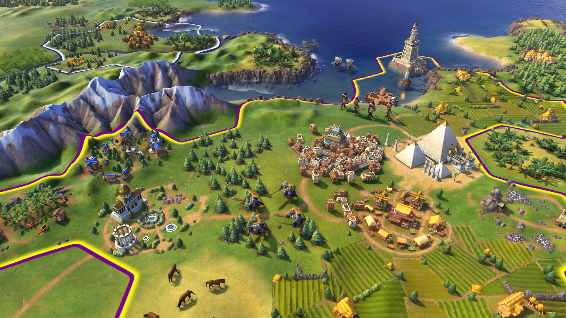
It's a simple style in order to give visual clarity on the map. There are 12 types of districts with up to 4 buildings depicted on each one and multiple improvements on multiple types of terrain with multiple possible resources.
The units on the map will probably have models for the base unit and any support units integrated in them.
In order for the player to quickly parse all this data at a glance it is presented in a simple fashion.
I don't care for it aesthetically, myself, but I can at least appreciate it conceptually.
AtlantaMarty
No longer active
I don't care if it is "easier to see and/or understand"
This is Civ, an epic game of world history, not some little kindergartener, toilet training, have a lollipop, free candy, dumb mobile game that is meant for those who still wear diapers.
This is Civ, an epic game of world history, not some little kindergartener, toilet training, have a lollipop, free candy, dumb mobile game that is meant for those who still wear diapers.
Westwall
Emperor
- Joined
- Sep 7, 2014
- Messages
- 1,341
I don't care if it is "easier to see and/or understand"
This is Civ, an epic game of world history, not some little kindergartener, toilet training, have a lollipop, free candy, dumb mobile game that is meant for those who still wear diapers.
I think the art style is alright and I don't wear diapers. And I've been playing every Civ game since 2. Also, when the developers say it's "easier to understand," in this case they're talking about the new district system and no doubt other systems they plan to implement, which I'd wager don't exactly work as well without making the map easier to understand.
You could argue it's still too "cartoony" either way, but I don't see an inherent problem with wanting it to make it easier to distinguish details on the map.
AtlantaMarty
No longer active
I would rather have a steeper learning curve with nicer graphics.
It's the same Art Director (Brian Busatti) doing Civ VI that did Civ Rev, so it's not surprising that they look similar.Anyone else draw the similarity?
Battlehelm043
Warlord
It's the same Art Director (Brian Busatti) doing Civ VI that did Civ Rev, so it's not surprising that they look similar.
If I'm not mistaken he is also the same art director for CiV as well.
Battlehelm043
Warlord
My concern is that they say the art style will give clarity by using the art similar to Civ Rev... idk about anyone else but even in Rev I can loose track of units given enough idle time between sessions..... I just hope it pans out, I mean as many have said the issue isn't so much the graphics, rather it is the sell that people feel confused on. The trailer conveyed seriousness in art style like CiV, but then we were presented with a completely different style all together. I think it can be summed up by shock to what was a perceived art style.
As I have said before until I see more this one is a no go, but that doesn't rule out me ever buying it. HAHA I mean hell I'm not gonna picket or anything because my minds eye was wrong lol.
Additionally, I was listening to Marbozir on youtube and he mentioned he was away on a project he couldn't yet talk about, I believe it is very likely he might be getting some hands on time with Civ 6.
Kouvb593kdnuewnd
Left Forever
- Joined
- Jul 3, 2012
- Messages
- 4,146
To me it look like similar to Rise of Nations art style.
Jon Shafer
Civilization 5 Designer
Busatti was definitely on the Civ 5 art team, but Dorian Newcomb was our art director.If I'm not mistaken he is also the same art director for CiV as well.
- Jon
salty mud
Deity
Spoiler :

I'd say there's a resemblance.
- Joined
- Aug 12, 2010
- Messages
- 16,937
Spoiler :
I'd say there's a resemblance.
The trees and farms are similar but the color pallette is more pastel in Rev
blitzkrieg1980
Octobrist
At first I had a knee-jerk reaction and hated the new style but after a little more inspection and analysis it isn't horrible. I could easily get used to it. I like the ships and the mountainsI think the art style is alright and I don't wear diapers. And I've been playing every Civ game since 2. Also, when the developers say it's "easier to understand," in this case they're talking about the new district system and no doubt other systems they plan to implement, which I'd wager don't exactly work as well without making the map easier to understand.
 . The problem, however, isn't in the stylistic choice, per se.
You could argue it's still too "cartoony" either way, but I don't see an inherent problem with wanting it to make it easier to distinguish details on the map.
Here lies the problem. When I look at the full screen images that were released, I have a very hard time discerning things that should be easy to find on a map. Units do not jump out in any way. In fact, they blend very easily into everything. This may have to do with the seemingly over-saturated colors but I have a feeling it has more to do with the fact that they wanted to make the cities themselves with all their details fully identifiable. That is a problem, IMO. There's no reason that I should be able to ascertain the entirety of a city's characteristics right on the world map. I don't need that kind of immersion in my grand strategy/4x game.
There's no reason why we can't have a separate city screen that has all the pertinent information and this includes for rival civs. If you aren't supposed to see certain data about a rival, then simply hide that data from the UI but allow players to look into the city screens to see the district info / layout / whatever else they wanted to convey directly on the world map. By trying to fit city detail along with terrain features, resources, and units all on the world map just creates a jumble of clutter IMO. Yes, I get that cities now take multiple tiles but you can represent that on the map without having all the gritty detail of every district showing, too.
Maybe I'm waaaaaaaay off on this... I sure hope so. I'm sure we'll find out more soon (though not soon enough).
brianshapiro
King
- Joined
- Mar 6, 2003
- Messages
- 775
The trees and farms are similar but the color pallette is more pastel in Rev
CivRev 2 had less pastel graphics.


The swordsmen are a similar style. In the Civ6 screens you see swordsmen hulking and hunched over with capes and swords with flouted ends. The fir trees are also multi-layered stacks just like in the Civ6 screens. Also bright color-coded buildings.
What's different is the proportions are a tiny bit less exaggerated -- ie. no big feet -- the details are further removed -- you see no pine needles -- and the graphics are more sophisticated.
Barathor
Emperor
- Joined
- May 7, 2011
- Messages
- 1,202
Yeah, Civ6 definitely isn't as stylized as Civ Rev. I personally think Civ6 is a nice balance between realism and stylization, even more now after viewing those Civ Rev examples (which also look so dingy and sad -- makes Civ6 look even more vibrant).
I'm looking forward to seeing a video of Civ6 so we can see all this eye candy in action and their effects (especially that day/night). I'm sure these few screenshots don't do the graphics justice. It'll be so nice to see the trees gently swaying about, the ripples in the ocean and the light bouncing off of them, the waves crashing into the cliffs, birds flying around, dawn/dusk and shadows slowly shrinking/expanding, little fishies jumping out of the water, swordsmen hacking each other apart, arrows raining down on enemies, smoking/pillaged districts, burning cities, and other cute little things throughout the game.
I'm looking forward to seeing a video of Civ6 so we can see all this eye candy in action and their effects (especially that day/night). I'm sure these few screenshots don't do the graphics justice. It'll be so nice to see the trees gently swaying about, the ripples in the ocean and the light bouncing off of them, the waves crashing into the cliffs, birds flying around, dawn/dusk and shadows slowly shrinking/expanding, little fishies jumping out of the water, swordsmen hacking each other apart, arrows raining down on enemies, smoking/pillaged districts, burning cities, and other cute little things throughout the game.
how about going and grabbing some screen shots from the console civrev, then placing them side by side with civvi screenshots.
they don't look the same, or even similar.
This point always confuses me,
I always felt the CivRev , especially CivRev 2 looks a lot more like Civ4. Both had square titles, and CivRev2 appears to have reused Civ4 terrain assets and had the kind of early 2000s 3D game look.
Here's Civ Rev 2 / Civ 4 / Civ 6 comparison
All 3 belongs in the same family, but Civ Rev 2 is clearly closer to Civ 4; whilst Civ6 style is perhaps inspired by it but all its own
Spoiler :
CivRev2
Civ4

Civ 6
Wow that's uncanny.Spoiler :
I'd say there's a resemblance.
I don't know how you can say that; the moment I first looked at the new Civ VI screenshots, the very first thing that popped into my mind was "ack, Civ Revolution!"how about going and grabbing some screen shots from the console civrev, then placing them side by side with civvi screenshots.
they don't look the same, or even similar.
They're not the same, of course. Civ Rev has much more exaggerated proportions, especially in the units, but they have very similar art styles. You can see the hand of the same artist in the styling of the figures and the trees, and the bright, saturated, minimalist textures. And it IS the same artist.
Civ VI does look a lot more like Civ IV (and Civ Rev) than Civ V. I think that's part of what's throwing people. They've been playing Civ V for so long that they don't remember how saturated and cartoony Civ IV was.This point always confuses me,
I always felt the CivRev , especially CivRev 2 looks a lot more like Civ4. Both had square titles, and CivRev2 appears to have reused Civ4 terrain assets and had the kind of early 2000s 3D game look.
Similar threads
- Poll
- Replies
- 209
- Views
- 13K
- Replies
- 140
- Views
- 13K
- Replies
- 0
- Views
- 351
- Replies
- 3
- Views
- 400