City screen building icon clarity

How do you like the change?

  • Yes please.

    Votes: 8 44.4%
  • The buttons were just fine.

    Votes: 6 33.3%
  • I would like to see all applicable building buttons having the resource icons.

    Votes: 4 22.2%

  • Total voters
    18

FlaviusBelisarius

Chieftain
Joined
May 13, 2020
Messages
59
Location
Finland
Hello all!

-- optionally skip this part to move to the topic of the headline -->
I am new to the forum so short introduction is in place: I am a long time colonization fan and have spent probably thousands of hours in my childhood alone playing the original Colonization Amiga version. While plain civ4col was a disappointment, the mods have been great and I have been following their development from time to time. But now I have finally decided to step in to do and share modding work of my own.

I am a professional software developer and I work with python. I am comfortable with C++ too and just got the developer tools set up and managed to compile the game dll for the first time. Nevertheless, I am very unfamiliar with the colonization / WtP mod codebase and I would greatly benefit from some basic guidance. I have loads of my own ideas to implement but I can work with community given ideas if I get motivated by them enough. In my mind, WtP is moving in general into a good direction but I might be tempted to do modmodding instead if my visions diverge too much from the established development team. And of course, I have limited resources to invest here so realistically I will do a small feature or improvement every now and then and that is it.

-- skip here -->
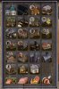
I have been playing WtP for quite a long time but still I am having painful time looking at the building button (icons): the different workshop designs are not easy to match to their function. So I end up hovering for the tooltip info and wasting time looking for a particular building.

So I added resource icons to the buttons that directly depict what the building does (for most buildings). What do you think? (see the screenshot crop)

I can share the work if desired.

-belisarius
 

Attachments

  • Screenshot 2020-05-13 20.40.39.jpg
    Screenshot 2020-05-13 20.40.39.jpg
    42.8 KB · Views: 187
Hi belisarius
I like the look of your icons. Personally I know what the buildings do by now but its not unlikely that some people would find them useful. So my vote would be a 'that's cool by me'.
 
This is a purely photo-editing modification. Free to use or to adopt to any mod.

Extract the attached zip file to WtP mod assets folder and it should overwrite two dds files. For some reason, the files got a lot smaller after saving with the Photoshop dds editing plugin I used but it seems to be working fine for me at least. Make backups of the original files to be safe.

The files edited:
[Documents]\My Games\Civilization IV Colonization\MODS\WtP28\Assets\Art\colonization_atlas_buildings.dds
[Documents]\My Games\Civilization IV Colonization\MODS\WtP28\Assets\Art\interface\buttons\Unit_Resource_Colonization_Atlas.dds
 

Attachments

  • Button_mod.zip
    382.2 KB · Views: 84
Did you include the third poll option, "I would like to see all applicable building buttons having the resource icons" because you figure some people can't decide between option 1 and option 2 without more examples?

I voted "Yes, please" because these bubbles help me filter those industry buildings and see the buildings I'm most likely to build.

I think this is an improvement, but a bandaid on a bigger problem: too many goods. There aren't meaningful gameplay decisions to make where you settle based on terrain, and the consequence of every terrain producing 3-4 viable resources is that, I guess because tobacco has to become cigars, there has to be a corresponding industry building for every raw good. 20 buildings inhibit visual recognition on the build screen. It also inhibits recognition in the Civilopedia, where a player will find himself trying to sort through all the corresponding experts and their non-uniform naming conventions. I'm not sure what modders were thinking by increasing the good count. "Only 20 options...Ah, now there are 40. Now this is an economic simulation premised on political independence!"

Settle the deserts, and having memorized which expert doubles, refine their salt into salt2 using a visually identifiable building. Thanks for helping make the building identifiable without a tooltip. I hope someone comes along and makes sugar, salt, and silver look different someday.
 
Last edited:
The icons are neatly done, especially those from the multi-producing buildings.

I still voted against the the idea, the buildings are distinct as they are now, IMO there is no need to clutter the building screen with additional content.

Maybe the devs could include them in the mod as an optional add-on?

Regards
XSamatan
 
Maybe the devs could include them in the mod as an optional add-on?
I will not rule out the ability to create an ingame switch to turn them on/off without having to mess with the files. The question is if that will be too much work to maintain as it will require two sets of building graphics and they should stay in sync.
 
I put the third option if some people prefer consistency over the present partial changed one. I personally feel that the version I shared above solves the issue for me - I can more easily separate trade good buildings and pick the right one. Blacksmith, church etc are very clear looking to me - unlike some of the generic shacks and huts. And I just prefer to optimize ergonomics. If an improvement to visuals grants me a second less time spent to find a button every time, it adds up.

I also feel it would be great to figure out some particular reason of existence for all goods in the game. Now they are too generic and perhaps even too "balanced" in my opinion. Historically, different crops / goods had quite different roles and significance.
 
@FlaviusBelisarius
To be honest, in the current state I do not like it.

-----

1. The biggest issue I have is that it is done inconsequently. Some Buildings do have the "Yield Icon", some do not.
So why does "Tobacco House" have it and e.g. "City Hall" or "Dock" does not? All of them produce Yields.

2. Also with my upcoming changes for "Additional Yields" almost every building will become "Multiple Professions per Building".
So every building would have a combined "Yield Icon" which may sometimes be hard to distinguish - because it is simply not a single Yield anymore.

3. Sometimes the "Yield Icon" simply covers too much of the really beautiful buttons.
I want to still be able to see those nice Building Buttons that modders have put so much effort into.

4. I currently tried to create an "immersive style" for buttons.
The "functional style" you tried to create would be in too strong contrast to it.

Check for example this here:
Spoiler :


-----

Especially here in Colopedia I do not want to have these "Icon Overlays".
It is prettier like this:


-----

Summary:

Sorry, but in this case I chose "style and atmosphere" over "functionality". :dunno:
It is just my personal taste of course and of course I have no issue if this here is offered as "mini mod-mod". :thumbsup:
 
Last edited:
I appreciate your sincere opinion Ray. Honestly, I would have doubts myself with this moving to an official release for the same reasons you point out. It could be made consistent as you say, but then it would certainly cover all button graphics making a mess.. not idea.

At the moment, even for a moderately experienced player like me, this was a perfect personal balance to improve ergonomics (I prefer good ergonomics over many things). So anyone similarly minded will perhaps find this useful and I would be happy with that.

Of course, ideally, we would have button graphics without this sort of a compromise. Strong both in clarity and atmosphere (most already are in my opinion, thus I did not modify icons for them). I am not the only one having this visual clarity issue as pointed out in this thread.
 
I am not the only one having this visual clarity issue as pointed out in this thread.
I do not doubt a single second that WTP in its sheer massive size (Game Concepts, Yields, Buildings, Professions, Experts, ...) is confusing for "new players".
But there are also the "hardcore fans" that have been playing this game (on and off) for several years already - which know exactly how things work and how those buttons look like.

----

That is basically the conflict we have all the time:
"New Player" vs "Hardcore Fan"

----

To a huge degree I am modding for very selfish reasons: To create my own perfect game.
(And I am a "Hardcore Fan" of this mod myself. And I like things to be "pretty and stylish".)

----

Summary:

To offer this optionally for new players sounds good to me.
But I do not want this to become "default" in WTP core mod.

But somebody needs to "maintain" this then in case the Buildings change in upcoming versions.
(I will e.g. add a few new Buildings for my "New Yields" and that might also become WTP core mod.)
 
Top Bottom