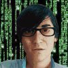
[graphics]

Buster's Uncle

AC2 Owner
Joined
Apr 13, 2009
Messages
1,657
Location
AC2
If creating/modifying graphics doesn’t interest you I doubt this will.

My first purpose here is to give potential graphics guys a leg up, so I have to go into torturous detail to be really helpful, as I don’t know what they do or do not already know how to do. I don’t have a sophisticated graphics set-up at all, and do a lot the hard way in simple, common programs, but that makes it more universal, albeit perhaps often extraneous to someone with PhotoshopUltimateSuper 2020.

You have been warned.


So, while working on the Vikings (see the Alt. Official Factions thread for the file) today, I started a little status report with a name suggestion to send Darsnan, but things went pretty smoothly, and it turned into running notes to send with the graphic instead…

It occurred to me that a few months ago while I was a lurker looking for information about various things I wanted to learn to do, I would have loved it if someone had posted about their creation process in really boring detail, naming programs used and tools, and what-not.

And I thought that the bulk of the email [with the blow-by-blow I didn’t waste Darsnan’s time on added in brackets] would make a start.

So I’m going to try to describe the entire actual creation of a faction graphic- we’re in for a long post(s)...

I hope my process will be at least of some interest to any other artists currently active, too- and that they’ll feel free to do the same, and also post here on any miscellaneous graphics issue they want. The next time I do some random graphic myself, this is where I plan to post it.


***
[Darsnan had suggested a name, Ulrik Magnussen, that sounded, not Finnish to me, but Norwegian. (Graphics stuff is coming- it’s all connected, anyway.)]

A Finnish name site was first hit when I looked. Because the original subject was apparently named Jim, I chose a j name, Jali (yahlee), for no Jim-looking equivalent at hand, its exoticness and that it doesn’t sound as much like a chick’s name as many.

Magnus was first in the M’s, so I’d say Jali Magnus was a lock, if you’ve nothing to add. Easy to remember, spell and type, too.

[I’d already cranked up the contrast on the bases he’d sent me this morning in Photoshop. They were Network Node’s work, and like a lot of his bases, pretty and well-designed, but to my eye, too pastel-looking to look realistic in the game. Then I selected the lot and pasted them into the copy of the whole Pirates .pcx I’d previously pasted into MS Paint. I use paint for this because it’s not something Photoshop 5 is any good for- Paint lets you move your paste around before you drop it.

[Then I opened the blank .pcx with the empty AC graphics boxes that Maniac had posted sometime in the past in Photoshop (all I began using Photoshop for was opening and saving, and did all the work pasting back and forth between Paint and Lexmark Photo Editor, which complement each other nicely used this way- if either did color manipulation I’d have never gone to the trouble to learn how to use Photoshop). I zoomed on the datalink leaderhead box and selected/copied it. I switched to a second copy of Paint in which was waiting the portrait I’d prepared. (A blow-by-blow of that kind of thing is enough for its own post later.) I pasted in the box from blankpcx.pcx, right-clicked the sample tool in the middle to make the .pcx’s background color this copy of Paint’s background color. I then turned off “Draw Opaque” and hit [control z] to undo and make the purple-filled box go away. I then [control w]ed to resize the image- there were several minutes of trail and error before I found 55% to be ideal for getting what I wanted of the figure to fit in the diplomacy box at what I judged was a good size for the game- ideally you want to get the figure somewhere roughly about the size in the frame of the official factions. So now I had the picture in front of me sized like I wanted with the box it had to fit in around it- I selected what was inside the box and [control c]]ed. Now it was time for the scan lines.

(I think I’ve now spent more time preparing this essay than I did assembling the faction graphic- I’m going to post this much and continue later.

Next up: manual scan-lines with an old edition of Photoshop that lacks an automatic function to do it for me. I’ll probably describe how to do it the really hard way with only Paint and any program that will adjust contrast, too.)
 
[Lacking an automatic function that will do scan lines for me, I’ve worked out two ways to do it manually. I’ll tackle them in reverse order of invention.

Once it fits the frame the way I want, I select the inside of the box and switch back to Photoshop.

The diplomacy frame I selected still waiting, I paste in the portrait. I reselect the picture- inside the box this time- and reduce the contrast 30% (usually- sometimes I think it needs to be brighter, and increase the contrast by the same amount, or reduce it 15% and increase the next by the same- I’ve found a 30% difference in contrast is about perfect for good scan lines). Then I paste again to drop another copy (which still has the original contrast level) on top of it.

I select a horizontal box the width of the picture, but only one pixel high, at the top of the portrait and hit delete. I hit the down arrow key twice- which ion Photoshop, moves the select box down two pixels- and hit delete again. I use a two-handed technique, hitting the delete button with a finger of my left hand, and the down arrow with a finger of my right. As I fly down the picture doing this, pixel-wide stripes of the lower-contrast copy of the portrait underneath are revealed every other row.

When I get to the bottom, I select the whole portrait inside the frame and click Layer>Flatten Image. This makes the two copies one layer- with the scan line striping I made- that I can copy and paste into place on the copy of the whole faction graphic in the other copy of Paint.

(Then I go back to the copy of Paint holding the leaderhead, reduce it in size 80%, and repeat the process- then 73% of the datalinks size, then 60%.)


I used to do the resizing with nothing but tedious trial and error, getting something close to the right size and shape, then seeing if it fit the box, shaving off a few pixels and trying again. It took a bit longer that way, to say the least.

In those days, once I had the portrait size/cropped for each box, I’d open two copies of Paint and paste the portrait into one of them. Then I’d paste it into Lexmark Photo Editor, reduce the contrast 30%, copy it that way, and paste into the other copy of Paint.

Now for the fun part. I’d zoom in on one of the copies of the portrait at 800%, and begin using the line tool to draw horizontal white lines one pixel wide though every other row of the picture. It’s simpler to describe, but took 20 times as much tedious work to do. When I had done that to the whole shot, I’d paste it on top of the other copy of the picture in the other copy of Paint with Draw Opaque switched off, (white is the default background color,) resulting in a scan lined shot.]

(Next up: fun with logos and such.)
 
Pickly had a question about changing the background colors in the (faction)2&3.pcx files with GIMP while replacing faction logos. To be honest, I use Photoshop for that because the select tools are more flexible than GIMP's are- so my answer wasn't as helpful as I would have liked. I've done a little testing using the Hive3.pcx now, and here's what I learned.

After loading the .pcx into GIMP, I selected Image>Mode>RGB (a lot of functions aren't available with the .pcx set to Indexed colors, so you have to switch mode to RGB, then put it back to Indexed before you save.) Use the fuzzy select tool- it's the fourth tool on the top row of the toolbox, a wand with a round yellow bit on the end. Mine had the threshold setting at 33. I selected bit of the random background colors at the edge of the Hive logo, selected Colors>Hue-Saturation. In the control that popped up I shifted the hue 50% to the left- I'd arbitarily decided I was preparing the background for a green logo- your milage will vary- and the lighter colored bits I'd selected in the background were now green. I had to repeat the process several times over to get the whole background, and some bits that impinged onto the interrogation-chamber part of the image. Most of the logo half, you could actually just hue-shift all at once with the plain box select, but you need to get good with the fuzzy select tool for the left edge where it impinges on the room. In the before and after shots attached, you can see that as soon as the Hive logo is blacked(greened) out, it'll be ready for pasting in a green logo.

Afterwards, the smudge tool and a lot of nitpicking work zoomed in close is great for cleaning up anything that doesn't look right around the edges.

Any questions? Pickly, you'll find that as you use GIMP you'll get better at using GIMP. You'll be telling me better ways to do it in GIMP before long, if you keep at it. This kind of work takes a lot of patience. Good luck, and I wanna see your art. Feel free to post here with questions, samples and comments. This thread is for spreadng the knowlege around
 

Attachments

  • hive3.JPG
    hive3.JPG
    55.5 KB · Views: 152
  • hive3b.JPG
    hive3b.JPG
    57.4 KB · Views: 142
Also, it doesn't change the background colors, but here are three .pcxs I found on the net somewhere with most of the stuff you'd have to erase done for you. These might save you a lot of work.
 

Attachments

  • Defaults3.pcx
    250 KB · Views: 127
  • Defaults.pcx
    128.5 KB · Views: 93
  • defaults2.pcx
    24 KB · Views: 103
On GIMP again, I should have mentioned that when the fuzzy select tool is in use, you can use those red mode buttons at the top of the current tool settings to add or subtract to what you're selecting. It's better to hue-shift everthing you're going to change the same way at once when you can, as then you don't have to keep track of as much.
 
I’ve decided to change my format from talking about my working process on a faction I finished over six weeks ago to talking about what I’m doing now. I can go into more- and more educational- detail that way.

(Yesterday in the Beta Lyrae thread, Darsnan and I were discussing the possibility of changing the bases for his alt. Usurpers/Imperial Starlost Progenitors. I give these remarks about background because the best game art doesn’t just look cool- it tells a story. These things have an important effect on the art decisions you make.

The Starlost- my label, not his- were a naval survey expedition that was lost in space long before the Manifold disaster destroyed Prog civilization, or the schism between Caretakers and Usurpers. After many thousands of years in stasis, they ended up stranded on Beta Lyrea not long before the humans, and instantly came into conflict with the Autochthon- descendants of other Progenitors who survived the Sentinels by achieving harmony with the environment. A lot of art decisions went to trying to suggest that the Autochthon are Progs gone native, and keeping a look consistent with their story.

The Starlost want to create the infrastructure to build a starship and leave. I’ve gone for a look that says “Alien Captain Kirk down on his luck” with the art- thus the approach I took to the diplomacy landscape shot, changing the DL Darsnan pointed me at- of a ship in flight- to the ship grounded and very chewed up-looking. With the bases, Darsnan liked my suggestion of running elements of Usurpers and Caretaker base designs together to suggest that these guys are from before the schism.

So last night, I did a little cut and paste work to put the top of Caretaker bases over Usurper ones. I did some minor fiddling with the Usurper struts to splay them just slightly and make them look a tiny bit more like Caretaker ones. I finished by trimming down a Caretaker subsidiary building to paste at the top of all the Usurper elements as a dome-cap.

This morning, Darsnan approved the design I posted last night, and picked one of the color schemes I'd done. We’d agreed on faction color and customizing changes to the Usurper logo colors, so I was ready to begin actual assembly of the graphic.)

I opened the Usurper .pcx, and copy/pasted the whole thing into MS Paint. I scan lined the diplomacy landscape I’d gotten approved and pasted into the Paint copy.

Now it was time to put in the bases. I opened the .pcx I’d saved before I made .jpegs to post last night- of the version of the bases Darsnan chose- I’d just done the first row of bases, and saved a copy of only that. I copy/pasted it over the Usurper bases in Paint- my design covers the originals completely, so I did it with Draw Opaque off. I did the same with the next two rows, leaving a bit of the shields showing behind- which will make it easier to get the surround when I get to replacing the rest.

When I got to the first row of water bases, I had a decision to make. Some bases look okay unaltered floating; I decided these stilted ones would not. I pasted them in, which left them on top of Usurper platforms –which are pretty generic- they’re brown, though. I copy/pasted that row of bases back into The Usurper file in Photoshop, switched the mode to RGB (Image>Mode>RGB Color) to get access to advanced functions, and sampled the dark brown of the platforms. Then Select>Color Range… I set the fuzziness (how close to the color sampled it needs to stay in selecting inside the select box around the row) to 60% -somewhat exclusive and hit okay. Sometimes it takes some trial and error to get exactly what you want selected- this looked about right, with most, but not all, of the water platforms selected- the darkest parts.

Image>Adjust>Color Balance, and I was bringing up the blue and cyan to 100%, with a touch of green, (about 20% was all that didn’t make it TOO green), resulting in a dark, slightly greenish blue that matched the blue parts of the bases proper, but left the platforms looking like separate pieces. I fiddled a little with the lighter-brown bits left over with an eye towards matching them with the pale-gold highlights of the bases, but they didn’t want to select cleanly, and I decided the platforms looked good the way they already were. I then copy/pasted the row three times into the Paint copy over the Usurper water bases. Now, all that was left was to put the shields back.

In Photoshop, I opened shields.pcx- a file I made long ago of both official sorts of bare shields (and a few I invented) for just such a purpose. I pasted the Progenitor shields into a third copy of MS Paint (the leaderhead is waiting in another, but I’ve already covered that part of the process) to erase the back halves. It’s another thing that’s easier to do in Paint.

I did so with the smallest stage-one shield and copy/pasted over the smallest shielded water base zoomed in at 800%- still with Draw Opaque off, so it only superimposed the shield over the base. I saw that the shield was far wider than the remnants around the back, so I found the pip on one edge of the select box and narrowed it. I tried to match the edges of the front with the back that was already there, narrowed again, and got a nice match. I repeated the process with the next size, taking a few seconds to draw in a gap on the left with the color sample and line tools. When I’d same the same with stage 3, and tried to scroll over to the next size shield, I discovered I’d accidentally skipped the smallest sized, making extra work for myself. Oh well. I pasted the largest size –it fit this time-, needing only a few pixels drawn in on the left, as the building covered the rest.

I zoomed out a little and selected the upper parts of the row of water bases I’d just shielded –the upper parts are identical to the land bases, so this way is less work- and copy/pasted them (w/shields) over the stage-one-shield land-base row. Correction: I wanted to do it that way, but concluded that the shields sat too low in front to leave all of the water elements out of the select. Instead, I repeated the process one base at a time. Oh well- I think it’s instructive to leave my missteps in the narrative. I was able to select enough of the water row and copy/paste first to avoid having to draw any gaps in twice. Without the drawing and resizing, it took only a minute to finish the land row.

(Then I pasted the Paint master copy back into the Photoshop Usurper .pcx and saved it in an in-progress folder while I went to run a quick errand. Artists, you want to be in the habit of saving your progress often. Stuff happens.)

When I got back to work, repeating the process for the stage-two Tachyon shields went much more smoothly without the wasted time resizing- and because I did it on the land bases first and thus could copy/paste the entire row on top of the water bases smoothly.

With the bases done, it’s now time to post this and get to work on the logos…
 
…Now this part is short to describe, but time-consuming and tedious in practice. We’d agreed to go with the Usurpers logo for the Starlost- but with the red parts turned blue, to match the change in the leader portrait’s shoulder-armor and the new faction colors.

There are a lot of ways to do that- the best one I’ve found for varied shades like the logos sport involves a long time zoomed in close with the Magic Wand (fuzzy Select) tool, adding all the red bits of each of five iterations of the logo. It took a lot of time and nit-picking concentration; somewhere close to an hour, I’d guess. Once I had everything selected, hue-shifting the red (and a little orange) to a royal blue didn’t take long. I’d considered using the color balance function instead, but tried the hue-shift first, (each has some benefits over the other, but a hue-shift is usually simpler) and found the result attractive.

However, I found that the yellow parts of the logos could maybe stand to be yellower, so I spent another 10 minutes or so selecting those parts of the logos- they gave me less trouble than the red parts selecting, not least because it was for an intensifying, not an outright color change, so it was less important if I missed the odd pixel.

This time I did use the Color Balance function (Image>Adjust>Color Balance, as opposed to Image> Adjust>Hue/Saturation—[in GIMP, the same functions are found under the Colors menu instead]). I shifted the yellow/blue slider all the way over to yellow. It didn’t make a huge difference, but I thought the logos looked great now. The yellow bit in the center of the Usurper logo clearly was supposed to be a star, something I’d never noticed with the orange parts surrounding it. Against shades of blue, however, it stands out as a star, and looks perfect for the symbol of an stellar exploratory expedition.

The only thing left to do now to complete the graphic was to make my standard changes to the Small Report Logos. I used the sample color and pencil tools in Paint to draw it in by hand. With other logos, especially original ones I made, I sometimes shrink the other logos to fit, but here, adding some color by hand to the pre-existing SRLs seemed best. I sampled the predominant shade of each section of the logo and added it by pencil until I was happy with how it looked.

I selected the result and pasted it into the blank pcx I’d used for scan lining the portrait and diplomacy landscape. I selected the box the logo was in, sampled the transparent background color of the .pcx and reduced the contrast of the logo 50%. This darkened the logo, but also changed the color of the background enough to ruin the transparency, so I switched foreground and background colors to save the original color I’d need in a second, sampled the new background color, clicked Select>Color Range and set the slider to zero before hitting okay. This caused it to select only the exact shade that I’d sampled- the darkened background and nothing of the logo. Then I clicked Edit>Fill, and with it set to use Background Color at Threshold mode with opacity at 100% I hit okay, which filled the selection with the original, transparent-in-the-game, background color.

I carefully selected the logo- except the bottom row of pixels- and pasted it back in the right place in the master copy in Paint, set one pixel lower in the box than the other two. Doing this with the middle, mouse-over, logo causes it to seem to leap slightly forward in-game when your pointer passes over it. I think it’s a neat effect, and I do it in all my faction graphics.

Having already changed the faction colors and dropped in the new leader portrait, the graphic was now done. All that was left was to “sign” it and post. When done with the credits I always add to left over space in the graphic, I copy/pasted the master image back into Photoshop, Image>Mode>Indexed Color, loaded the SMACX palette to be sure all the colors were kosher with the game, and seeing no problems with the result, saved, zipped it up, and posted for Darsnan.

Next up: (maybe) why you should sign your work, IMO.
***


...I'd really like to encourage others to comment here. These installments aren't all that easy or fun to write and I wouldn't mind knowing if someone found it helpful. I'd especially like to hear about other artists' working process, too...
 
A crucial thing I haven't gone into is the SMAC(X) palette. If you're going to do game art, eventually you'll run into the "blue (or pink) box around my bases" problem...

Do this. Load palette.pcx. That's the color guide the game uses. Save it as a palette your graphics program can use. In Photoshop5, that's done through Image>Mode>Color Table. Choose the Save option on the right of the pop-up. In the pull-down beside Save As, choose Microsoft Palette (*.PAL) and save.

Load that palette always before you save your work- some color manipulation alters the default palette, and stuff dosn't always display the same in-game. Doing this can head off a lot of problems.
 
…So I needed a new leader for my alternate/splinter Data Angels. After I collaborated to varying degrees with Darsnan on graphics for splinter factions he’d created for his Eye of the Believer scenario, I kept going, to make a complete set if all the official factions. The alt. Data Angels were the 14th, and would complete the project.

(Actually I’d already done more than one alternate for some of the factions- including an overhaul I did of someone else’s custom faction, the Cannabis League, I’ve done the Gaians four times.)

So over a month ago, I solicited ideas for the alt. Angels in the “Alternate Official Factions in Progress” thread. Sexymindwworm said “Microsoft”, Psyringe said “nerd”, and I said “Japanese”.

Thursday or Friday night, I googled for pictures of Japanese nerds. I was surprised not to find a lot more than I did. I saved a few nerd photos- you never know when you might have use the good images you don’t use later- and loaded my favorite into Photoshop to begin working it over. The nerd was holding up a computer chip, and since it was hard to make out, I decided to take the hand and chip alike out of the picture. Before I began working on that, it began to dawn on me that there was a problem. The big chin had fooled me- this was a woman. And a subtly good-looking one when you looked at her close, at that. See the before and after shots attached at the bottom of the post.

I pasted the picture into MS Paint, because the first step of turning her into a man would be some copy/paste work to alter the proportions of her face- and as I’ve said before, I find Paint easier to use for copy/paste work. I started by selecting a box that took in most of her chin, and copied it. Then I pasted it back in moved down by one pixel. Then did it again. That keeps the edges of the box-of-face you’re pasting in from showing much as the shading of the face changes along its contours. Then I selected a bigger box that took a bit more of the chin in both directions- you don’t want to paste in the same edges too many times, or it makes a funny pattern- and did it again. The photo was nearly twice the dimensions of the portrait I was working towards, so this wasn’t a big change, but enough to make a prominent chin moreso.

I did the same sort of thing with her jaw line, moving it outward to make the face bigger. Likewise for lengthening her nose. Raised the peaks of the cheeks up and out- Japanese as well as male, remember. It looked like a dude with plucked eyebrows and light makeup now- but- I saw what it still needed then. I proceeded to widen his neck.

So after- I dunno, maybe an hour or two of this; it’s hard to keep track of time when you’re deep in right-brain concentration- I copy/pasted the whole shot back into Photoshop and began using the smudge tool to erase the hand and chip.

There’s a million things I did in the next couple of hours that I could show you if you were in the room with me, but can’t describe in any reasonable length- the process is too intuitive. I fixed those tapered eyebrows and changed the shape of the eyes, removing all the mascara and eyeliner that didn’t stand out a lot, but definitely looked female- all with the smudge tool. I wasted a lot of time trying to select the upper lip and lower face with the magic wand- some things select easy, and others refuses to select just what you want no matter the sensitivity settings, and this was one of the latter. I eventually got something in the right neighborhood selected after far too long trying, and reduced the color saturation and brightness just a tad to make a (bad) five o’clock shadow. (Which later vanished anyway as I processed the color to make it look painted.)

His lips were a bit too full and too pink to look male- I selected the lips and reduced the color level a bit, then narrowed them with the smudge tool. I did a lot of things to make him look male and Japanese, far too many to describe in full- if you have talent, you should be able to figure it out like I did. I can’t really draw, and have to depend on nit-picking patience and perfectionism to compensate.

I gave him a bit of a haircut- the hair was too full in back where it peaked around the neck, and shortening it there looked more masculine. I left the long, full, bangs, though, because they looked nerdy.

An easy thing I did towards the end was to make his shirt look a little future-y. I did something I do a lot- removed the lapels from his collars. They stuck up straight now, and no one but me may notice, but the devil is in the details in these things.

It was time to make it look like a SMAC-style painting now. I pasted the shot into GIMP to use Filters>Artisitic>Oilify on low settings. Then I pasted back into Photoshop and spent a long time fiddling with hue/saturation and color balance. It’s another intuitive thing impossible to describe in detail, but the idea is to end up with a narrower range of colors than a photograph. With the color balance function, I generally brought up the red, magenta and yellow at the expense of the blues, greens and cyans- real human skin has a trace of those tints, and paintings tend not to. I kept bringing up those rosy orangey colors, then reducing the color saturation to compensate. There was a good deal of fiddling with the brightness and contrast, too. Also blurring and sharpening to blend my mistakes rearranging in, and carefully reduce the realism further.

Finally, I loaded the SMAC palette- this is one of the only times you’ll like the limitations of the 256-color palette, because it reduces the range of shades of the skin, making it look even more like a painting. The result was a face that was a little blotchy-skinned- which is ordinarily a lot of work to smooth out, but perfect for a nerd. All the procssing had turned the highlights of his hair faintly red, so I selcterd his hair and turned it bck to blue.

The faint background was long wiped out by now, so I selected it, deleted it to the white background color and went looking for a new background to pate the figure onto. The hacker theme made me think of the green on black Matrix thing, which I had no trouble googling. I pasted the figure onto that- and hey! The numbers of the shot I found were Japanese. Perfect. (That background ended up giving me the color scheme I used for the rest of the elements of the faction later- green and black.)

So I added scan lines and dropped the portrait in, then saved and went to bed.

… the next morning when I looked at it, I decided that his jaw was too robust to look really Japanese, so I ended up spending a while with a pre-scan lined copy I’d saved (always save a .bmp before you do the scan lines- you end up needing to revisit the portrait for further alterations or something later that you’ll be glad you did) and spent some time slimming his jaw and making his chin more pointed. Now he looked fairly Japanese. I re-scan lined and dropped him in again…

Coming soon: I’m going to use the original shot again for a SMAniaC faction shortly, leaving her white and a her this time. Perhaps the difference in process will be educational…
 

Attachments

  • prod_nerd_med03b.jpg
    prod_nerd_med03b.jpg
    17.4 KB · Views: 62
  • prod_nerd_med04c.jpg
    prod_nerd_med04c.jpg
    24.5 KB · Views: 77
skreblios emailed me some portrait shots last night. He said he was having trouble with some of the orange of his new, hot, brunette Sister Miriam portrait turning out to be the same as the orange SMAC color used for shadows. The fix seemd simple. The palette I work from is the SMACX one-where black is the shadow color. I loaded it for the picture, and saved it as a .pcx and then a .jpg, both of which are attached.

skree, let me know if this works for you. There are other things to try if not.
 

Attachments

  • GodwinsonShan.pcx
    21.4 KB · Views: 88
  • GodwinsonShan.jpg
    GodwinsonShan.jpg
    17.9 KB · Views: 79
Any suggestions for handling the perimeter defenses for custom cities? (Most other graphics issues I think I've got sorted out.) I've looked on the internet for some pure perimeter defense images, but none were at a high enough resolution.

Also, a couple of GIMP patterns I've found (I'm not sure how well they work in other programs and whether people reading this thread will understand them already, as they are pretty simple):

1. For faction logos, the "colorize" functions will give the exact shade needed for the grayscale faction logos (like those used in the diplomacy screen) The faction logos will also need to have bands of brighter and darker sections to resemble the regular faction logos, this can be done with the selection tool and the brightness adjustment.

2. MS paint seems to have more difficulty with scaling (you'll loose more of the resolution than GIMP).
 
Here is the bare shields file I made for my own use. Usually, you can paste the bases over the shields, then erase the back half of the shields and paste the the front half over the bases. That actually makes more sense in practice than it sounds like...

GIMP is a lot better for scaling that Paint or Photoshop 5. I mostly use Paint for its facility at pasting elements in.

The at-rest small report logo should have a bit of green and blue to match the SMAC/SMACX style exactly.
 

Attachments

  • shields.pcx
    99.4 KB · Views: 96
Here is the bare shields file I made for my own use. Usually, you can paste the bases over the shields, then erase the back half of the shields and paste the the front half over the bases. That actually makes more sense in practice than it sounds like...

The at-rest small report logo should have a bit of green and blue to match the SMAC/SMACX style exactly.

Thanks for the shields. I have read the "paste one sidem, than the other" method for walls elsewhere, but having the city walls themselves will be quite useful.

I haven't tested the colorize function with faction logos already in the game, but with new logos it give the right "light bluish grayscale" sort of hue for the selectable logos (We may just be describing the same color with different sort of logos, but the colors match when I see them side by side). (Trying to mess around with the color balance directly was taking more time.)
 
...Now for putting in the scan lines, which is what I believe you're talking about with the logos, you're better off using the contrast rather than the brightness to make the lines. The color saturation changes with the contrast, and is how the artists at Firaxis did it, as near as I can tell. You want about a 30% difference.
 
I think I now understand what you were getting at with the colorize function. (I didn't notice the hue, brightness, etc. sliders before, but did notice them after posting.) So Buster is right, when colorizing, it needs to be set to a cyanish color.


I'll try out the saturation rather than brightness again. (After getting another view, my logos so far aren't really working all that well in general, so I'm not sure how much a difference brightness vs. saturation will work with mine in particular.)
 
Contrast. It drags the color level/saturation along with it- and makes a subtle difference in how the scan lines look, but more in line with the official standard.

...It's really great to have someone to discuss this stuff with, finally...
 
Am having some palette problems, I think.

After adding the logos to the factions, the Arcology movement is still o.k., but the Marketeer graphics do not show up at all, and the Chiron Colonist cities are surrounded by a blue square.

After reading about the color palette adjustment in this thread, i tried to do something similar in GIMP by going to "palette dialogue", and adding the palette.pcx file to to available ones. i than switch to "indexed" in the "indexed/RGB/(whatever the other option is)" section. This does allow Arcology graphics to display, but the colors are way off (The faction logo colors seem reversed or shifted, and the city and leader portrait pictures are completely off, the cities have a wild mixes/streaks of colors, not sure exactly what the effect is called.), and the "blue screen around cities" get changed ot brown (Marketeers) or green (Colonists).

I've also tried indexing to the "choose optimum colors" option, and the same results occur.

Because the faction logos seemed ot cause this problem, should I redo the troublesome logos using SMAC palette colors, or is there some other issue going on that needs ot be fixed in some way? (Or am I just indexing to the palette in the wrong way.)
 
Top Bottom