Guess the Map IV: A Thousand Cries for "Hint Please!"

Joecoolyo

99% Lightspeed
Joined
Apr 8, 2008
Messages
9,908
Location
茨城県
Welcome to the Altered Maps inspired game!

Ground Rules:
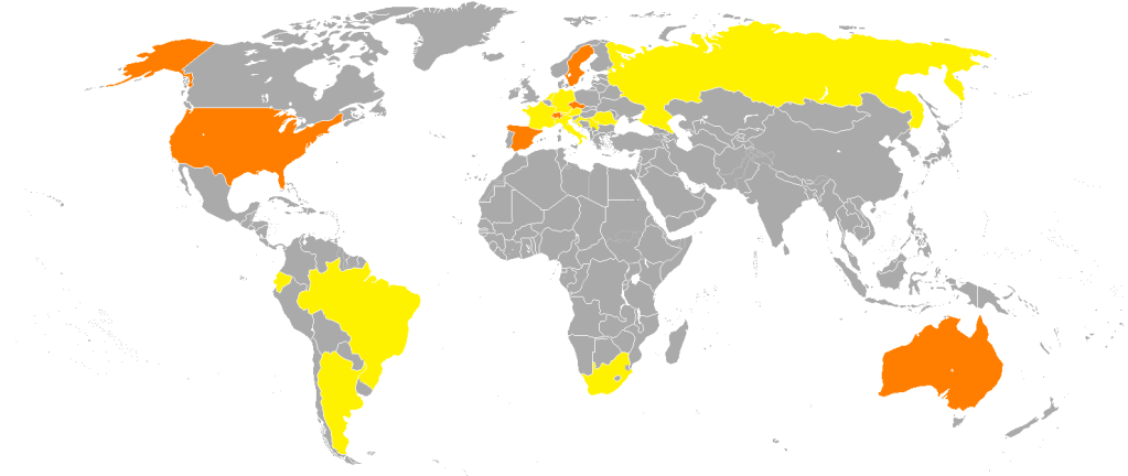
One person will post a map, and everyone will try and guess what that map is representing. Once someone gets it right, they will post the next map. If they don't have a map/don't want to post one, then they can declare an open floor.

If a map is posted, and no one is able to get it right/the person who posted it hasn't told us if someone got it right after a bit of time (one to two days), then open floor will be declared.

Previous Threads
Guess the map
Guess the Map II: witty sequel titles failed me
Guess the Map III: The Map Lover's Paradise
 
So, who's map is it right now? dwaxe didn't even confirm anyone had gotten the correct answer yet. :p
 
I proclaim that the map is whosoever's who takes it!

 
That map is a map of average penis size, one that I have seen many times before. :p
 
Average air quality.

Edit: Oh I guess that works with the numbers range too.
 
I'm pretty sure Mexico has worse air quality than the U.S., so it wouldn't be that.
 
I'll guess penis size too, based on racist stereotypes. I doubt the accuracy of the map though.
 
And where do you hang out that this map is so common? :mischief:

Um... :mischief:

Well, there was this one SATW comic that resulted in Danes in the comments section using that map to defend their, ahem, size....
 
OK, as so many people think they've posted the right answer I won't even bother guessing this one, but subbed :D
 
Ummm...

I'll be honest: I haven't a clue.
 
Hint please!

Looks like one of those "countries above/below average in x category" maps.

Just as an aside, I don't like that map. The way they draw in the disputed borders makes it look really ugly. And I appreciate the effort at making the map accurate but there are way, way too many islands than necessary for most casual layman's use, which I dare say accounts for 98% of all usage of that map.
 
Hint please!

Looks like one of those "countries above/below average in x category" maps.
Orange>Yellow>Grey. :p Grey means zero.

Need a few more "Hint please!"-s to get more specific... :mischief:

Just as an aside, I don't like that map. The way they draw in the disputed borders makes it look really ugly. And I appreciate the effort at making the map accurate but there are way, way too many islands than necessary for most casual layman's use, which I dare say accounts for 98% of all usage of that map.
I was looking for that map most of you use, but couldn't find it that quickly. Got this one from one of the altered map threads. Maybe someone can upload or link the "standard" blank one again in this thread for convenience.
 
Grey means zero ? It doesn't mean no data ?
So, we know this doesn't happen in either China or Japan ?
 
Top Bottom