Improving Graphics

Zuul

Mod lister!
Joined
Nov 13, 2005
Messages
1,117
Location
Sweden
What needs to be improved graphically?

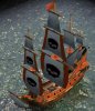
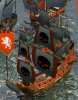
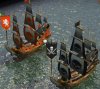
What have Dale added that are not that good? (he is not an artist as he has stated many times :p)

Here is my first try to improve Priate Brig texture:
First is Dales version then comes 2 of my versions. Which one do you like most?
 

Attachments

  • Pirate.jpg
    Pirate.jpg
    43.3 KB · Views: 117
  • Pirate1.jpg
    Pirate1.jpg
    54 KB · Views: 118
  • Pirate2.jpg
    Pirate2.jpg
    69.2 KB · Views: 115
  • Galleon.rar
    44.8 KB · Views: 66
i like it, though honestly i can't actually tell what all the differences are?! I played spot the difference for a bit, and can see that pic 2 has recoloured eyes and nose for the skull logo's, and pic 3 has fully recoloured skulls.

overall, I prefer pic 3 of the three above, skulls with team colours
 
I like it! :)

The Brig also needs a new unit button too, in the style of Col not Civ4.
 
Also there is a graphical glitch on the brig and the other pirate ship (both in my version and dales). The ropes from the mast is behind everything else. I will try to see what file that is missing that makes this correct from galleon.

Jenks - I mostly only changed the logo. Well all graphics was better as dale had reduced the quality.
 
Actually, I used the brig and PS as they came in strategyonly's mod. As for the other graphics (backgrounds etc) they are un-compressed. Also, the main menu picture is what it's supposed to look like. It's zero-lossy. :)
 
It's not zero-lossy. You can clearly see big jpg artifacts around the logo name (and everywhere else). Every time you edit an jpg the quality degrades (always edit in png or similar).

If you could send me the original pictures I could combind them for you.
 
Top Bottom