Lord Tirian
Erratic Poster
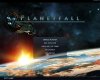
Okay... it's a random goodie... and basically I'd just tried to produce a main menu for this, and I've finished:
Main_Menu.zip
Of course, not official, just made by me. Main menu template from here. Background and text are both made by me.
If you guys like it, feel free to use it, if there "some quibbles", I can change it further, if you don't like it, well that's self-explanatory!")
EDIT:
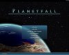
1) Changed to completely 2D title - and changed text style to fit better
2) Replaced unused textures by blank ones, to reduce file size a lot
3) A screenshot is attached.
Cheers, LT.
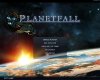
Main_Menu.zip
Of course, not official, just made by me. Main menu template from here. Background and text are both made by me.
If you guys like it, feel free to use it, if there "some quibbles", I can change it further, if you don't like it, well that's self-explanatory!
EDIT:
1) Changed to completely 2D title - and changed text style to fit better
2) Replaced unused textures by blank ones, to reduce file size a lot
3) A screenshot is attached.
Cheers, LT.


")