If they have the same name and go in the same place as the old buttons there is no need to do anything with the FPKs except recreate them. It also has the advantage of requiring no XML changes.
You can already overwrite what players see by just putting them in the correct assets\art folder. We do it that way because many people can then contribute and only one needs to do anything before the release when rebuilding the FPKs that need it.
Buttons outside of the FPK override those inside?
I really HATE it when modders update the large FPKs and would pray we never do so outside of once at the end of the cycle. The small ones, no problem.
It's also easier just to name them when doing the art then find them as applied in the game later.
I have a bunch of files but I can't remember which was which now. I was trying to replace the button shape with a scroll shape with the picture on the scroll.
Interesting ... I'll play with that and see what the deal is with it.
@Whisperr
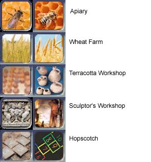
Some I dislike most of those. The only one I like is the Terracotta Workshop.
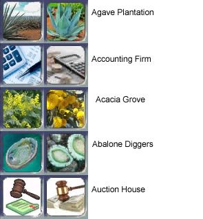
the problem wioth many of yours is you are using too modern of a version. Such as too modern soap and hop scotch. Others have too much white background like the broccoli and soap. Infact many of those look way worse to me.
Without some contrast, most images are just coming across as confusing blobs of jumbled colors, particularly when playing on Medium graphics settings. You can eventually start remembering which blob means what but that doesn't help much as a memory trigger. The white on some could be toned down but there MUST be a definable SHAPE more than just a 'perfect image' or the button doesn't work to perform its function which is to create something recognizable in-game.
Please don't chnage them except for maybe the Terracotta Workshop.
I worked hard to find most of those and I am very happy with the ones I have. I did not make the Terracotta Workshop though.
Please don't change them.
I also have no idea why people are trying to chnage stuff that is already done. There is so much stuff that still needs to be done. This seems like wasted effort to be remaking stuff I and other already spend time making. Sorry to get defensive over this but I to put a lot of time into getting my icon/buttons to look really nice so we would not have to redo them like this.


![[pissed]](/images/smilies/pissed.gif "Pissed [pissed]")
I only want her to because I want them and it's going to be very annoying sharing the same game files and having to dance around not updating these to the svn everytime without putting them on the ignore list and then never getting them updated properly and having to redo those files with every update.
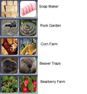
I prefer the new amber one because I see something else in the old one. It is like in the corn farm button which I see as a ferret.
This is WHY most of them do translate better. Jumbled images without a contrasting background are just splats on the screen with little definition - we simply don't have the proper resolution for many of these buttons to be successful.
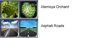
Current Atemaya Orchard: Green blob
Current Art Patronage: Looks like a monument and says nothing for what it means
Current Archaeology Lab: Is that a fire? or a really fuzzy reddish peach?
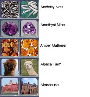
Current Anchovy Nets: Are we looking at a sandbox upclose?
Current Amber Gatherer: Nice... a pile of rocks.
Current Alpaca Farm: In game looks a bit like a chocolate Easter rabbit. Or something less mentionable.
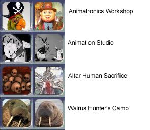
Oh and the Hopscotch and Soap look more like various types of brick walls. And why do we have a parrot for the animatronics studio?
The problem is... these images look GREAT when you blow them up and put them on the screen here. But in-game on medium graphics they look wretched.
No, not many of these NEEDED done and in some of these cases they just come across better in the game, even by a small margin. If you only look at them on high graphics setting it's probably not so noticeable.
The issues with 'too modern' could be addressed of course. Still... more important to be distinctive and trigger some kind of recognition than to be 'era appropriate' imo.


 . It is probably a ray but the feather confuses my eye. Better than what I tried to do anyway.
 I know, it was very quick.