Units for MansWork

Ok I'll try it. But now I more busy with lighting and color scheme.
Tanks still not clearly lighted from every visible side (but really should they?) so maybe I must start some radical changes...

If you're going to do anything drastic, try doing a new attack animation. These are BIG guns, so they should look like they are very powerful. Right now you have a very generic and weak blast effect. I can tell you are using 3dsmax and you can do so much more with that program.

Big Boom. Lots of recoil.
 
I didn't really focus on blast size of Su 8 and 14, and didn't compare them. But now I see my fault, they are almost idential with Su-5! :sad:

I'll resize that in another couple of SPG I plan.
 
Listen to Wyrmshadow, Gwendoline. He is an expert in these matters, I assure you.

In all things Civ, the light comes from the East-northeast - in other words, it looks like you have done it correctly.

Truer words have rarely been spoken.

-:)z
 
Are you ripping these models from "World of Tanks"?
 
Well, if yes, will they become worse?:rolleyes:

What? I'm asking if that is where you extracted these tank models from because the style looks similar.
 
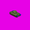
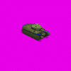
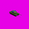
These are the next. Any suggestions about size, color or else?

Attack1.gif
Attack2.gif
Attack3.gif
 
Good!:clap:


the units look well done! :goodjob:

:love:

Wotan49
here:coffee:
 
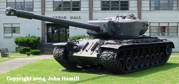
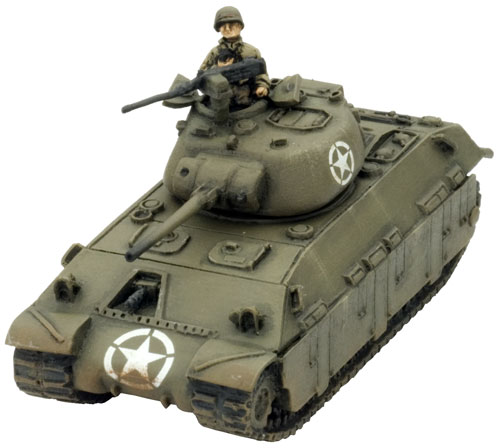
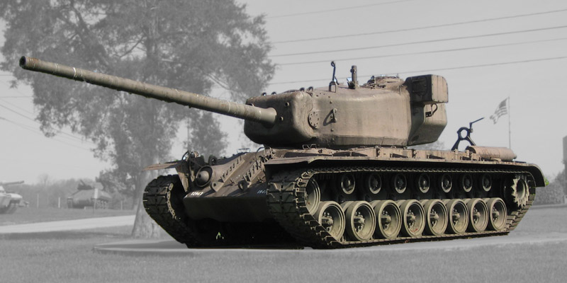
Not sure what the first one is, but the 2nd and 3rd are US heavy tank prototypes.
 

Attachments

  • griffin3ut.jpg
    griffin3ut.jpg
    251.4 KB · Views: 211
Not sure what the first one is, but the 2nd and 3rd are US heavy tank prototypes.

Yep It also from the same line, heavy tanks.

Wow I like that bottom tank, looks great! Hope you have the same size as Wyrm units.

Edit; If I may suggest something? Wyrm uses a different color scheme for each country. Hope you can do the same. Have a look in the downloads

Last tank is close to Wyrm's Tiger II and IS-2 and they all in his american WW2 colours. At least first two.

If first two was easy enough to color, I spent much more time to adjusting the 3rd and still not satisfied. But perhaps this is the best what I can do with it.
 
The tanks are the
Heavy Tank M6


Might be T30 or T34


It's really hard to tell because there were only 1 or 2 tank prototypes produced. Just imagine a Super Pershing

1st one is the T14 Assault Tank (MM04)
 
Ok I'll try it. But now I more busy with lighting and color scheme.
Tanks still not clearly lighted from every visible side (but really should they?) so maybe I must start some radical changes...
Yes, and no, the side away from the sun will be shadowed but not completely dark. On colors if you have the pantone codes I can convert them to rgb valuse. You are doing a great job on your units
 
Heard nothing about pantone codes...

Yes, and no, the side away from the sun will be shadowed but not completely dark.

You mean that tiny gap between the shadow and figure? I tried some ways to fix it, but until my render on its settings, suspect that impossible :(

Anyway, in game everything looks fine.
 
Top Bottom