Deliverator
Graphical Hackificator
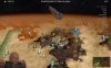
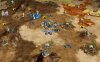
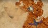
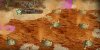
I do empathize with your view that the background is bland - but to a certain degree this is intentional. The issue is that as soon as you try and make it more interesting the outline of the unit gets harder to distinguish. This is one of those situations where making things look pretty and making things that are good from usability and gameplay perspective can pull you in opposite directions. When I've tried to use some sand ripples or deserty texture for a background the unit itself becomes less distinct, particular when resized down to 32x32. The simple gradiant effect is the best I've found for making the unit stand out.
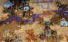
This is my process, all done in Paint.NET apart from step 5:
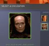
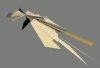
1. Take a screenshot of the unit using NifSkope.
2. Select and cut away the background colour.
3. Crop to a square leaving enough boundary for the frame when resized.
4. Add radial gradiant background layer. The hex values for the radial gradiant are 83483F and FFD86D.
5. Resize down to 64x64 using Photoshop (the downsizing bicubic algorithm is so much better).
6. Apply Sharpen+ plugin, Amount 75.
7. Increase Saturation +10.
8. Apply Alpha Mask to make the border transparent.
9. Add frame layer.
10. Save in the DDS pixel format A1R5G5B5. I've found this format gives much much nicer quality for icons than the harsh compression of DXT3. The icons are ~9kb rather than ~5kb and you can't use semi-transparency, but it's worth it IMO.
I can try again with a very subtle Dune ripple background or something, but even the gradient background design would be a significant improvement IMO. If we get a nicer design we can implement in the future.
This is my process, all done in Paint.NET apart from step 5:
1. Take a screenshot of the unit using NifSkope.
2. Select and cut away the background colour.
3. Crop to a square leaving enough boundary for the frame when resized.
4. Add radial gradiant background layer. The hex values for the radial gradiant are 83483F and FFD86D.
5. Resize down to 64x64 using Photoshop (the downsizing bicubic algorithm is so much better).
6. Apply Sharpen+ plugin, Amount 75.
7. Increase Saturation +10.
8. Apply Alpha Mask to make the border transparent.
9. Add frame layer.
10. Save in the DDS pixel format A1R5G5B5. I've found this format gives much much nicer quality for icons than the harsh compression of DXT3. The icons are ~9kb rather than ~5kb and you can't use semi-transparency, but it's worth it IMO.
I can try again with a very subtle Dune ripple background or something, but even the gradient background design would be a significant improvement IMO. If we get a nicer design we can implement in the future.
")