New Tile Info

Grav

Warlord
Joined
Jan 18, 2004
Messages
238
Location
Funkytown
I modded the tile info graphic. It highlights the resources collected, with their appropriate colors. Also, now the image is only 'semi' framed, leaving a sheik slanted look in the view window. Enjoy.

tileinfo.jpg
 

Attachments

Thanks. I've always focused on simple graphic mods. I've released a border mod a while back as well. I just browse through the civ 3 graphics once in a blue moon, and see what I can get away with. I was lucky this time, as it did not glitch out the game by expanding the visible tile area... which I thought it would. So I ran with it. In fact, if you *really* want you, you can actually color code the *entire* graphic, so it would display a massive terrain area. Unfortunately, what I saw this lead to was the human being able to use it to "see" undiscovered terrain.
 
Anarki said:
Pounder, you should make that, or grav, that would be awesome.

EDIT: I had a go instead, hope nobody minds.

Link: http://www.civfanatics.net/uploads9/tileinfo3.pcx

It clutters the view, and is a potential problem with the display of large numbers. I try to keep my mods minimalist, but pleasing to the eye.
 
Grav said:
It clutters the view, and is a potential problem with the display of large numbers. I try to keep my mods minimalist, but pleasing to the eye.

I don't think that I have seen a tile go into double digits and if it did your mod is not elastic either.

I agree that it is redundant to have the icons, but so are the colours you have added.

I would say that visuals are a preference that some people like and both your addition and Anarki's are appreciated. :goodjob: I always like to have alternatives.
 
Pounder said:
I don't think that I have seen a tile go into double digits and if it did your mod is not elastic either.

I agree that it is redundant to have the icons, but so are the colours you have added.

I would say that visuals are a preference that some people like and both your addition and Anarki's are appreciated. :goodjob: I always like to have alternatives.

Mine isn't elastic, but in the case of double digit numbers, it would not be hard to discern the number even with spillover, as I chose light backgrounds. But in the case of icons being added, it can visually distort the number, or in extreme cases, distort long resource names. Both situations are somewhat common in mods, the former moreso. Furthermor, since the pallet of the file is limited, you can only edit so many colors, before you start to mess up the entire image. I was able to squeeze 3 custom colors in, by replacing redundent blacks. So when you add icons to the image, the actual image of the icon being added, becomes visually distorted as well, due to the lack of color options.
 
Like pounder said its always nice to have a second option. Theres nothing wrong with having the icons there too. If your really that worried about the name getting too long someone could just move the shield icon to the other side. Then if it gets too long it'd be your falt :D
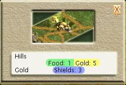
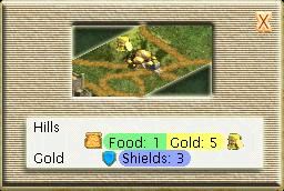
. Unless your dealing with a bunch of idiots (which in most cases-most-you're not) then even if it does go into double digits (which I've never seen before) they should still be able to read the numbers on top of the icons. Any on another note.... this is just tile info-nothing major. I think I've only even looked at tile info once (just for fun lol.. wow so fun!) So all in all, thank you for your mod grav, and thanks for the second option Anarki. Thats as far as this really needs to go. Everyones happy so lets leave it at that.
 
Back
Top Bottom