Button thread

Maniac

Apolyton Sage
Joined
Nov 27, 2004
Messages
5,603
Location
Gent, Belgium
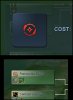
Guide for converting SMAC icons to Civ4 buttons

I think there are too many tech strategies and building uses and effects to be able to compress them in only four different colours, and still keep some consistent meaning to these colours.

So I figured instead each tech and building belonging to a certain theme could get the same colour.

I was thinking of seven different colours/themes:

Terraforming: Believer orange
Enclosed Biosphere/Naval/Space: that pressure dome colour
Centauri: SMAC Explore green
Industry: SMAC Build gold/yellow
Physics: SMAC Conquer red
Computers: SMAC Discover white
Genetics: PK colour

I have drawn up a list of the SMAC icons which would be immediately useful when 'Rubinized' (Rubin being the person who told me what pattern, bevel, etc... to use). I also included what colour they should have according to the themes mentioned earlier. I placed a few question marks though.

If I used two question marks, it means I'm not sure what theme/colour I should give to the tech or facility.
If I used one question mark, it means it's obvious what theme the tech/fac belongs to, but, because I'm used to seeing the icon in a different colour, I have my doubts if the icon would look good in that new colour. Of course this may just be a matter of getting used to the new colour, nothing inherently wrong with the colour.

So perhaps if you want to Rubinize these buttons, you should only focus on those without question marks for now? Or if you do want to do the 'questionable' ones, make sure to make an xcf save before applying the pattern. So if we want to change the colour of a couple later on, the workload is reduced. What are your thoughts on this matter?

Here's the list:

Spoiler :
Everything has buttons already. :D

(list layout seems to get lost unfortunately)
 
That's why the guide was made 100% dummy-proof.
nod.gif
 
I tried to re-do the Renewable Energy icon using a softer red (html: ed624f) than the Conquer theme.
I have attached a screenshot with a comparison: the original Conquer red is on the left, the softer red is on the right.
I personally prefer the Conquer red, it is clearer to see on the techtree too.
What do you think? Maniac?
 

Attachments

  • compare.jpg
    compare.jpg
    115.4 KB · Views: 534
For the datalinks, I actually prefer the new button you made. But for the tech tree, I agree with you the old Conquer-red button is more visible.

In response to this I tried meddling somewhat in GIMP myself. I wanted to have a noticable change of colour within the icon (which, together with the bevel, adds more life and 3D to it), yet at the same time not make the colour too bright.

I finally figured out how to make the lighting effect more localized. By increasing the Shiny from 0.00 to 0.20 (which increases the spotlight intensity) and decreasing the Polished setting from 27 to 10 (which makes the spotlight more localized), I managed to create some colour variety within the icon, but still somewhat keep the original Conquer red in the lower part of the button. Perhaps experimenting somewhat more with Shiny and Polished can create better results.

What do you think about this one?


Anyway, most new buttons seem to have a problem being distinguishable on the tech tree screen. I think the problem may be the transparency. Buttons with transparent background look better than a completely black background (as in the old draft buttons) in the datalinks and the city screen etc, but worse on the tech tree. Reason is probably because there's not enough contrast between the button colour and the tech screen colours. In the datalinks/city screen, there is enough contrast, because the background is dark blue or opaque black.

So I was thinking, perhaps in the tech screen we could let two buttons be displayed on each other. The bottom button could fully consists of a black shadow of a certain opacity, with curved corners, and the opacity becoming fully transparent near the edges. On that could our tech buttons be displayed. Thus creating a better contrast.

I wouldn't know right now how to create such a shadow button though. :-s
 
I finally figured out how to make the lighting effect more localized. By increasing the Shiny from 0.00 to 0.20 (which increases the spotlight intensity) and decreasing the Polished setting from 27 to 10 (which makes the spotlight more localized), I managed to create some colour variety within the icon, but still somewhat keep the original Conquer red in the lower part of the button. Perhaps experimenting somewhat more with Shiny and Polished can create better results.
What do you think about this one?
The new experiment you made is nice... maybe just a little too shiny? I tried to do a little variation, setting Shiny=0.1 (you used 0.2) and Polished=10 (as you did), the result is in attachment.
Which do you prefer?
In any case, all the icons would need to be done with the same system, so the few icons that have already been made should be re-done (but I can do that, no problem).


So I was thinking, perhaps in the tech screen we could let two buttons be displayed on each other. The bottom button could fully consists of a black shadow of a certain opacity, with curved corners, and the opacity becoming fully transparent near the edges. On that could our tech buttons be displayed. Thus creating a better contrast.
I wouldn't know right now how to create such a shadow button though. :-s
If you could discover how to do it, it would be great! :goodjob:
 

Attachments

  • newbutton.jpg
    newbutton.jpg
    23.1 KB · Views: 404
The new experiment you made is nice... maybe just a little too shiny? I tried to do a little variation, setting Shiny=0.1 (you used 0.2) and Polished=10 (as you did), the result is in attachment.
Which do you prefer?

I prefer the 0.20. With Shiny 0.10 I once again hardly notice there is any colour gradience.
Do you prefer buttons with or without colour gradience by the way?

In any case, all the icons would need to be done with the same system, so the few icons that have already been made should be re-done (but I can do that, no problem).

Not all buttons would need to be redone. The reason for this added shininess is because the lighting effects and bevel* is hardly visible on dark colours. On lighter colours it is visible. So only those with dark colours would need to be redone. I guess that means the Conquer theme, and possibly the Terraformer techs. (I already redid the Rare DNA buttons - still look kinda crappy IMO, but somewhat better than before)

* In fact, even with this added shininess, the bevel seems unnoticable. I think I'll experiment with adding a radius 1 "shadow" which adds light instead of darkness. Would look similar to a bevel. In that case perhaps there needs to be a little less shiny. I'll have a try and report back.
 
Well, here's another go.

Shiny is 0.10.

After having resized to 64x64, just before you'd normally save, I added a...

drop shadow: x:0, y:-2, radius: 1
Colour/Brightness-Contrast... Brightness: 50, Contrast: -50 (with the new layer selected)
Toolbox/Alignment Tool (once again select the new layer, this time by clicking on the image itself!!)
Toolbox/Alignment Tool/Align middle of target, Offset 2
Layers Box: set the new shadow layer mode to 30% saturation

Giving this result:

Renew3.jpg


The extra shadow makes it look a bit similar to just using Shiny .20. :hmm: When not using any Shiny at all, neither does the drop shadow make much of a difference... Weird graphical interactions. :dizzy:
 
The latest experiment seems very good!
If you could please explain better the steps you followed, I will try to do one of the light-colored icons to see how they appear with this method.
Once a final method is decided we could begin to create the buttons!
 
Hmm, not sure how to explain it better.

What I write below, should be done where I place the stars in this extract of the guide. You can now doubt also do it before resizing to 64x64. But that would require finding different Offset X/Y and Blur Radius values.

Filters/Light and Shadow/Lighting Effects/Material: Bright: 0,80; Shiny: 0.10; Polished: 10.00; rest 0,00
...
Layer/Merge Down
Image/Scale Image...: WidthxHeight = 64x64; Interpolation: Cubic
***
File/Save as... : Name: ButtonX.dds; Save
Save as DDS: Compression: BC2/DXT3; no mipmaps!!!

Filters/Light and Shadow/Drop Shadow: Offset X: 0; Offset Y: -2, Blur Radius: 1: 80% opacity; uncheck 'Allow resizing'
Windows/Dockable Dialogs/Layers: select the new shadow layer
Colour/Brightness-Contrast... Brightness: 50, Contrast: -50
Toolbox/Alignment Tool
Click on the new layer, on the image itself!!
Toolbox/Alignment Tool/Align middle of target, Offset 2
Windows/Dockable Dialogs/Layers (select the new shadow layer) Mode : Saturation 30%
Layer/Layer to Image Size (not sure if this is necessary)
Layer/Merge Down
 
Hmm, not sure how to explain it better.

Hello Maniac, I tried to do the "holographics" button following your instructions but the result is very different, the shadow doesn't show at all.
I have attached the file with the two un-merged layers, maybe you could understand what did I miss!
 

Attachments

Hmm, I think you didn't do anything wrong. It's just, what that low saturation 'shadow' does, is make the colours whiter. However the Discover colour with the Bevel applied to it already is almost completely white, so there wouldn't be any additional effect from the shadow. Hence why this extra shadow is probably only needed for dark colours, on which the bevels have insufficient effect for some reason.

Btw, talking about shadows, I discovered a while ago that I didn't do the main shadow* on the Renewable Energy button as according to the guide. I forgot to change the offset, which left them at Offset X: 8; Offset Y: 8 instead of the Offset X: 0; Offset Y: 0 the guide recommends. I kinda like how the shadow with offset 8 makes the button look though. What do you think?

*this step:
Filters/Light and Shadow/Drop Shadow: Offset X: 0; Offset Y: 0, Blur Radius: 45: 80% opacity; uncheck 'Allow resizing'
 
Btw, talking about shadows, I discovered a while ago that I didn't do the main shadow* on the Renewable Energy button as according to the guide. I forgot to change the offset, which left them at Offset X: 8; Offset Y: 8 instead of the Offset X: 0; Offset Y: 0 the guide recommends. I kinda like how the shadow with offset 8 makes the button look though. What do you think?
I don't know, I tried to experiment a little bit more with the holographics icon, but if I select "saturation" on the shadow layer the shadow basically disappears.
I am yet unable to get samples to compare, what I get is always almost the same as the original guide.
 
I don't know, I tried to experiment a little bit more with the holographics icon, but if I select "saturation" on the shadow layer the shadow basically disappears.
I am yet unable to get samples to compare, what I get is always almost the same as the original guide.

There is a misunderstanding. With the new step I described for dark-coloured buttons, two shadows have to be applied. I bolded them in this extraxt of the guide.:

Filters/Light and Shadow/Drop Shadow: Offset X: 0; Offset Y: 0, Blur Radius: 45: 80% opacity; uncheck 'Allow resizing'
Windows/Dockable Dialogs/Layers: select the shadow layer
Layer/Layer to Image Size
Layer/Merge Down
Image/Scale Image...: WidthxHeight = 64x64; Interpolation: Cubic
Filters/Light and Shadow/Drop Shadow: Offset X: 0; Offset Y: -2, Blur Radius: 1: 80% opacity; uncheck 'Allow resizing'
Windows/Dockable Dialogs/Layers: select the new shadow layer
Colour/Brightness-Contrast... Brightness: 50, Contrast: -50
Toolbox/Alignment Tool
Click on the new layer, on the image itself!!
Toolbox/Alignment Tool/Align middle of target, Offset 2
Windows/Dockable Dialogs/Layers (select the new shadow layer) Mode : Saturation 30%
Layer/Layer to Image Size (not sure if this is necessary)
Layer/Merge Down
File/Save as... : Name: ButtonX.dds; Save
Save as DDS: Compression: BC2/DXT3; no mipmaps!!!


In the part of my post you quoted, I am talking about the first shadow, where I was thinking about changing the offsets from 0 to 8 or so. You do not need to change the mode of that shadow to Saturation. Just leave it on Normal.
 
In the part of my post you quoted, I am talking about the first shadow, where I was thinking about changing the offsets from 0 to 8 or so. You do not need to change the mode of that shadow to Saturation. Just leave it on Normal.
And what light settings should I use? The ones from the guide or the ones from the posts above? Are these the settings you used for the new icons added in the latest patches?
 
For darker colours such as conquer red I use
Filters/Light and Shadow/Lighting Effects/Material: Bright: 0,80; Shiny: 0.10; Polished: 10.00; rest 0,00

For the rest I still use the old lighting effect settings.

Hmm, I guess the guide might be becoming a little hard to follow with all those "do A if B, else do C" added recently. :(
 
Hello Maniac, I would like to give another try at buttons editing.
Is the guide available here updated? If it is not, could you please update it to the latest version, the one you used for the latest buttons?
Which button could I try do to first? Thanks! :)
 
I updated the guide. I hope it's a bit more readable now.

There now are good lighting values for the Explore, Build, Conquer, Genetics and Enclosed themes.

Not for the Discover colour though. I tested out the usual values on the Virtual World button, and the button becomes practically complete white. So for that colour we'd need to do the opposite of the Conquer theme: reduce the effect of the lighting.
 
Back
Top Bottom