Hi Everyone,
I've been a lurker here for a few civ releases now, taking advantage of all the great strategy advice and mods that these forums are so great for. With the release of Civ V I thought it was time I finally sign up, and give back a bit. With that I present to you The_Larch's UI Mod! (A creative title to be sure)
My mod has been designed to make the playing space more open. Rather than having big screens and buttons in each corner, I've removed and reduced the sizes where possible.
Features:
-Reduced the sizes of both the minimap and unit panels
-Removed the large diplomacy, advisors, and policy buttons from the top right
-Added advisor and policy menu options to the top right pop up menu
-Changed the choose technology notification to open the full tech tree. This means that the top left info panel will not constantly be reset to show the technology panel
-Removed some of the sillier notifications (do I really need to be told every turn my city is shrinking, or I discover a natural wonder?)
-Removed the second tooltip in the bottom right when hovering over tiles. Still shows the tooltip by the mouse.
-Beakers per turn in the top left replaced with the tech being researched and how many turns to completion (can still hover for BPT)
-Clicking on the gold per turn opens the economic advisor screen (don't know why this wasnt there, when bpt opened the tech tree and cpt opened policies)
I think thats everything I've done so far. It started off small and sort of grew over time, so I wasn't keeping track of everything . Hopefully this mod will be of use to someone else out there. You can download it in the civ v mod browser under user interface->other section.
Let me know of any bugs or future feature requests, and I'll see what I can do about them. I'm learning as I go, so please bear with me")
ToDo:
-Create menu options for everything.
Edit: Heres a screenshot. I knew I forgot something
I've been a lurker here for a few civ releases now, taking advantage of all the great strategy advice and mods that these forums are so great for. With the release of Civ V I thought it was time I finally sign up, and give back a bit. With that I present to you The_Larch's UI Mod! (A creative title to be sure)
My mod has been designed to make the playing space more open. Rather than having big screens and buttons in each corner, I've removed and reduced the sizes where possible.
Features:
-Reduced the sizes of both the minimap and unit panels
-Removed the large diplomacy, advisors, and policy buttons from the top right
-Added advisor and policy menu options to the top right pop up menu
-Changed the choose technology notification to open the full tech tree. This means that the top left info panel will not constantly be reset to show the technology panel
-Removed some of the sillier notifications (do I really need to be told every turn my city is shrinking, or I discover a natural wonder?)
-Removed the second tooltip in the bottom right when hovering over tiles. Still shows the tooltip by the mouse.
-Beakers per turn in the top left replaced with the tech being researched and how many turns to completion (can still hover for BPT)
-Clicking on the gold per turn opens the economic advisor screen (don't know why this wasnt there, when bpt opened the tech tree and cpt opened policies)
I think thats everything I've done so far. It started off small and sort of grew over time, so I wasn't keeping track of everything
. Hopefully this mod will be of use to someone else out there. You can download it in the civ v mod browser under user interface->other section.Let me know of any bugs or future feature requests, and I'll see what I can do about them. I'm learning as I go, so please bear with me
ToDo:
-Create menu options for everything.
Edit: Heres a screenshot. I knew I forgot something
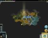
 I use 1366x768 resolution.