Accurate Earth Map (132 x 64)

Laskaris

Warlord
Joined
Nov 14, 2010
Messages
182


Download Accurate Earth Map (132 x 64)


About this map:
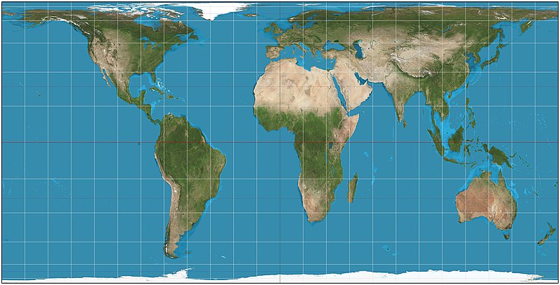
Obviously, it is impossible to make a perfectly accurate Earth map for Civilization. The Earth is a globe, so any representation of its surface on a plane is a compromise of one form or another, accurately representing some of the properties of the Earth's surface at the expense of distorting others. That is why geographers have invented various different map projections for different purposes.

Rather than a boast of perfect accuracy, calling my map "Accurate Earth Map" is simply a declaration of intention and design philosophy. Unlike many other Earth maps for Civilization IV (including the official one), mine does not feature an artificially enlarged Europe and Japan or an artificially reduced Pacific ocean. Instead, I went for as much geographical accuracy as possible, within the limitations of the game. The result is an Earth map that, in my view, is very interesting and unique. And while it won't allow you to cram half a dozen civilizations into Europe, it makes for a great game in other ways.

Because cities and the plots they occupy are in many ways the core of the game, I decided that preserving area was the most important aspect of geographical accuracy in Civilization, rather than preserving shape or distance. I used a cylindrical equal-area projection with standard parallels at 37.3 degrees north and south of the equator (sometimes known as the "Hobo-Dyer projection"). All continents and oceans are depicted with their correct areas relative to each other. Australia really is three quarters the size of Europe, Africa really is 14 times the size of Greenland, and so on.

I spent a lot of time trying to get the placement of terrain, rivers and natural resources as accurate as possible. For example, I used essays like Forecasting Coal Production Until 2100 by Evans and Mohr to get figures of worldwide coal reserves at the beginning of the industrial age, and distributed that resource accordingly. I placed oases at geographically appropriate locations like Tafilalt in Morocco. I even looked at maps of the ocean productivity like this one to place fish resources.

I created the map from scratch using MapView 2.0. As a basis for the map, I primarily used the maps from the Natural Earth III website, which I converted to the cylindrical equal-area projection with NASA's Global Map Projector and overlayed one on top of the other with Adobe Photoshop Elements.

As you can see, a lot of work went into this map. I hope that you like the result. Have fun, and don't hesitate to send feedback and comments!

Inside the .rar archive:
There are six maps inside the .rar archive. Two for basic Civilization IV, two for the Warlords expansion, and two for the Beyond the Sword expansion. For each version of the game, there is one "blank" map with no civilizations set, and one that has 12 civilizations already set up (in historically accurate starting locations, unless otherwise noted). For basic Civilization IV, the 12 civilizations are: American, Aztec, Chinese, Egyptian, English (in South Africa), French (in Southeast Asia), Greek, Incan, Indian, Malinese, Mongolian, Persian. For Warlords, they are: American, Aztec, Chinese, Egyptian, French (in Southeast Asia), Greek, Incan, Indian, Malinese, Mongolian, Persian, Zulu. For Beyond the Sword, they are: Aztec, Babylonian, Chinese, Egyptian, Greek, Incan, Indian, Khmer, Malinese, Mongolian, Native American, Zulu.

To use the maps, you need to extract the appropriate files to the appropriate PublicMaps folder. For basic Civilization IV, extract the *.Civ4WorldBuilderSave files to the PublicMaps folder inside your Civilization IV directory. For Warlords, extract the *.CivWarlordsWBSave files to the Warlords\PublicMaps folder. For Beyond the Sword, extract the *.CivBeyondSwordWBSave files to the Beyond the Sword\Public Maps folder.
 
This is fantastic! I have being trying to find such a map for a long time. Thank you!
 
The reason your not getting alot of d/l's is because alot of Earth maps promised to do what you do, but they really weren't, so just let people know alittle of what you did different from any other Earth Map that makes yours better, that MIGHT help:dunno:
 
This is fantastic! I have being trying to find such a map for a long time. Thank you!

You are welcome. I am glad you like it!

The reason your not getting alot of d/l's is because alot of Earth maps promised to do what you do, but they really weren't, so just let people know alittle of what you did different from any other Earth Map that makes yours better, that MIGHT help:dunno:

Actually, I am getting a fair number of downloads. I am just not getting many comments. But this is not unusual, I suppose - people are more likely to comment if something isn't working than they are to just say that they liked the map.

What does my map do differently? Like I said in the OP, it is an equal area map, so it accurately represents the sizes of the different continents and oceans. It distorts shapes and distances somewhat, but the area is spot on. Some people prefer an enlarged Europe and Japan (there already are many maps like that), but I prefer accurate area. To my knowledge, this is the first such map for Civilization IV.

I also put a huge amount of work into accurate placement of terrain and resources. I used a biome world map from the NOAA website for terrain, which sadly is not available online anymore. For resources, I started with resource maps from atlases, but I wasn't satisfied because maps in atlases don't give you an idea of how much of a resource a country has. So I used projections of what is called URR, "ultimate recoverable reserves", from websites that deal with such stuff. Like this one for oil. Then I distributed the resources accordingly. For example, the study I used estimates the URR of oil in Saudi Arabia as 260 billion barrels, in Russia as 210 billion barrels, in the US as 200 billion barrels, and so forth. I used these proportions in my map: 3 oil in Saudi Arabia, 2 each in Iran, Russia and the US, 1 each in Iraq, Kuwait, Abu Dhabi, Kazakhstan, China, Venezuela, Mexico, Libya, Nigeria, Indonesia and the North Sea off Norway.
 
Peter's projection, eh?
 
Peter's projection, eh?

Actually, no. The Gall-Peters projection has standard parallels 45 degrees north and south of the equator. It looks like this:


Africa and the Americas are stretched very thin. I don't like the Gall-Peters projection, I think it is very ugly, somehow. I much prefer the Hobo-Dyer projection in aesthetic terms, which has the standard parallels at 37.3 degrees north and south of the equator. The resulting map has a different height / width ratio than Gall-Peters, it is not as tall and Africa and the Americas are not stretched vertically as much. It's all very subjective, of course, but I just think it looks better:


That is the one I used.

They are both cylindrical equal-area maps, though, so the principle is the same.
 
Basing a world map on any of those 2 map projections will make the endresult anything but accurate, since large parts of those projection are either stretched or squashed as you can see on this deformation key for the Hobo-Dyer projection.


Effectively this means that large parts of africa, central-/southamerica and southeast asia far too large and all of canada, greenland, europe, russia, new zealand and antarctica far to small.

Considering that most of the available civilizations have to fit into the areas that are now too small and that there are very few civilizations available for those parts are now too large doesn't real make an ideal setting for 'accurate' gameplay.
 
Basing a world map on any of those 2 map projections will make the endresult anything but accurate, since large parts of those projection are either stretched or squashed as you can see on this deformation key for the Hobo-Dyer projection.

Effectively this means that large parts of africa, central-/southamerica and southeast asia far too large and all of canada, greenland, europe, russia, new zealand and antarctica far to small.

Africa is actually that big, and Europe is indeed that small. Just look at a globe. This projection, despite it's distortion at the extreme north and south, is far more accurate than maps based on the outdated, inaccurate and horribly biased Mercator projection. Note that the distortions near the poles are distortions of shape, rather than size (mostly).

So, yes. This map's projection is drastically more accurate than any map based on the Mercator projection. Personally I'm a fan of the Winkel-Tripel projection, as is the National Geographic Society. But anything is better than Mercator.

Considering that most of the available civilizations have to fit into the areas that are now too small and that there are very few civilizations available for those parts are now too large doesn't real make an ideal setting for 'accurate' gameplay.

Of course, accuracy doesn't necessarily mean better gameplay, for the reasons you've described.
 
Africa is actually that big, and Europe is indeed that small. Just look at a globe. This projection, despite it's distortion at the extreme north and south, is far more accurate than maps based on the outdated, inaccurate and horribly biased Mercator projection. Note that the distortions near the poles are distortions of shape, rather than size (mostly).

So, yes. This map's projection is drastically more accurate than any map based on the Mercator projection. Personally I'm a fan of the Winkel-Tripel projection, as is the National Geographic Society. But anything is better than Mercator.

Of course, accuracy doesn't necessarily mean better gameplay, for the reasons you've described.
To me then shape is just as important (if not more so) as size in order to achieve accuracy. So while Winkel-Tripel indeed does give a far better representation of relative proportions of the world than the 2 others shown here then the distortions of such projections still doesn't work too well for accuracy on a square map - especially on the far east and west ends of the maps

My main point is that merely making pixel to pixel conversion of any world map projection wont work very well to give any kind of believeable accuracy for a game map.

Imo then a world map handcrafted by patching together areas based on 'locally' centred maps - while trying to keep a close estimation of shape and size, but still favoring representation of fertile areas over infertile ones - would be required before the word 'accurate' could rightfully be applied.
 
Effectively this means that large parts of africa, central-/southamerica and southeast asia far too large and all of canada, greenland, europe, russia, new zealand and antarctica far to small.

As Xyth pointed out to you, the parts of the Earth you mention really are that big, or small, in relation to each other - that is precisely the point of an equal area projection.

I realise that the continent sizes can seem "wrong" to peope who are used to looking at other types of map projections. But it's not my map that is wrong, it is your idea of the sizes of the different continents.

To me then shape is just as important (if not more so) as size in order to achieve accuracy.

It all depends on what kind of accuracy you mean, doesn't it? As I pointed out in the OP, there can be no perfectly accurate representation of the Earth's surface on a plane. The Earth is a globe, so any representation of its surface on a plane is a compromise of one form or another, accurately representing some of the properties of the Earth's surface at the expense of distorting others.

You prefer shapes to be accurate, and that is fine. Some people do, probably for aesthetic reasons more than anything else, and there are many maps like that. I, on the other hand, prefer the areas of the continents to be accurate. And, given that cities and the plots they occupy are in many ways the core of the game, I think a good case can be made that area is indeed a very important aspect of an Earth map in Civilization.

My main point is that merely making pixel to pixel conversion of any world map projection wont work very well to give any kind of believeable accuracy for a game map.

Again, that depends on what kind of accuracy you have in mind. I had accuracy of area in mind, and in that regard, the map is highly accurate (I don't know what, exactly, you mean with "believable"). I would say that it is also one of the most accurate Civilization maps to date in terms of the placement of resources, on which I did a huge amount of research.

Imo then a world map handcrafted by patching together areas based on 'locally' centred maps - while trying to keep a close estimation of shape and size, but still favoring representation of fertile areas over infertile ones - would be required before the word 'accurate' could rightfully be applied.

Personally, I don't like "freeform" maps so much. But that is a matter of personal preference, and your preference is as valid as mine. In any case, there already are many freeform Earth maps for Civilization (like Genghis Kai's Giant Earth Map). Part of the reason why I decided to use an equal area projection instead (in addition to what I wrote above) was that it was something new - to my knowledge, nobody had done a map like that for Civilization before.

Accurate shape and accurate size are mutually exclusive - the nearer you go towards perfect accuracy in one aspect, the more you lose it in the other. Therefore, a "close estimate" of both is not possible. I don't know what, exactly, you have in mind.

Considering that most of the available civilizations have to fit into the areas that are now too small and that there are very few civilizations available for those parts are now too large doesn't real make an ideal setting for 'accurate' gameplay.

It's true that you won't be able to cram half a dozen civilizations into Europe on my map. However, if you use one of the setups that I included (like the Aztec, Babylonian, Chinese, Egyptian, Greek, Incan, Indian, Khmer, Malinese, Mongolian, Native American and Zulu civilizations in their accurate starting locations), you get a game with 12 civilizations which are fairly evenly spread across the globe.

Anyway, thank you for your interest in my map, and thank you for your comment.
 
All you really need to do is to compare a few satellite photos from various angles of earth (google earth is about as accurate as it gets also) to realize that this map is not quite as accurate as you seem to insist that it is - not even in regard to individual regions landmass size.
 
All you really need to do is to compare a few satellite photos from various angles of earth (google earth is about as accurate as it gets also) to realize that this map is not quite as accurate as you seem to insist that it is - not even in regard to individual regions landmass size.

Hobo-Dyer is a cylindrical equal area projection. By definition it means that the landmasses are the correct size relative to each other. Can't get more accurate sizing than that.

It's not accurate in terms of shape due to west-east stretching near the poles. Google Earth is a globe so there is no distortion of shape or size. It's impossible to have a 2D map of the earth without distortion of shape and/or size, there's always compromise. Many projections choose to excessively distort size in order to preserve the shape of the northern hemisphere and as a result generations of people think Greenland, Europe, Scandinavia, Siberia and Northern Canada are far larger than they actually are. A couple facts to put things in perspective:

• The Arabian peninsula is larger than Greenland by over 1 million km²
• Africa is almost twice as large as Russia​
 
I am not really arguing the landmass size accuracy of any of the projections, but what I have been arguing is that THIS particular rendition of one of those projections does not live up to the claim of being accurate. Imo then there are simply too many illogical landmass "Free Form" compromises (trimmings/exclusions and enhancements/additions) on it to validate even a claim of landmass based accuracy.
 
I am not really arguing the landmass size accuracy of any of the projections, but what I have been arguing is that THIS particular rendition of one of those projections does not live up to the claim of being accurate.

Actually, you haven't been arguing "that THIS particular rendition of one of those projections does not live up to the claim of being accurate". In your original comment, your complaint was about the Hobo-Dyer projection in general, the concept of which you obviously did not understand:

Basing a world map on any of those 2 map projections will make the end result anything but accurate, since large parts of those projection [sic] are either stretched or squashed as you can see on this deformation key for the Hobo-Dyer projection. [...] Effectively this means that large parts of africa, central-/southamerica and southeast asia far too large and all of canada, greenland, europe, russia, new zealand and antarctica far to [sic] small.

Xyth pointed out to you that the distortions you mentioned are distortions of shape, not area, and that the continents are indeed the right size in the Hobo-Dyer projection, which is precisely the point of a cylindrical equal area projection. Then you changed your criticism and wrote that "to me then shape is just as important (if not more so) as size in order to achieve accuracy". I pointed out to you that there are different types of accuracy in different map projections (such as size, shape, or distance), and that my focus in this case had been on accuracy of size, just as I had explained in the original post. Now, your complaint is with size again, this time with my rendition of the equal area projection.

I don't know why you are so determined to find fault with the map. It is an accurate Earth map in terms of area, nothing more, nothing less. If you don't like it, fine. I have no problem with that. But no matter how much you insist, your claim that the sizes of the continents are wrong remains factually incorrect. Frankly, your comparing of satellite photos and Google Earth to a two-dimensional map shows once again that you are ignorant about the subject of map projections in general.

Yes, Google Earth is "about as accurate as it gets". It's a globe, dude! Unfortunately, though, we do not have globes in Civilization. We have two-dimensional maps. Which is why there has to be a major compromise of one form or another in terms of shape and / or area.

As an experiment, peel an orange. Now try to make the skin of the orange into a neat, perfect rectangle. You can't. In order to get a rectangle, you have to stretch the orange skin, in one place or another.

Imo then there are simply too many illogical landmass "Free Form" compromises (trimmings/exclusions and enhancements/additions) on it to validate even a claim of landmass based accuracy.

I did not make any "free form compromises". I took an Earth map in the Hobo-Dyer projection, put a 132 x 64 square grid over it in Photoshop, and transferred the whole thing to Civilization. When a square had (mostly) land in it, it became land. When it had (mostly) sea in it, it became sea.

The only exclusion is most of Antarctica, which is useless terrain, anyway. All the other landmasses are there without trimmings or enhancements. Note, for instance, that Greenland is on the upper edge of the map not because I trimmed it, but because that's where it is in the Hobo-Dyer projection. The strip of sea north of Greenland is very small in terms of area. Those squares are mostly land in the Hobo-Dyer map overlaid with the 132 x 64 grid, and so they became land in the map.

If you believe that there are any trimmings/exclusions or enhancements/additions, please point out to me where you think they are, and I will address them.

The only "major" inaccuracy you will find in terms of area is with very small islands like the Azores or Mauritius. They became one tile in the map, which is bigger than they realistically should be. But I can't make them smaller than one tile, and I wanted to have a couple of islands for gameplay reasons. In any case, these few islands are in my opinion a very minor aspect of the map.
 
Great map!

I am really enjoying it.

I was wondering if you'd take a request - would you invert these? So Oceania is in the upper left corner, and North America in the lower right?

Thanks!
 
Great map!

I am really enjoying it.

Thank you!

I was wondering if you'd take a request - would you invert these? So Oceania is in the upper left corner, and North America in the lower right?

You can do that very easily yourself, actually. It should not take more than a minute, and you will get the maps quicker than if I do it, because getting new uploaded files approved always takes quite a while here.

Download MapView, which is the program I used to make the map. Open the map (just using the File -> Open menu). Then go to the Layers menu, and use the Flip Vertical and the Flip Horizontal command once each. You now have an inverted map, with Oceania in the upper left corner and North America in the lower right. Save it, and play it.

If you have any trouble, let me know and I will try to help you. But it should be easy enough.

One thing I have been thinking about doing, if / when I get the time, is making a real upside-down Earth. If the Earth really were flipped, but still turning the same way, then we would have backwards ocean currents, winds and rainfall patterns. So not only would South America be the new North America and vice versa, but the climate and the biomes (forests, deserts etc.) in the various parts of the world would be quite different than on our Earth.

There is a guy, Chris Wayan, who has done a study of a few tilted Earths like that. It is fascinating to fiddle around with this and see how "alien" the worlds you can create are, simply by changing the poles while leaving all the landmasses exactly the same.

That is the far future, though. For now, my next project is creating an accurate map of the last ice age on Earth. It is about 80% done right now.
 
Design philosophy? You? :lol:

If you have criticisms you would like to voice, do so. If not, kindly go away and stop trolling.

Thanks Cyberchrist for pointing out, what's wrong with this map.

CyberChrist claimed, incorrectly, that the sizes of the continents on my map are wrong. He demonstrated through several statements of his that he does not understand the concept of an equal-area map projection and that he is quite ignorant about the subject of map projections in general. He also claimed, incorrectly, that there are "landmass 'Free Form' compromises (trimmings/exclusions and enhancements/additions)" on the map. He did not substantiate this with any examples when challenged to do so.

If some people dislike the map on grounds of personal taste, I have no problem with that. We all have our preferences. If, on the other hand, people make factual claims about my work that are incorrect, I will defend myself and point out where they are wrong.
 
You're not being trolled, you're getting negative feedback, dear! I don't need to say, why I don't like your map, if I don't want to, but you may guess, that I agree with Cyberchrist in rejecting the claim of accuracy, made in your thread title.

Apart from that, don't you think, aesthetic considerations should go into map designing just a little?
 
You're not being trolled, you're getting negative feedback, dear!

In your first comment, you just made a curt, condescending remark without giving any arguments for what you dislike about the map or why. That is not negative feedback. It is trolling.

I don't need to say, why I don't like your map, if I don't want to, but you may guess, that I agree with Cyberchrist in rejecting the claim of accuracy, made in your thread title.

The map, being based on a cylindrical equal-area projection, is highly accurate in terms of representation of landmass area. If some people like CyberChrist do not understand what a cylindrical equal-area projection is, that's too bad. But it does not change the facts. If they prefer accuracy in terms of representation of landmass shape, that is fine. I never claimed that my map is accurate in terms of shape. Given the nature of map projections, you have to choose what kind of accuracy you want at the expense of others, and I chose accuracy of area.

Furthermore, the map is highly accurate when it comes to the placement of rivers, biomes and resources as well. I did a huge amount of research on resources especially. If there is one aspect of the map I am proud of, it is that one, even though most people won't even notice how much work went into it.

Be that as it may, calling the map "Accurate Earth Map" was first and foremost a statement about intention and design philosophy. I explained this in my opening post, which you presumably read since you quoted it. The point is that most Civilization IV Earth maps (including the official one) do not strive for high geographical accuracy in any aspect. They are freeform maps to one degree or another, enlarging Europe, enlarging Japan, reducing the Pacific ocean, et cetera. My map is different in that it strives for high geographical accuracy in at least one major aspect, i.e. area.

Apart from that, don't you think, aesthetic considerations should go into map designing just a little?

Absolutely. Choosing an equal-area projection and creating a map that strives to be highly accurate in terms of landmass area, river and biome placement, and resource placement and distribution, was an aesthetic choice for me. It is the kind of map I like. I think the result is very beautiful. You are free to disagree on that, of course.

Beauty is all in the eye of the beholder.
 
Top Bottom