Irkalla
ENTP POWWWEEEEEER
So apparently this has been long awaited. I've finally set down the time to do this. I do hope that everyone from our new little scrublet modders to our old timers may find this useful.
First thing's first. This tutorial assumes that you are using Adobe Photoshop CS2 or Later. This may work on older versions of Photoshop, and this may work with whatever other paint program the plebs these days are using. If it doesn't work out of the box, you may need to read up, get plugins, or poke it with sharp sticks until you find that you can properly do these things. With that said, let's get into it.
So the subject of this tutorial, provided by RandomCountry.com, is... Serbia! Now that we know what civ we'll be doing this for, we get into the first phase of making our icon. Not making it! That's right, we're not going to start quite yet because we must do a little bit of research. We'll need to figure out a good way to symbolize this culture in a way that people can understand.
Since they're a modern country, I'll start by looking at their flag.
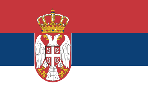
See those little 'B' shaped things upon the shield that's on the bird's breast? Those things interest me. But let's keep looking. On to coats of arms.

Again, if we look hard enough, we can see the little 'B' shaped things. It's in the bottom of circle, the little circle with the cross on the left. This, by the way, is their coat of arms from the First Uprising era, which was in basically the first decade of the nineteenth century. Let's look at some more.

Here's their greater coat of arms during the Principality days, which was during the mid to latter nineteenth century. Again, we see the 'B' things. A little bit of research seems to lead us to the conclusion that these are supposed to be representation of firesteels, which are items that were used to strike something with to generate sparks to light tinder with. This symbolism streches back to its use by the Byzantine Empire. Perhaps Serbia's making some sort of claim here? Just a little deeper into this research, and we discover that the firesteels are actually just stylized betas, abbreviating the Byzantine Greek phrase "Basileus Basileon, Basileuon Basileuonton," or "King of Kings, Ruling over Kings." This phrase was the motto of the Palaiologoans of the Byzantine Empire, which was also the dynasty that used the cross and firesteels symbolism.

So again, even in the Yugoslavian days, Serbia stuck to the firesteels to represent themselves. I think I'm set firm upon using it to represent Serbia in Civ.
So now that our research is done, we need to grab the firesteel real quickly. Be sure to respect the terms of the licensor of the work you pull from. A little bit of looking around nets us a public domain image, found here. Be sure to grab the highest resolution image you can, because we need the absolute best quality for our works!
Now that we've downloaded our image, it's time to build our icon. For this icon, I'll be making a 600 by 600 pixel document, using an 8-Bit RGB colour mode at 72 pixels per inch. The colour mode and DPI are pretty much standard. You shouldn't use a higher bit colour mode because when you export to DDS, you'll be exporting to an 8-Bit colour mode. So any higher colour depth will be lost and possible artifacting will occur.
Let's make a black background layer. This is done by selecting the
 paint bucket tool, and making sure that black is on your foreground colour (the top left square.) Click the background, and make it black! Now make a new layer by pressing Ctrl + Shift + N, and we'll get to making our icon background.
Select your Elliptical Marquee tool. If you can't find it, then right click your Rectangular Marquee Tool to access it.

Now, up at the top you should see Feather, Style, and Width and Height and all that junk. Hit the Style dropdown menu, and select Fixed Size. To the right of that, dial in the numbers to 512 px by 512 px. Now take and place your circular selection down. Don't worry about getting it perfectly centered, we'll do that right now.
In your File/Edit bar, click Select. In the dropdown that appears, select Transform Selection. Up at the top, you should see fields for X: and Y:, W: and H:, and Degrees of Rotation. Set X and Y to 300.0 px and 300.0 px. Or if you didn't listen to me, like a dumbass, and made your document a different size, set X and Y to half of the document dimensions. This should center your circular selection. Once you've got that done, grab the paint bucket tool to apply your changes.
Set your foreground colour to white and, with Layer 2 selected, use your paint bucket inside the selected circle. You should now have a white circle. But don't deselect that selection just yet! Make a new layer, then go back and find Transform Selection. You remember how to do that, right? This time you want to set W and H to 80%, and fill the smaller circle with a nice gray colour that's bound to contrast with most things. You may now deselect the elliptical selection by pressing Ctrl + Shift + D. Right now, you should have something that looks like this...

I'll tell you what the gray circle is about later, but for now, in your Layers box, click the tickbox with the eye in it until the eye disappears on Layer 3. The gray circle should now be gone.
Now, time make our logo and get it placed on the icon background. I'll spare you making the logo, you should be able to do it with a bit of common sense and reasoning. Once you've got that made, cut it out and paste it into your photoshop document. Make sure it's a separate layer. It should be this way by default. Now, bring up your gray circle layer. Click the tickbox so the eye is there again, and select your logo. In your File/Edit bar, click Edit, then click Free Transform. Up between W and H, click the chain icon. This locks the W and H to each other. Now click one of the two's field, and then press Down Arrow on your keyboard. Keep doing this until the icon fits completely within the gray circle. That's what the gray circle's for! A guide for setting your logos on the icon. As a general rule of thumb, all logos should fit inside this circle. But like all rules, this one's meant to be broken under the proper circumstances. What these circumstances are is entirely up to you. It's your world.

Anyway, this is what I've got. I'm going to click a tool over on the toolbar to apply my selection, hide the gray circle again, and continue.
Now it's time to pick our colours. For this icon, even though they're overused, I'll go with 235, 235, 235 White, and 189, 27, 43 Red. Let's see how they look. I'll be using Blending Options -> Colour Overlay to do this. Right click the layer and click Blending Options to see your... Blending Options. While we're at it, I'll also be applying a Drop Shadow to the logo layer, with the settings being 50% Opacity, 8 Distance, 3 Size, and Light Angle 135 degrees. Let's see how they look.

And, if your image looks anything like this: Congratulations, you're not dumb and should not reconsider what you're doing with your life! If it doesn't look like that, I didn't really mean what I said before and you should go back and try again or somethingbecause that's what losers do.
Now's time for the fancy effects. We'll start with our "sheen" layer. Make a new layer. Get your Elliptical marquee tool, and set the fixed size to 500 x 500 in this instance. For other instances, it should be just a tad smaller than your icon background layer (red circle.) The bottom of the marquee should extend just a tad below center, and the marquee should be offset to the left. In this instance, the center of your selection (should you choose to precision move with Transform Selection,) would be at or around 285, 95. Now that we've got our selection, we're going to deselect everything outside of the red circle, or icon background layer. While holding Ctrl, Alt, and Shift, click the little picture thumbnail of the icon background layer. This should deselect everything outside of that layer and your selection. You should end up with something like this.

Now, right click your paint bucket tool. You should see Gradient tool. Select it. Set your foreground colour to 255 White, and then up top you should see a little dropdown box with a bunch of gradient styles in it. Select the one that goes from white to checkerboard. Now, starting at the top of your selection, click and drag the line down to the bottom of the selection. You should now have a nice white to transparent gradient. Leave this alone for now, you may even want to hide it while we do the shadow work. By the way, you should have something like this.

Taking a break on the tutorial, will pick it up again. Hope you're still with me.
First thing's first. This tutorial assumes that you are using Adobe Photoshop CS2 or Later. This may work on older versions of Photoshop, and this may work with whatever other paint program the plebs these days are using. If it doesn't work out of the box, you may need to read up, get plugins, or poke it with sharp sticks until you find that you can properly do these things. With that said, let's get into it.
So the subject of this tutorial, provided by RandomCountry.com, is... Serbia! Now that we know what civ we'll be doing this for, we get into the first phase of making our icon. Not making it! That's right, we're not going to start quite yet because we must do a little bit of research. We'll need to figure out a good way to symbolize this culture in a way that people can understand.
Since they're a modern country, I'll start by looking at their flag.
See those little 'B' shaped things upon the shield that's on the bird's breast? Those things interest me. But let's keep looking. On to coats of arms.
Again, if we look hard enough, we can see the little 'B' shaped things. It's in the bottom of circle, the little circle with the cross on the left. This, by the way, is their coat of arms from the First Uprising era, which was in basically the first decade of the nineteenth century. Let's look at some more.
Here's their greater coat of arms during the Principality days, which was during the mid to latter nineteenth century. Again, we see the 'B' things. A little bit of research seems to lead us to the conclusion that these are supposed to be representation of firesteels, which are items that were used to strike something with to generate sparks to light tinder with. This symbolism streches back to its use by the Byzantine Empire. Perhaps Serbia's making some sort of claim here? Just a little deeper into this research, and we discover that the firesteels are actually just stylized betas, abbreviating the Byzantine Greek phrase "Basileus Basileon, Basileuon Basileuonton," or "King of Kings, Ruling over Kings." This phrase was the motto of the Palaiologoans of the Byzantine Empire, which was also the dynasty that used the cross and firesteels symbolism.
So again, even in the Yugoslavian days, Serbia stuck to the firesteels to represent themselves. I think I'm set firm upon using it to represent Serbia in Civ.
So now that our research is done, we need to grab the firesteel real quickly. Be sure to respect the terms of the licensor of the work you pull from. A little bit of looking around nets us a public domain image, found here. Be sure to grab the highest resolution image you can, because we need the absolute best quality for our works!
Now that we've downloaded our image, it's time to build our icon. For this icon, I'll be making a 600 by 600 pixel document, using an 8-Bit RGB colour mode at 72 pixels per inch. The colour mode and DPI are pretty much standard. You shouldn't use a higher bit colour mode because when you export to DDS, you'll be exporting to an 8-Bit colour mode. So any higher colour depth will be lost and possible artifacting will occur.
Let's make a black background layer. This is done by selecting the
Select your Elliptical Marquee tool. If you can't find it, then right click your Rectangular Marquee Tool to access it.
Now, up at the top you should see Feather, Style, and Width and Height and all that junk. Hit the Style dropdown menu, and select Fixed Size. To the right of that, dial in the numbers to 512 px by 512 px. Now take and place your circular selection down. Don't worry about getting it perfectly centered, we'll do that right now.
In your File/Edit bar, click Select. In the dropdown that appears, select Transform Selection. Up at the top, you should see fields for X: and Y:, W: and H:, and Degrees of Rotation. Set X and Y to 300.0 px and 300.0 px. Or if you didn't listen to me, like a dumbass, and made your document a different size, set X and Y to half of the document dimensions. This should center your circular selection. Once you've got that done, grab the paint bucket tool to apply your changes.
Set your foreground colour to white and, with Layer 2 selected, use your paint bucket inside the selected circle. You should now have a white circle. But don't deselect that selection just yet! Make a new layer, then go back and find Transform Selection. You remember how to do that, right? This time you want to set W and H to 80%, and fill the smaller circle with a nice gray colour that's bound to contrast with most things. You may now deselect the elliptical selection by pressing Ctrl + Shift + D. Right now, you should have something that looks like this...
I'll tell you what the gray circle is about later, but for now, in your Layers box, click the tickbox with the eye in it until the eye disappears on Layer 3. The gray circle should now be gone.
Now, time make our logo and get it placed on the icon background. I'll spare you making the logo, you should be able to do it with a bit of common sense and reasoning. Once you've got that made, cut it out and paste it into your photoshop document. Make sure it's a separate layer. It should be this way by default. Now, bring up your gray circle layer. Click the tickbox so the eye is there again, and select your logo. In your File/Edit bar, click Edit, then click Free Transform. Up between W and H, click the chain icon. This locks the W and H to each other. Now click one of the two's field, and then press Down Arrow on your keyboard. Keep doing this until the icon fits completely within the gray circle. That's what the gray circle's for! A guide for setting your logos on the icon. As a general rule of thumb, all logos should fit inside this circle. But like all rules, this one's meant to be broken under the proper circumstances. What these circumstances are is entirely up to you. It's your world.
Anyway, this is what I've got. I'm going to click a tool over on the toolbar to apply my selection, hide the gray circle again, and continue.
Now it's time to pick our colours. For this icon, even though they're overused, I'll go with 235, 235, 235 White, and 189, 27, 43 Red. Let's see how they look. I'll be using Blending Options -> Colour Overlay to do this. Right click the layer and click Blending Options to see your... Blending Options. While we're at it, I'll also be applying a Drop Shadow to the logo layer, with the settings being 50% Opacity, 8 Distance, 3 Size, and Light Angle 135 degrees. Let's see how they look.
And, if your image looks anything like this: Congratulations, you're not dumb and should not reconsider what you're doing with your life! If it doesn't look like that, I didn't really mean what I said before and you should go back and try again or something
Now's time for the fancy effects. We'll start with our "sheen" layer. Make a new layer. Get your Elliptical marquee tool, and set the fixed size to 500 x 500 in this instance. For other instances, it should be just a tad smaller than your icon background layer (red circle.) The bottom of the marquee should extend just a tad below center, and the marquee should be offset to the left. In this instance, the center of your selection (should you choose to precision move with Transform Selection,) would be at or around 285, 95. Now that we've got our selection, we're going to deselect everything outside of the red circle, or icon background layer. While holding Ctrl, Alt, and Shift, click the little picture thumbnail of the icon background layer. This should deselect everything outside of that layer and your selection. You should end up with something like this.
Now, right click your paint bucket tool. You should see Gradient tool. Select it. Set your foreground colour to 255 White, and then up top you should see a little dropdown box with a bunch of gradient styles in it. Select the one that goes from white to checkerboard. Now, starting at the top of your selection, click and drag the line down to the bottom of the selection. You should now have a nice white to transparent gradient. Leave this alone for now, you may even want to hide it while we do the shadow work. By the way, you should have something like this.
Taking a break on the tutorial, will pick it up again. Hope you're still with me.


")


")