Icons and unit graphics are supposed to convey the idea of what they mean to represent. Offensive units should look aggressive and powerful. Defensive ones like they're tough to beat. Making it look like what it is, is what makes my clock tick. Nemo'ish units often seem too cartoonish and similar for my liking, and the fake isometric 3D doesn't make much sense to me.
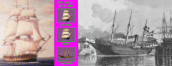
I often use pictures as models for the units I create, but its definitely not as simple as rescaling and pasting into the units file. But its a good way of getting an idea of what it should look like, gettting proportions and details right etc. Sometimes it can be rescaled and redone, but more often than not it takes a lot of work from scratch to get it right. Examples :
In the first example, I cleaned up the frigate picture on the left and rescaled it. A lot of work went into enhancing the hull, sails and lines. I needed to tweak it in various ways and reduce its height slightly to fit the square, but still retain the 'right' look. When done I realized I needed a unit that looked a little more powerful and changed it into a 3-master, and ended up with a 2 masted corvette and a 3 masted frigate.
In the second example, I wanted an authentic looking troop transport, but found that I had to do basically everything from scratch. The mass of people on the ship simply turned into a blurry mass, as expected, and since the picture was b/w I needed some colouring of my own as well. I added the rolled up sails, turned the smoke in the 'right' direction, and added a couple of more lifeboats, all to signify a ship with good speed and load capacity.
I'm proud to be a member of the anit-nemo graphics association
")
")

 Count me in. Come out from the closet, people!