tjedge1
Writer of writerly things
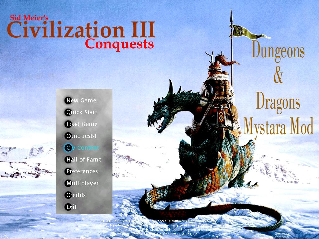
This is a poll thread to determine which title screen I should make for my mod. I am at a loss and would like the majority to determine this. Below are the pictures available. Which ever is most popular will be the first one to attempt to make into a title screen.
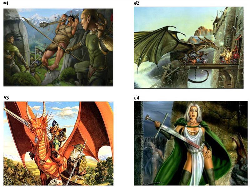
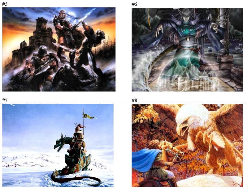
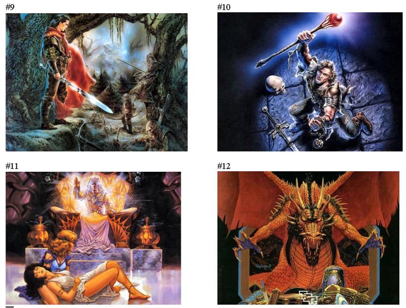
As far as resizong goes, I have found a technique that has worked before, better than the last title screen I made was, to avoid the fuzzy problem. It involves a digital camare which I print the picture then retake a shot of it with very high pixels and then shrink it in photoshop. So far it has worked perfectly for all my tests, so size is not really an issue. These pictures are down-sized just for the preview so they didn't take up too much space.
I will turn any one of the pictures above into a title screen if it gets more than 5 votes. If it gets more than 15 I will add it to the mod as an extra title screen.
And the winner is:
") ie. I vote for anything that is no smaller than 1024x768 before resizing.
ie. I vote for anything that is no smaller than 1024x768 before resizing.")


