GRAPHICS: Civ3 Usability Pack 1.0

Il Mafioso

Chieftain
Joined
Nov 1, 2001
Messages
66
Location
Hollywood, FL
Try this modpack! I guarantee you you (money back on a free modpack... hummmm) you will find Civ so much more enjoyable. This doesn't alter rules or anything like that... all the great things described below are achieved thru modifications of 2 graphic files....

Here's an excerpt from the documentation, you'll need to look at the attached image to follow the description. When you download the zip (which I'll post next) you'll get the full documentation, including the easy to follow installation instructions.

Hope you'll like it!

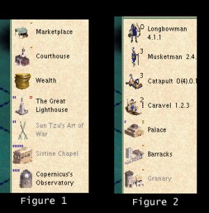
###POINT A: How do I pick which unit to build based also on upgradeability?

Look at figure 2, specifically at the Longbowman, the Musketman and the Caravel. Notice that the Longbowman has a ZERO next to it? Guess what.. zero upgrade steps from Longbowan. For Musketman it's 3... Rifleman, Infantry, Mechanized Infantry. For the Caravel it's 2... galleon then transport.

POINT B: How do I know how much maintenance gold improvements require?

Look again at Figure 2, specifically the Palace and the barracks. Notice the brown (dark gold in my eyes <grin>) lines in the upper right hand corner of each one's icon? Count them! Two lines for Palace, one for Barracks (also one for Granary below) the lines correspond to the maintenance cost in gold. If you look at the palace, you may also notice a vertical blue line in the upper left hand corner... but don't get ahead of me here... that's point D!

Point C: How do I know which units carry other units, and how many they carry?

Look at the Caravel in Figure 2, notice that under the "2" that indicates 2 more upgrades there are 3 little lines? Guess how many units a caravel can carry. Now look at the catapult... count the little lines... right, ZERO, what did you expect?

Point D: How do I know how much culture an improvement or wonder generates?

Remember that lone blue line in the upper left hand corner of the Palace? Look at the Sistine chapel in Figure 1.... 6 blue lines... mmmm copernicus has 4 blue lines.... mmmm ring a bell?

Point E: How do I know if a wonder I may think of building expires?

Look at figure 1. Specifically, the Lighthouse... notice the 2 blue lines? Well you already know what those mean, right? Ok look to the right? See that RED "O"? Let's see... OOOOO...bsolete! That tells you a wonder may eventually become obsolete due to a discovery.
 

Attachments

  • usabilitypack.jpg
    usabilitypack.jpg
    75.7 KB · Views: 21,894
Brought to you by the same dude who brought you the "Wonders with Info" and "Elvis 2.0" modpacks!

Alessandro Di Sciascio
adisciascio@hotmail.com
 

Attachments

  • civusabilitypack1.zip
    172.7 KB · Views: 6,494
wow, a spearman can be upgraded 5 times!

can I give my approval too? even tho my stamp is a much smaller one ;) good work, Mafioso, I'm currently using your Elvis mod as well. :goodjob:
 
I am sincerely impressed by the amount of effort you have put into improving this game in less than a week! Although I have no complaints about the game's playability you'd think that Firaxis could have thought of something like this or the WonderPics.:confused:

Thanks Il Mafioso. Keep up the good work but be sure to find some time to enjoy the game!:lol:
 
Il mafioso, you are our new king! please keep up the improvements coming and in the mean we'll take care of improving your palace :p
 
I like your mod! Great job.

One suggestion is changing the red "O" into an "X" instead. Anyone else think so?

:goodjob:
 
Originally posted by aiya
I like your mod! Great job.

One suggestion is changing the red "O" into an "X" instead. Anyone else think so?

:goodjob:

Actually I thought so during development :D


I had already done the gold cost, culture, and unit transport bars. They were all 2x4 (or 4x2) whatever. so I wanted the obsolescence symbol to respect one or both of those measurments (for a visual consistency thing) so I was basically stuck with either a 2x2 symbol, a 2x4, a 4x2 or a 4x4. You really can't make an X with any of those except 4x4... you could make: (X being red, - being clear)

X--X
-XX-
-XX-
X--X

That sounds reasonable in theory. In practice (meaning I tried it, in-game) the single pixels making up the edges of the X are essentially invisible for anyone playing at resolutions higher than 1024 on Non-Huge monitors, so what was meant to be an X looks like a fuzzy dot.

I also tried just a plain 3x3:

X-X
-X-
X-X

This was still visible, but... you really couldn't tell it was an X. If you looked at it yeah you could, but glancing, the X was in no way obvious. What WAS obvious was that the symbol was both skinnier and smaller than the culture bars. I found that to be visually unpleasant.

Finally I tried a 5x5

X---X
-X-X-
--X--
-X-X-
X---X

In this case, even at 1280 on a 17" monitor you could definitelly tell it was an X. But the "I'm bigger than the Culture bars" effect was just as obvious.

On top of that, 2 of the wonders' pictures would have needed to be scaled down in order not to touch the bottom left hand corner of the X, and downscaling was something that I had planned on avoiding (I spent most of the deveopment time figuring out where to put the symbols so they wouldn't cause loss in quality of the already minuscule graphics.

At that point I abandoned the X idea and decided to go with an O or box.

I tried what would probably look like an O

-XX-
X--X
X--X
-XX-

And that was acceptable.

But I found that the square:

XXXX
X--X
X--X
XXXX

was significantly more visible and IMHO blended well with the culture bars. Incidentally the easier visibility of the final one is not just a function of it having 4 extra red pixels (which it does and I'm sure they help) But it has something to do with the human vision system's ability to identify horizontal features. To demonstrate this to yourself, try reading something with your head tilted 20 degrees or so to the left. Even though you can still easily identify the letters, I can assure you that you will find that you read significantly slower.

So you see... a bit of thought went into this after all :D

By the way, thanks for making all my attempts to get an X worthwhile!!!! :)
 
Thanks for taking the time to modify and share this enhancement to Civ3! I have it installed, and it adds much to the enjoyment of Civ3! Keep up the great work!
 
Thank you, Il Mafioso! What a great enhancement to the game. I'm using it and loving it!
 
Great mods Il Mafioso!

Two comments. One for your elvis mod and one for this one.
For the elvis mod, I might have installed it wrong but when you click on the adviser button on the top corner of the screen elvis doesn't show up on the little button to switch between advisors, the girl still does. Is this something I did wrong or just something that couldn't be remedyed?

Also, on the mod pack that shows the cultural points and stuff like that for city improvments you should also make it so when elvis pops up saying "New York has completed the Barrack! What should we build next?" You should be able to see the cultural points and upgrade stats there as well.

Again, I might have messed up and not installed them right but if I didn't, just a little input.

Thanks a lot for making the mods! They're awsome anyway and I love em.
 
Ive read all about this wonderful mad but the &$&%(% website downloads section just takes me to the forum..so how the hell do you download it??? Please?? pretty please??
 
Originally posted by Turbo
Great mods Il Mafioso!

Two comments. One for your elvis mod and one for this one.
For the elvis mod, I might have installed it wrong but when you click on the adviser button on the top corner of the screen elvis doesn't show up on the little button to switch between advisors, the girl still does. Is this something I did wrong or just something that couldn't be remedyed?

Sorry!

I posted Elvis 2.0 as an upgrade for 1.0

If you didn't have 1.0 you would be missing a file.

I just corrected my mistake. Please return to the completed modpacks section and download Elvis 2.1 (full package)


Also, on the mod pack that shows the cultural points and stuff like that for city improvments you should also make it so when elvis pops up saying "New York has completed the Barrack! What should we build next?" You should be able to see the cultural points and upgrade stats there as well.

Again, I might have messed up and not installed them right but if I didn't, just a little input.

Thanks a lot for making the mods! They're awsome anyway and I love em.

This I can't do. It would involve changing the CODE of the program, something I'm not prepared to do. My mod only modifies the GRAPHIC, and the GRAPHIC isn't shown when Elvis suggests building something.

You'll have to ask Firaxis to implement my MOD in code (they could do it pretty easily) so that it shows up on the advisor screen, and so it matches the BIC file and therefore isn't broken by weirda$$ modpacks that surely will come :D
 
Originally posted by MagiK
Ive read all about this wonderful mad but the &$&%(% website downloads section just takes me to the forum..so how the hell do you download it??? Please?? pretty please??

If you read my SECOND post, you'll see it says "ATTACHMENT: CIVUSABILITYPACK1.ZIP" please click that to download.

If that doesn't work, you can download it from:

www.dialisdn.net/user/adisciascio/civ3/civusabilitypack1.zip

If that doesn't work, contact me via email: adisciascio@hotmail.com and I'll be happy to email it to you.
 
Hey Il Mafioso your the man! :goodjob: Too bad about not being about to fix that other part :( when is Fraxis gonna release a patch! Arrgg, the wait is killing me! Not that I am going to stop playing the game 4 hours a day! :crazyeyes:
 
Thanks Il - can't wait to try this out - and thanks to all of those who posted on corruption - i'm off to test the king of the day theory, I was so pissed off when the city making the new palace for me was LOSING shields every two turns... went from 9 to 8 to 7 to 6 and no change in the happiness/unhappiness levels (I had close to 20 or more red shields).
 
Thanks for the great Mod Il. It's a clear five star job.

Personally, I think you should omit the information on the number of upgrades. IMO it detracts visually and isn't worth the candle.

Still a great job and a permanent enhancement of my game.
 
Top Bottom