Civ 6's Art Style - Do You Like It?

Do you like Civ 6's art style?

  • Yes - I like Civ 6's art style can be improved

  • No - I think Civ 6's art style can be improved


Results are only viewable after voting.
I think Civ3's idea of changing leaders was absolutely horrible. Abraham Lincoln in a loincloth, skinhead Joan of Arc, Montezuma in a tux...just so, so many bad ideas--and when Firaxis tries to be original, they always have bad ideas. IMO leaders should look iconic.

oh and I agree civ III did it horribly, the concept I like, It would be a matter of doing it right. as I mentioned, if the leader had visual clues as to what is going on with it's civ it could be so rich, for example say, diferent styles if It's on golden age, dark age,etc, bankrupt, invaded, just won a war, culturally influential or a subject, etc. (by the love of God, yes avoid everybody on tuxedos by modern)
 
oh and I agree civ III did it horribly, the concept I like, It would be a matter of doing it right. as I mentioned, if the leader had visual clues as to what is going on with it's civ it could be so rich, for example say, diferent styles if It's on golden age, dark age,etc, bankrupt, invaded, just won a war, culturally influential or a subject, etc. (by the love of God, yes avoid everybody on tuxedos by modern)
I think that would be really cool if they could pull it off...I just don't have the confidence that they could without making it cringy again. :(
 
I don’t like it but got used to it. I appreciate the clear representation. You can see in an instant what is what on the map. I think the colors are to bright and i prefer a more realistic look more simular to civ 5.

The animated characters are superb and do fit with the artstyle of civ 6.
 
I like that the visuals offer so much information about the game state. Just by looking at the map, you can see exactly what infrastructure exists in a city, what infrastructure is damaged, which improved tiles are being worked, you can see what infrastructure is currently being built by a city (including how much progress has been made on the construction of a wonder, to help you determine if you are likely to build it first), and so much more. This level of information would be hard to convey at a glance if the game had given up its more exaggerated, cartoony art style in favor of something more photo-realistic (like in Civ V).

That being said, the one thing that I really do not like is the leader screens. It isn't the leaders themselves that bother me. I don't mind them having the more cartoon look. It's the backgrounds that bother me. The artwork looks good, and it should definitely be in the game somewhere, but I much preferred how the leaders in Civ V existed in an environment. I was hoping to see more of that. IMO, Civ VI's leader screens are closer to Civ IV's "leader heads", which I feel is a regression compared to Civ V's leader screens.

There's also some other small ways that I think the visuals could have been improved. For example, I would have liked if the Scout unit has 2 or 3 people as part of the unit graphic, like most of the other units do. That way, you can more easily tell the health status of the Scout if one or more of the characters are gone. I have similar issues with units like the Tank, Battleship, etc, which don't do a very good job of showing the health status of the unit at a glance. But those are really minor nitpicks.
 
I really like the style of Civilization 6. Very much.
I do not consider the backgrounds of the leaders to be incomplete or bad. I think this is on purpose, so that the leader would stand out more. Multiple leaders are not annoying. It's are not caricatured and pleasant.
I love the menu, but in the last video, this screen just killed me. It's just awful! Tasteless! Trash as animation of new leaders :mad:
upload_2020-12-12_11-47-19.png
 
I really like the style of Civilization 6. Very much.
I do not consider the backgrounds of the leaders to be incomplete or bad. I think this is on purpose, so that the leader would stand out more. Multiple leaders are not annoying. It's are not caricatured and pleasant.
I love the menu, but in the last video, this screen just killed me. It's just awful! Tasteless! Trash as animation of new leaders :mad:
View attachment 578116
What is wrong with it? Just a list of city state icons for city state opion screen.:confused:
 
What is wrong with it? Just a list of city state icons for city state opion screen.:confused:
- some icons are cut off
- why are they in the circle?
- why is there a white highlight on top of the circle?
- checkmark as in Windows operating system
- simple font
I find all this not the best design solution. Compared to what is in the game, it's a hack
 
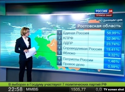
ehmm.. i am not good at math, but currently we are at 103.7% votes in total.. ???

  1. Yes - I like Civ 6's art style can be improved
    79 vote(s)
    72.5%
  2. No - I think Civ 6's art style can be improved
    34 vote(s)
    31.2%
 
What do you know about percents!?
Elections to the State Duma 2011 in Russia :crazyeye: 146,47% :goodjob:
 
I believe Civ 7 can be way more cartoonish. I want more leaders, I think more artoonish can be more civ made.
 
I disagree, pretty strongly in fact. I think the leaders is what sets the Civilization franchise apart from other (better) 4X games. I think Civ7 needs to double down on leaders, make diplomacy more complex, and make it feel more like you're interacting with the leaders directly.

I think Civ3's idea of changing leaders was absolutely horrible. Abraham Lincoln in a loincloth, skinhead Joan of Arc, Montezuma in a tux...just so, so many bad ideas--and when Firaxis tries to be original, they always have bad ideas. IMO leaders should look iconic..

Just to counterbalance, I have to bring up here that I loved Civ'III leaders changing trough the ages, and in each game I'm expected it to come back again. I'm in agreement with you in that interaction with the leaders is at the core in the franchise, but also with @ehecatzin in the side that, if leader interaction it's that important, it should convey much more information than just being eye candy.

I can agree some choices in Civ III were questionable (stone age Abe Lincoln is just offensive, G.I. Jane Jeanne of Arc, I can see the intention of it, but I agree it did not work very well).
On the other hand, i found everyone (and really not everyone) in tuxedos for industrial was indeed neat, as it shows a time were industrialization and global communications make there appear "standard" formats of dressing in all the world (while we can call tuxedos and military mess dress a "western" invention, they break as well with western dress code history, and we can find evidence of them extending as a global standard, with particularities, in different areas of the world, therofore to me they are indeed more "industrial" than "western". It is more likely that leaders would wear military mess-dress, nevertheless, and that would help introducing differentiating items and complements. Industrial age pushed standardization, (ford's "choose car color, with the condition it is black") and it's only once industries are more established that differentiation re-surfaces in post-industrial era.

What I'm trying to say, is I agree with @ehecatzin position below (except the tuxedos part :) - well, I can agree partly as explained below, because more types of differentitation should be added)

oh and I agree civ III did it horribly, the concept I like, It would be a matter of doing it right. as I mentioned, if the leader had visual clues as to what is going on with it's civ it could be so rich, for example say, diferent styles if It's on golden age, dark age,etc, bankrupt, invaded, just won a war, culturally influential or a subject, etc. (by the love of God, yes avoid everybody on tuxedos by modern)

First mix to be considered is Civ I government + Civ III age + Civilization "tendency" (underestanded by that, the type of victory they are pursuing).

Therefore, coming back to the tuxedo's example: you'll expect an industrial civ leaders to come at you in tuxedo if looking for a diplomatic/economic victory, but in military mess-dress if looking for a military/scientific victory, and maybe in a more culturally-focused garb if pushing in culture victory. Also, economic governments would be more likely to show a more neutral/standard/commercial scenario (and black-tie dressed advisors, because there should be more people than the leader), military governments can show more traditional and culturally linked warfare/dominance-oriented scenery (and military clad advisors), and diplomacy-oriented governments may show a mix of cultural items from the leader civ and your civ... the leader strenght may be shown in the quality of the scenario as well.... etc.

It's not an easy challenge, and it can be either become too big (costly) or fall too small (Beyond earth affinity appearance changes came to me as the second case, something promising - and doable, as seen in Starships, but that fell very short in the game), but something I would really like for them to invest in the art department. That and maybe some option for "grand" city view a la Civ III - In my opinion the current map has the correct mix between strategy and beauty, but, as there is a "strategic", iconic view, it would be nice to bring back an organically generated, no color-coded, immersive and realistic view, even if just only for specific cities.
 
For the longest time I was not a fan of cartoony leaders. However, I have recently come around to the other side of the argument. The more cartoony something is, the better it ages IMHO. I'm not a graphics/FPS/resolution purist, but the civ 4 leaders look so bland and boring, and have not aged well at all. I feel like the cartoony look of games like civ 6 will help them age better. I also feel like civ 6 as a whole feels a little more upbeat. Even if you're winning in civ 6, it feels dark and foreboding and kind of depressing. Just my 2 cents, but I do like the cartoon looks of the leaders. But yes, the hills do need to be hilly-er.
 
For the longest time I was not a fan of cartoony leaders. However, I have recently come around to the other side of the argument. The more cartoony something is, the better it ages IMHO. I'm not a graphics/FPS/resolution purist, but the civ 4 leaders look so bland and boring, and have not aged well at all. I feel like the cartoony look of games like civ 6 will help them age better. I also feel like civ 6 as a whole feels a little more upbeat. Even if you're winning in civ 6, it feels dark and foreboding and kind of depressing. Just my 2 cents, but I do like the cartoon looks of the leaders. But yes, the hills do need to be hilly-er.

Did you mean Civ 5? Civ 4 were also very cartoony.
 
- some icons are cut off
- why are they in the circle?
- why is there a white highlight on top of the circle?
- checkmark as in Windows operating system
- simple font
I find all this not the best design solution. Compared to what is in the game, it's a hack

I'm sorry to say that, but I am afraid all you are pointing out it's in the game "standard UI" (see spoiler below for examples in the advanced start settings screen). The only difference (that, I agree breaks the aesthetics), is that the "picker" screens have a solid blue background, instead of the translucent background in other menus.

Spoiler Screens :

BTW, nevermind the civ colors may be odd, I modded them so I could have more pleasant colors and jerseys triggering more often. It is the only change applied

Civ6 UI fails.png
Civ 6 UI CS.png
 
I'm sorry to say that, but I am afraid all you are pointing out it's in the game "standard UI" (see spoiler below for examples in the advanced start settings screen). The only difference (that, I agree breaks the aesthetics), is that the "picker" screens have a solid blue background, instead of the translucent background in other menus.

Spoiler Screens :

BTW, nevermind the civ colors may be odd, I modded them so I could have more pleasant colors and jerseys triggering more often. It is the only change applied

View attachment 579399 View attachment 579400
I must say that the menu looks better in-game than it does in the video, but it's still on the level of an amateur mod and looks simple compared to other menus. In your screenshot, these same elements fit perfectly into the menu. And they are not cut off
Thanks for the comment, but I think it's a matter of taste. The menu disappointed me
 
I'm not sure how important "aging well" should be as a consideration. But that's coming from someone who was fine with the graphics achieved back in 2008 and views everything afterwards as unnecessary overkill that takes resources away from the core gameplay. I just don't get the fetishization of how many pixels or how good the water looks or whatever. I don't stop in a game to stare at water, nor do I stop in Civ 6 to appreciate the nuance of a leader screen.
 
- some icons are cut off
- why are they in the circle?
- why is there a white highlight on top of the circle?
- checkmark as in Windows operating system
- simple font
I find all this not the best design solution. Compared to what is in the game, it's a hack

Well, if a screen you may look at for 5 seconds before starting the game is worth all this time to gripe about, I guess the game is in pretty good nick.

But yes, the hills do need to be hilly-er.

100%!!!!
 
I'm colorblind so the contrasts in 6 are better for me. Hills are hard to see so I use the mod that fixes them. I tried that civ V reskin and I don't like it.

I guess I'd say a little more realism but with brighter colors than V is what I'd like. The V reskin just looked dull after playing VI so much.
 
Top Bottom