• Civilization 7 has been announced. For more info please check the forum here .

The drawing thread

Yes, it's digital.

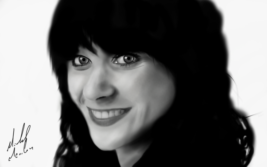
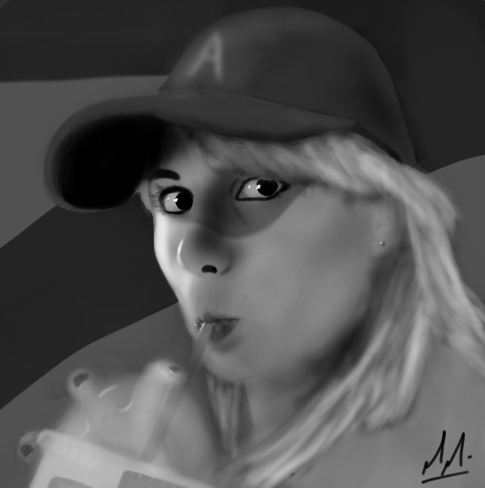
But I scanned it from a pencil drawing (see above pictures of the guy and the two girls wearing different expressions) and then painted on top of it in Photoshop.

I'll apply some filters and make some Adjustments on it after I feel sufficiently satisfied with my composition.
 
Ah I see. Well, I meant completely digital, as in you were drawing it using a tablet and photoshop like I do.

Edit: you said painting in photoshop, so I suppose this tricks could help anyways.

Try overlaying a layer filled with a light tan or gray and setting the opacity to 70-80%. Then redraw the outline and features and re-buff the colors.
This is of course only if you don't mind drawing on the computer. If you don't have a tablet, though, it can be a little tricky.

This cleans the drawing and allows you to dilute the colors a little bit if they're too strong. Makes it look more realistic.
 
Ah, alas. I don't have a tablet.
When I had the opportunity, I chose to upgrade to a better laptop instead.
Which was well worth it because my school offers the full Adobe Master Collection Suite for free to all its' students.

Thank you for the advice by the way.
I'm actually trying to go for a halfway between Bruce Timm's style
and Gil Elvgren's, two artists I'm highly influenced by.
 
I promised fonts, here's most of the special letters. I'll be doing the rest, signs, moar numbers, etc. later.
<snip>

Looking cool, Takh. Gonna try and license it I'd assume?

^Princess Elise.

No. Just no. :p

Anyways, Day 2 of my WIP painting:

<snip>

Background Info if you're too lazy to read the deviantART description:

A daughter of Njörðr.

Looking good, TD! That varying thickness of lines really shows your original point; it helps the picture look even more interesting than it already is. =]

Spoiler :


3-3. The Governor's identity is probably more obvious by now than I had wanted, but ah well. Though I'm dropping all sorts of yummy misleading hints too. Have fun!

Not even 3 issues in and we're already playing "The Game." (The Game being the term Archie Eggman uses to describe his tendency to employ treachorous subordinates. He knows each one of them plots against him, but will serve him faithfully so that there's more for them to take when they overthrow him... if they succeed, anyway.)

One of my best comments was "Geez Robotnik got thin! O.O" I'll clarify accordingly - that is NOT Robotnik. xD

Next panel, back to trees.
 
I attempted to paint the picture I did, but like with using the tablet I was doing it wrong. I couldn't find a way to blend or mix colours like with real paints and so I ended up having to do it pixel by pixel. After about an hour all I managed to do was an iris.
 
Looking cool, Takh. Gonna try and license it I'd assume?
Eventually, yes, I need to do the rest of the signs and a lot of Unicode characters. Greek and Cyrillic might be fun, but I'm not good at drawing them by hand so it'll be a problem, I'll first have to try them by hand. Then, yes, I might put it on Sourceforge or somewhere like that.
SonicTH said:
No. Just no. :p
Hey, you're learning Tropese already.
I attempted to paint the picture I did, but like with using the tablet I was doing it wrong. I couldn't find a way to blend or mix colours like with real paints and so I ended up having to do it pixel by pixel. After about an hour all I managed to do was an iris.
Try GIMP's feature for degradés and similar stuff. Might just work, but I've never used it on hand-and-pencil stuff, only on digital ones.
 
@Chukchi: Are you painting on separate layers? If not, that's what you need to do.
Make lots of layers and name all of them, paint separate things on separate layers.

@SonicTH: How about Cosmo or Cream then?
 
I attempted to paint the picture I did, but like with using the tablet I was doing it wrong. I couldn't find a way to blend or mix colours like with real paints and so I ended up having to do it pixel by pixel. After about an hour all I managed to do was an iris.

Best thing to do is to use multiple layers. And I mean a LOT.

Every time you add something new to the portrait it has to be a new layer.

If it doesn't look quite right, try adjusting the opacity of the layer.

If the picture is becoming messy, add a new layer with a light color at about 60% opacity and continue drawing.

If you need to accentuate shadows, add a dark layer with about 60% opacity, erasing some of the layer to provide the highlights.

^Just some tricks I use.
 
Chalk tool looks nice. Is it meant to be so blurry though?
 
I like those drawings even if I don't like the series. :thumbsup:
 
Some more of my crap:


Some more of my crap:


Your "crap" is very nice. :)

Some of my own. Zooey! :love:

Spoiler :


About 5 hours with a 2 hour break in the middle. Maybe it was 6 hours. Whatever, it was done today between 3:00 and 11:00 pm.
 
Almost babe-thread worthy.

And I agree, it ain't no crap, useless.
 
The colours. By GOD, I love the colours.
 
Thanks, though I wish I could think my drawrings as nice at least as much as you guys seem to :0
It happens to me as well, whenever people start saying 'Oh look, he draws!' and I'm the one whoc an spot all the flaws and could've beens, and I always think less of my drawings.
The colours. By GOD, I love the colours.
Indeed.
 
Top Bottom