It may not seem particularly important, but it would be quite useful to allow scenario makers to adjust the yields on plots (not only adding, but also subtracting). I think it would be a good idea to include it.
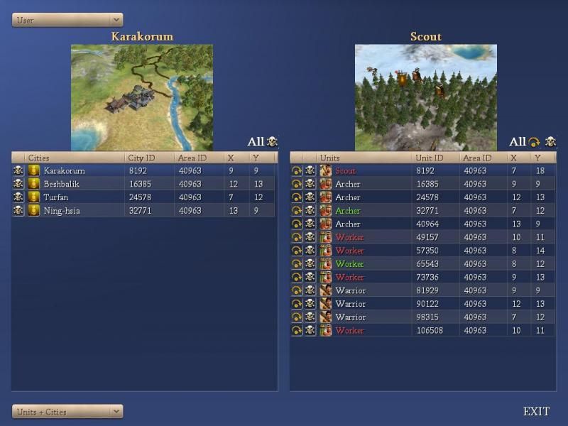
Given how cities can now be viewed like units on an owner/team/all basis, I think that they should also have their leader picture placed next to the name instead of only the civ flag icon. It can get confusing when there are multiple players of the same civ type in the game. (It can be more confusing in FfH2 mods when the city owner has the Tolerant trait, which causes the city civ type to stay like that of the original owner and be displayed as such regardless of the current owner's civ type.)
The new ability to end the turns of all a player's units is quite useful for ending "Waiting for other Civ issues," but it would be even more useful if we did not have to figure out which player is causing the problem but could also opt to end the moves for all units in the game with one click.
(I actually went ahead and copied the skip all and kill all commands for units and buildings, making a new version placed just above it which ran for all players. I'm not positive that this is the best way to handle it though, largely because I'm not sure how to word it so as to make the difference clear to users without making the labels too verbose to look good.)
It would probably be better if you would change the mouseovers of the skip and kill commands to say "kill" and "skip" rather than + and -.
Just as a matter of aesthetics, I think it would look better if the kill and skip all commands were located on the same side of the table as the kill and skip commands for the individual units/cities, just above them. I'm not sure if it would be better to move the all commands to the left or the individual unit/cities commands to the right side of the tables.
The color coding looks nice, but I wonder if it might be better to add a new column including the waiting/fortified/finished moves info, so that it would be possible to sort the table based on that status. When you have far more units than can fit on the screen at one time, it is easy to overlook one green one while scrolling than it would be if you could adjust the table to put all the waiting units on top.
I'm sure I could handle these changes easily enough all by myself for the MNAI/MagisterModmod version (and probably will if you decline to use them) but for the sake the sake of making future merges easier I think I'll wait to see if you would again like to do the all work for me.

Edit:
I decided to go ahead and make most of the changes myself.
Adding leader icons (and mouseovers for the player and leader type) to the city list table on the city Data I, II, &Buildings screens was quite easy.
On the Units + Cities screen I moved the "Skip Turn" and "Kill buttons to the left, because if moved to the right it would not align as well when the list is long enough to need a scroll bar. I shrunk the icons down to match those in the table, and placed "All" and "All Player" labels to the right of them in size 3b. I used iData1 == 1041 for Kill and iData1 == 1042 for Skip Turn mouseovers for all the icons. I couldn't seem to get the table to sort based on moved status, so I just stuck with your color scheme. (I still leave the selected unit in bold too, and have more links to the pages associated with the selected unit and city.)