EDIT(04-07-20_14!); HUGE news about a BNW compatible version!
Here's the direct Steam-Workshop link to it; http://steamcommunity.com/sharedfiles/filedetails/?id=281115092
... or (as it was requested by some people) in the CivFanatics D/L section; http://forums.civfanatics.com/downloads.php?do=file&id=22985
**********
EDIT(29-04); Corrections below to comply with v1275 fixes.
EDIT(10-02); A couple more files below!
EDIT(02-02); Added some new stuff in post #3...
EDIT(15-01); New version (v2) has been updated in the Downloads section with a whole bunch of extra files (mostly Notifications items & Hover Hint boxes!) along with the three DiploCorner buttons, etc.
EDIT(04-01); In #3 slot below, you now have three new colorful buttons.
EDIT(01-12); Released! Find it all here. *** DELETED.
It's too blueish for my taste & behaves like common hip-hop-techno standards; I heard a few formal complaints about how the UI feels too commercial or even downright slick silly.
So - although, i may be waaaayyyy over my head with these attempts - i've decided to tackle a complete rework of all if not many of the UI elements such as popup framings, corner backgrounds, loading bars, clicked hovers, few icons & what else.
To be honest, it's an extremely *HUGE* task & some highly complex editing is required. Proper saturation & balanced coloring is fundamentally driven by acute artistic sensitivities which i might not have enough of... and, yet i can only prove i do by creating the stuff for anyone to judge or use.
I expect this to slowly become a fully Modular context where you'll be able to select what you wish only. Either through an Lua/Xml functional component or within an easy install process.
a) The whole first UI will be GreyScale with a few dark reds here & there to add contrast where it may matter most for visual "appeal".
b) Once that initial one is done, i'll possibly wrap this all up with extra versions such as Magenta, Red, Green (etc) inspired settings.
Gotta start somewhere...
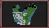
#1) The Minimap... i felt it needed a somehow darker setting. So below, you'll find the zip of a tiny set with the basic 4 files (Fog, Grass, Shallow, Water) which need to be put straight into the ..\Resource\DX9\(here) folder *Temporarily* or until i create the formal Mod for it.
PS; Mountain default Triangular tag has been replaced with an hexagonal image.
#2)... and continue with the "blending_a_little_better_with_coast" river diffuse file. **Deleted, fixed by v1275.
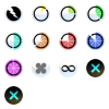
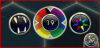
#3)... three DiploCorner buttons designed for Social Policies, Advisors Council & Diplomacy.
EDIT; Also added a new TimerMeter while (for those curious about these) the LeoPaRd & ErasCorner notification icons are shown since i'm currently working on both standalone MODs. I wanted to use DiploCorner location at first but it will be MUCH easier to access and design the whole stuff from there instead.
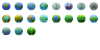
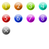
#4)... Your difficulty levels should now be more distinctive since they use individual colors instead of the browny_yellowish vanillas.
#5)... As requested by Amble, the FoW clouds are much more darker -- watch out, there's a huge Storm coming!")
Sooooo, the maximum of 10 files has been reached for this post; if i have anything to add later... it will have to be inserted in some other replies below. Continuing with #6, etc.
Here's the direct Steam-Workshop link to it; http://steamcommunity.com/sharedfiles/filedetails/?id=281115092
... or (as it was requested by some people) in the CivFanatics D/L section; http://forums.civfanatics.com/downloads.php?do=file&id=22985
**********
EDIT(29-04); Corrections below to comply with v1275 fixes.
EDIT(10-02); A couple more files below!
EDIT(02-02); Added some new stuff in post #3...
EDIT(15-01); New version (v2) has been updated in the Downloads section with a whole bunch of extra files (mostly Notifications items & Hover Hint boxes!) along with the three DiploCorner buttons, etc.
EDIT(04-01); In #3 slot below, you now have three new colorful buttons.
EDIT(01-12); Released! Find it all here. *** DELETED.
It's too blueish for my taste & behaves like common hip-hop-techno standards; I heard a few formal complaints about how the UI feels too commercial or even downright slick silly.
So - although, i may be waaaayyyy over my head with these attempts - i've decided to tackle a complete rework of all if not many of the UI elements such as popup framings, corner backgrounds, loading bars, clicked hovers, few icons & what else.
To be honest, it's an extremely *HUGE* task & some highly complex editing is required. Proper saturation & balanced coloring is fundamentally driven by acute artistic sensitivities which i might not have enough of... and, yet i can only prove i do by creating the stuff for anyone to judge or use.
I expect this to slowly become a fully Modular context where you'll be able to select what you wish only. Either through an Lua/Xml functional component or within an easy install process.
a) The whole first UI will be GreyScale with a few dark reds here & there to add contrast where it may matter most for visual "appeal".
b) Once that initial one is done, i'll possibly wrap this all up with extra versions such as Magenta, Red, Green (etc) inspired settings.
Gotta start somewhere...
#1) The Minimap... i felt it needed a somehow darker setting. So below, you'll find the zip of a tiny set with the basic 4 files (Fog, Grass, Shallow, Water) which need to be put straight into the ..\Resource\DX9\(here) folder *Temporarily* or until i create the formal Mod for it.
PS; Mountain default Triangular tag has been replaced with an hexagonal image.
#2)... and continue with the "blending_a_little_better_with_coast" river diffuse file. **Deleted, fixed by v1275.
#3)... three DiploCorner buttons designed for Social Policies, Advisors Council & Diplomacy.
EDIT; Also added a new TimerMeter while (for those curious about these) the LeoPaRd & ErasCorner notification icons are shown since i'm currently working on both standalone MODs. I wanted to use DiploCorner location at first but it will be MUCH easier to access and design the whole stuff from there instead.
#4)... Your difficulty levels should now be more distinctive since they use individual colors instead of the browny_yellowish vanillas.
#5)... As requested by Amble, the FoW clouds are much more darker -- watch out, there's a huge Storm coming!
Sooooo, the maximum of 10 files has been reached for this post; if i have anything to add later... it will have to be inserted in some other replies below. Continuing with #6, etc.
Attachments
-
Darker-MiniMap.zip122.3 KB · Views: 505
-
 Darker-Minimap.png41 KB · Views: 3,070
 -
 Buttons-Trio_DiploCorner.png68.6 KB · Views: 3,207
 -
Buttons_DiploCornerTrio.zip83.9 KB · Views: 505
-
 LeoPaRd_Timer_ErasCorner.png54.1 KB · Views: 2,889
 -
DifficultyLevels_wColors.zip94 KB · Views: 339
-
 difficultylevelicons_wColors.png91.9 KB · Views: 1,630
 -
Darker_FogClouds.zip2.4 MB · Views: 724