Tomorrow's Dawn
Heroes Never Die
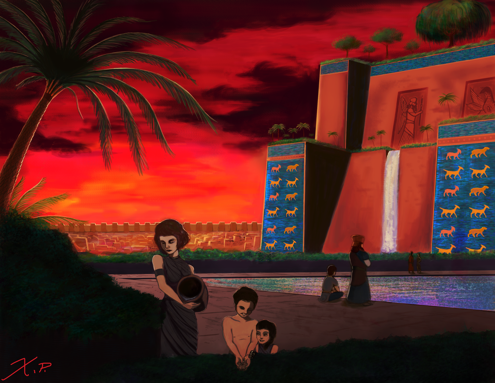
I've seen the current DoC loading screen in some of my Google searches before
and I realized permission may not have been solicited for its use.
As a student artist, I have strong opinions on the usage of others' work in a non-educational context,
so I took it upon myself to kill three birds with one stone, while preparing a painting for a portfolio this week and to sharpen my skills.
While my own painting is in no way anywhere near as technically proficient or masterful as Raphael Lacoste's (the original artist and a working professional),
I would like to submit my version of the Hanging Gardens of Babylon and allow permission
to Leoreth for use as a loading screen for RFC Dawn of Civilization, if he wishes.
Please comment and critique as you see fit.
I will likely at some point go back in and rework my painting.
My deviantart from which this is hosted on can be found here:
http://slumberparties.deviantart.com/
If this proves popular, I may do a series of multiple scenes from different civilizations across the world, and hopefully hone my own skills in the process.
and I realized permission may not have been solicited for its use.
As a student artist, I have strong opinions on the usage of others' work in a non-educational context,
so I took it upon myself to kill three birds with one stone, while preparing a painting for a portfolio this week and to sharpen my skills.
While my own painting is in no way anywhere near as technically proficient or masterful as Raphael Lacoste's (the original artist and a working professional),
I would like to submit my version of the Hanging Gardens of Babylon and allow permission
to Leoreth for use as a loading screen for RFC Dawn of Civilization, if he wishes.
Spoiler :
Please comment and critique as you see fit.
I will likely at some point go back in and rework my painting.
My deviantart from which this is hosted on can be found here:
http://slumberparties.deviantart.com/
If this proves popular, I may do a series of multiple scenes from different civilizations across the world, and hopefully hone my own skills in the process.

