OrsonM
Our man
- Joined
- Jan 1, 2011
- Messages
- 555
Introduction
Earlier work
Policies artwork
One way or another, the character mood thing didn't take (or I just didn't understood it, what was I supposed to do Markus?) and I was asked to this time draw the policies artwork for the game.
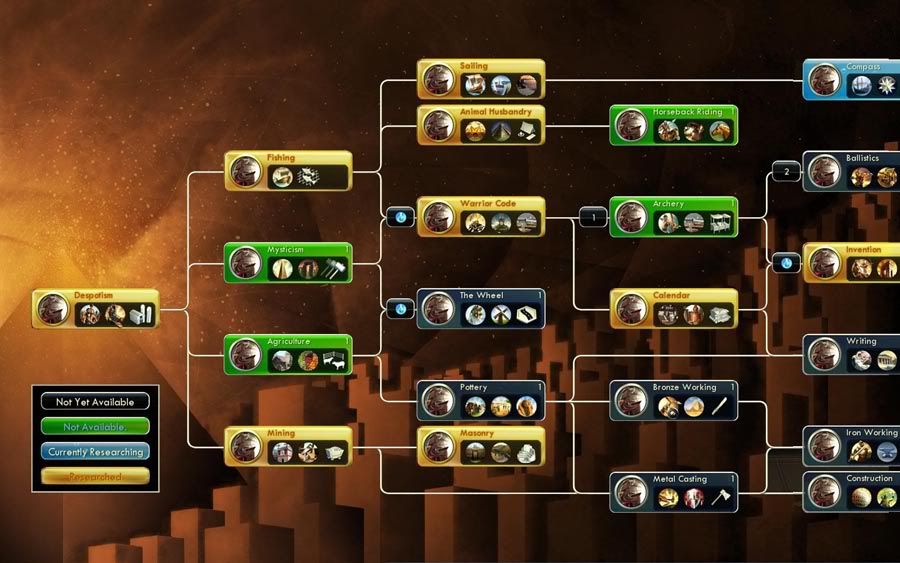
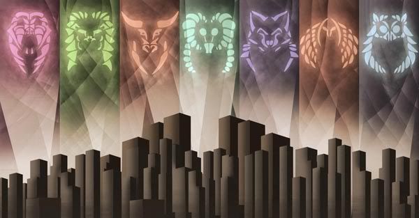
Nights of course has 7 policy branches that have less of a cryptic feel than Civ V (I though Freedom and Liberty were synonims, and what exactly is Order to begin with?). The way Nights is set is a bit more clear (they are all forms of goverments).
Now usually these sort of thing would be made by just dusting those old western-oriented symbols and icons (a knight and castle for feudalism, an ss trooper for autocracy, a gigantic cross for theocracy, maybe the Gipper for democracy, etc). And because every other mod out there would have the same thing, I tried to aim for a different approach (afterall, this night time, baby).
So I thought about sort of political effervescence of the turn of the century, when there were numerous political parties, numerous points of views, ideas and theories of how best to run a society. Then I wondered just how did they came up with symbols like the hammer and sickle, the rose, the star, the elephant and whatnot (they must come from somewhere), and thought the best and most global approach for the goverment icons was to come up with new icons for these, almost as if the parties were re-made from scratch (so animals seemed like a good choice there).
So I had a concept, now I needed a good inspiration to start with. I knew the original Civ V had art deco as an inspiration, WPA posters to be exact. But that's not entirely true, half the art work looks very loose and cartoony. I needed a style that felt similar to the original Civ V (for technical and economical reasons) but that had a better feel to it.

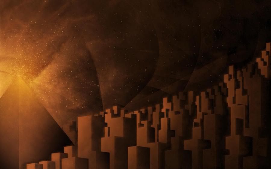
The policy screen is just a big homage of the Metropolis poster, I feel it was just a reference that had to be used. I like working using references, I feel it helps clear out a lot of the visual language and to keep the work focused.
and so the sketching procress began.
and then it continued...
And I believe that was the first release I sent Markus with the policies, this time he was very pleased, he wrote me some long emails about ideas to add, things about the mod, etc. Now this is a huge thing, usually developers I've worked with are a bit dismissive or overly critical. Not this man though.
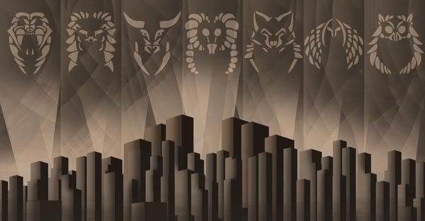
So of course I kept working on it. One of his observations was that it needed to look a bit grittier, a bit wore off. I agreed, so I began to work on it a bit more, I spent several hours working on texturizing the icons so that they integrated better into the background.
And then Markus, had the idea of having on and off versions of the policies. But using the earlier sketch, genius!. But that was an sketch, so I made him a more appropiate off version of it. And hey, seemed to work!
and that would be the policy work so far. The last one having the most Metropolis-like feel.
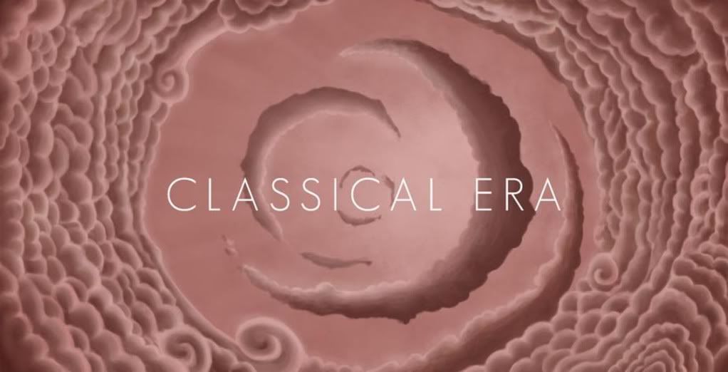
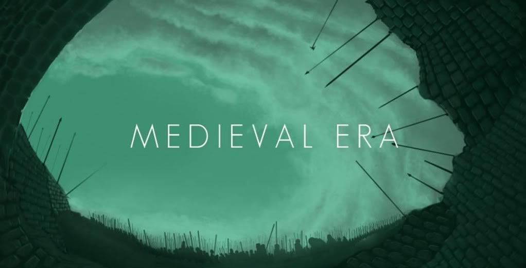
And that would be the work on the policies. I'm hoping players liked it, at this moment I'm moving towards other graphical aspects of the mod, such as the technology screen and the eras screens, so join me next week, where these will hopefully be done by then!.
Questions, comments, all welcomed.
Update 2 here:
Update 3 here:
Spoiler :
(using the same blog format as Markus here...)
Hello, my name is Rodrigo Petunio, I'm an illustrator, most would probably know me as OrsonM or as that guy from the thread about copyright issues on Civ V. I'm in charge of illustrating original artwork for Markus's mod. I offered to help modders a few months ago, and here we are.
Originally I wasn't too happy about the current state of artwork on mods, a lot of them use images that do not belong to them, something that I do not agree with myself. I work with all original materials made by me, I feel it's more professional, there's more control to the images in that way and finally I won't get Markus in any sort of legal bind.
I do however use previous artwork as an inspiration or as a reference, but of course never downright copying it and noting when done so.
Earlier work
Spoiler :
Now early enough I got an email from Markus about working on the artwork for the characters in the game, I never got his idea right very well, but he really wanted to have new character screens that would communicate better all the diplomatic factors of the game (I think, not sure). I cooked up quickly a small concept art about Montezuma and just basing myself on the old moods from Civ IV and Civ III, which I think work a bit better in showing moods than the current 3d animations (which are awesome, but can be intrusive at times and a bit hard to read at times)
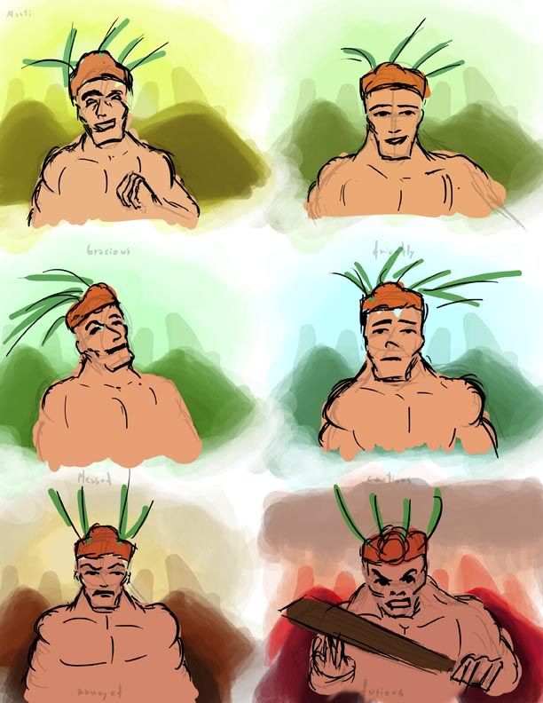
(sketching at work!)
And so, I showed this to Markus, he saw it, replied to me something around the lines that he had no idea what was that, that it was impossible to make that within the game at this moment. My detective senses told me I may had misunderstood his original instructions (not sure, will check again).
Perhaps one day my raggedy sketch will become an actual thing within the game...
Policies artwork
Spoiler :
One way or another, the character mood thing didn't take (or I just didn't understood it, what was I supposed to do Markus?) and I was asked to this time draw the policies artwork for the game.
Nights of course has 7 policy branches that have less of a cryptic feel than Civ V (I though Freedom and Liberty were synonims, and what exactly is Order to begin with?). The way Nights is set is a bit more clear (they are all forms of goverments).
Now usually these sort of thing would be made by just dusting those old western-oriented symbols and icons (a knight and castle for feudalism, an ss trooper for autocracy, a gigantic cross for theocracy, maybe the Gipper for democracy, etc). And because every other mod out there would have the same thing, I tried to aim for a different approach (afterall, this night time, baby).
So I thought about sort of political effervescence of the turn of the century, when there were numerous political parties, numerous points of views, ideas and theories of how best to run a society. Then I wondered just how did they came up with symbols like the hammer and sickle, the rose, the star, the elephant and whatnot (they must come from somewhere), and thought the best and most global approach for the goverment icons was to come up with new icons for these, almost as if the parties were re-made from scratch (so animals seemed like a good choice there).
So I had a concept, now I needed a good inspiration to start with. I knew the original Civ V had art deco as an inspiration, WPA posters to be exact. But that's not entirely true, half the art work looks very loose and cartoony. I needed a style that felt similar to the original Civ V (for technical and economical reasons) but that had a better feel to it.
The policy screen is just a big homage of the Metropolis poster, I feel it was just a reference that had to be used. I like working using references, I feel it helps clear out a lot of the visual language and to keep the work focused.
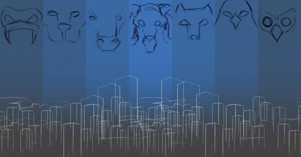
and so the sketching procress began.
and then it continued...
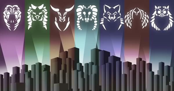
And I believe that was the first release I sent Markus with the policies, this time he was very pleased, he wrote me some long emails about ideas to add, things about the mod, etc. Now this is a huge thing, usually developers I've worked with are a bit dismissive or overly critical. Not this man though.
So of course I kept working on it. One of his observations was that it needed to look a bit grittier, a bit wore off. I agreed, so I began to work on it a bit more, I spent several hours working on texturizing the icons so that they integrated better into the background.
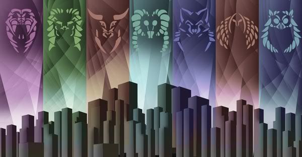
And then Markus, had the idea of having on and off versions of the policies. But using the earlier sketch, genius!. But that was an sketch, so I made him a more appropiate off version of it. And hey, seemed to work!
and that would be the policy work so far. The last one having the most Metropolis-like feel.
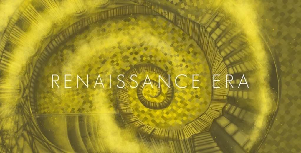
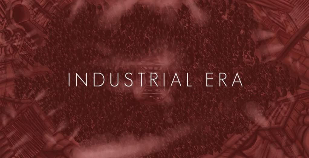
And that would be the work on the policies. I'm hoping players liked it, at this moment I'm moving towards other graphical aspects of the mod, such as the technology screen and the eras screens, so join me next week, where these will hopefully be done by then!.
Questions, comments, all welcomed.
Update 2 here:
Update 3 here:
")