Magma_Dragoon
Reploid
- Joined
- May 10, 2008
- Messages
- 2,354
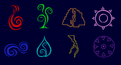
I remembered a few days ago that despite buying a Wii for the sole purpose of Skyward Sword, I had never finished it. On my second round of dungeons tonight, I dropped into the Lanayru Desert and decided to check my map since I haven't played in a while. Notice the markers on the three power stations. There is no way this is a coincidence.

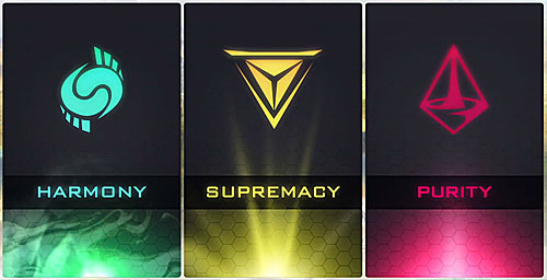
Water drop and harmony both are shaped like magatama, purity looks like a stylized flame, supremacy is a Mercedes logo, unrelated.

Spoiler :
Water drop and harmony both are shaped like magatama, purity looks like a stylized flame, supremacy is a Mercedes logo, unrelated.
")