Hi KJ,
some feedback about your variant:
(Also please excuse any critcs.
")
)
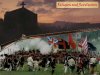
1. The gun itself looks very good.

But would it be possible to have the gun form the border between the two parts from left to right ?
(To my opinion the small parts at the left side and on the right side where the two images come together would look better then.)
2. The upper image of the Screen fits quite well to the theme of the game.
3. I somehow do not like the lower part of the Screen.

It reminds me of some scene from Russia or eastern Europe.
(Also I can see knights with metal helmets.)
It simply does not feel like "New World" to me ...
4. In general you variant is totally different atmosphere than what I had tried to create in
my variant.
(Which is not necessarily negative, it is just an observation at this point.
)
Your variant is a lot "brighter" and much more detailled than mine.
I had tried to create a "darker" atmosphere on purpose.
But that is simply a matter of taste.

5. Generally the arrangement and the style of the two images really fit together.
Summary:
My main "negative" point with your variant is, that I somehow do not feel like the
lower images itself fits.
Otherwise I think that you are going into a good direction. (The overall assembly is good.)
Although I would have personally preferred a "darker" atmosphere I think that that is simply my personal taste and
maybe we should really go with your style.
But before you start to change anything let us see, what the others think about it. 
")


 )
)