[Religion and Revolution]: Starting Screen

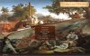
At the moment I don't know what to do with widescreen monitors. This image (1024x1024) is very deformed at 1920x1080 resolution.

Any ideas?

Hi KJ,

this is actually a problem with many other screens (in TAC and accordingly in Religion and Revolution too).

Fankman had created a new Screen for Founding Fathers for TAC
-> Same problem.

I could name many more examples.

Different modders (Fankman, melcher, koma, myself ...) had all discussed this problem.

There is no solution known. :dunno:

I would really say:

It is not really nice, but we will simply accept this "minor" problem.
(The game was simply not designed for wide screen resolutions ...)
 
I see. Maybe there is only one solution.

1. to check (min x min) and (max x max) resolutions available for CivIVColonization
2. to make a similar type collage for an (average x average) resolution.
 
I see. Maybe there is only one solution.

1. to check (min x min) and (max x max) resolutions available for CivIVColonization
2. to make a similar type collage for an (average x average) resolution.

Yes, something like that was discussed, too.

But:

1. It would be an awful amount of work (if you want to do this for all screens).

You would need a lot of if / elif / else in many screens.
All different things like positions and size would need to be recalculated.
An extrem amount of adjusted graphics would have to be created.

2. You never know, what types of resolutions will be used in a few years.

Again:

Please, let us ignore this minor problem. :)
 
Yes, something like that was discussed, too.

But:

1. It would be an awful amout of work (if you want to do this for all screens).

You would need a lot of if / elif/ else in many screens.
All different things like positions and size would need to be recalculated.
An extrem amount of adjusted graphics would have to be created.

2. You never know, what types of resolutions will be used in a few years.

Again:

Please, let us ignore this minor problem. :)

No, I mean a little bit different.

The typical background has a size 1024x1024. Such screen looks OK even at 1440 x 1200. However, has a lot of distortions at 1600 x 1050.

Thus, my idea is create only ONE background. During my work all part will be without distortion at some (average x average) resolution. When all parts of collage will be ready, I will re-size the image to required size 1024 x 1024 and convert it in dds format. Exactly this image will be used as a background in the game. To my opinion such background must have smaller distortions on BOTH normal and widescreen monitors.

I don't know about all screens, but for the background it should work (I guess)

Well, I will try today evening.....
 
Well, I will try today evening.....

Ok. :)

However:

Personally I would rather have

A) Looking "very good" with normal resolutions and "a little worse" with wide-screen resolutions.

than

B) Looking "ok" for normal and wide-screen resolutions.

But I am looking forward to see the results of your work. :thumbsup:
(Probably it will look "very good" on all screens ... :) )
 
Hi everyone,

I'm sorry about my last post... I've got some work to do. So maybe I wasn't clear enough!

Hi!
Let me explain my position.

1. I can change/edit all part of the collage including both pergament and fonts practically "on the fly". However, I need to understand the direction of changes.

2. "underlying pergament"

Whan exactly I have to change? Size, color?
You're right! I could have been more specific. :eek:
The size is quite good actually! And I like the color...
No, the shape doesn't seem the best. I don't like the sharp edges very much. But as Ray said, it's probably a matter of taste!

To my opinion the size of this pergament is rather optimal. Title is very difficult to read on the pergament of smaller size. Even on this pergament I cannot use the font from post #7. It looks too small. At the same time the larger pergament covers a large part of top image.

The color of pergament is also cannot be too different from the top image. Moreover, it should be yellowish taking in the account the age of pergament.

I edit a little bit the color of pergament and now it looks as a color of original Declaration of Independence.
I understand!

3. "fonts"

I agree with Ray, when he asked to change a modern font (see post #44.) on the older one.
I actually agree too!

Pardon-moi Robert, however, your variant of "agaro's font" cannot be accepted exactly due to "bloody".
:lol:
There's a misunderstanding !
Ray said he didn't like agaro's fontstyle, and said the first font you chose wasn't old-fashioned enough.
Maybe I misinterpreted... But I thought he meant that agaro's font not only didn't fit Religion and Revolution's spirit but was also quite ugly (or simply not nice).
I actually find it quite nice, but for a "bloody" mod (Vampire colonization?).
But I do agree with both of you (KJ and Ray) to say it doesn't fit Religion and Revolution. At least, I would rather have a curly old-fashioned font...

To my opinion, all parts of collage should be in harmony. We used old-style art paintings as top and lower images. This means that a text also should be also of "old-style" or closed to "old-style", as we have on two last variants (previous one and this post).

Unfortunately, Gimps program has rather limited number of old style fonts.

Here the next variant of starting screen
- with another "old-style" font
- with slightly changed pergament.
I like this version better actually !

Ray said:
"Perfection" is not easy to achieve, especially as there are always different tastes involved if you have several team members.
Well, again, I like your screen KJ! That's why I intentionally used the word "perfection". ;)
 
About large resolutions...

In Fall from Heaven II, you can choose between many screens... I think (but I'm not sure :confused:) that you can also have a large version and a normal version of each screen...
Maybe this has nothing to do with your question KJ, but who knows...

If this has nothing to do with your question, please ignore my message :blush:
 
Thank you very much, Robert, for your remarks.

About large resolutions...

In Fall from Heaven II, you can choose between many screens... I think (but I'm not sure :confused:) that you can also have a large version and a normal version of each screen...
Maybe this has nothing to do with your question KJ, but who knows...

Yes, you are right concerning Fall from Heaven II. They really have a number of screens inside Pak0.FPK, but I guess only one of them is working during the mod loading.

However, we can use their idea and as a variant to create a couple of background screens for a normal and widescreen monitors. Each user (depending on his/her monitor parameters) can choose a desirable version (normal version as default, widescreen version as additional variant).

I'm not sure that similar trick can be used on Europe and other screens. As far as I remember, some players informed me that they cannot see some buttons on the Europe screen in my "1492: Global Colonization. Resource Pack" mod. I tested the reasons and found that the problem was in wrong screen resolution.

But I am looking forward to see the results of your work.

After a number of tests and optimizations I have.

Parameters:
1. game run in "full screen"
2. screen resolution 1680x1050. Well, this is not full HD resolution (1920x1080), but it's max possible on my PC.
 

Attachments

  • final variant full screen 1680x1050.jpg
    final variant full screen 1680x1050.jpg
    298.3 KB · Views: 298
Yes I think this variant also looks good on wide screen resolutions. :thumbsup:

As long as everything still looks good in normal resolution everything is fine to me. :)
(Put you post a screenshot of this variant at normal resolution ?)
 
Yes I think this variant also looks good on wide screen resolutions. :thumbsup:

As long as everything still looks good in normal resolution everything is fine to me. :)
(Put you post a screenshot of this variant at normal resolution ?)

Here the summary.

1. Background from previous post #68, window mode, resolution 1280x1024.
(P.S. nearest "normal" resolution is 1600x1200 but I cannot use this combination on my PC)

window mode 1280x1024.jpg

2. Background from previous post #68, full screen mode, resolution 1280x1024

full screen mode 1280x1024.jpg

3. Background for normal resolution, full screen mode, resolution 1280x1024

full screen mode 1280x1024 normal image.jpg

Thus, for widescreen monitor we can use background from post #68, for normal monitors - the last image. One of them will be default, another one - as an option.
 
Hi Guys,

Just a note to confirm my agreement with the title format.

My draft was very rough just to get the layout and concept understood and supported (or not) - and really it was Ray who provided the initial draft idea of having 2 separate images. Once you get to an agreed layout concept, it isn't that difficult to keep swapping or modifying individual elements in the image as KJ said. But I didn't want to put a lot of time into it if people were not going to like the basic layout anyway.

My title block was a suggestion about location and colours - but my intention matched what you ended up with. It is historically consistent to have a faux scroll background - for example maps had an ornate scroll border drawn around the title block, and even wooden picture frames had an imitation paper scroll carved around the title plate. I had downloaded a few backing scroll options but I didn't want to upload any to you before I sorted out any ownership issues - so I just used a basic rectangle first up.

Also the word pergament was unknown to me before this. I think it is more common in Europe. Does it just mean parchment or is it something else as well?

My font was the best one I had in my version of photoshop (it had old english but that is too old). I had bigger sets of fonts in other packages - but I just wanted to use what was in photoshop first up to make it easier. However, it was always my intention to search for a better older font style with decorated curved lettering such as Ray used initially (and KJ ended up with).
 
We found a new Starting screen, however, there is a second LOADING screen. Now we have a TAC version, but I propose such variant:


This image made from last Preview version.

All credits to George Walter Vincent Smith for his "New England Scenery" (1851).
 
We found a new Starting screen, however, there is a second LOADING screen. Now we have a TAC version, but I propose such variant:


This image made from last Preview version.

All credits to George Walter Vincent Smith for his "New England Scenery" (1851).

It's beautiful :D I wonder if it is possible to have a random loading screen, so that the player wouldn't always get the same loading screen, and we could add a variety of them.
 
I wonder if it is possible to have a random loading screen, so that the player wouldn't always get the same loading screen, and we could add a variety of them.

I think it is possible, but I am not sure. :)
TAC-team was talking about that if I remember correct. :think:

I will ask koma and Fankman, they should know. :thumbsup:

Edit:
I have asked them, but it may take a while till they reply.
 
I think it is possible, but I am not sure. :)
TAC-team was talking about that if I remember correct. :think:

I will ask koma and Fankman, they should know. :thumbsup:

Edit:
I have asked them, but it may take a while till they reply.

As far as I know you can't edit the loading screen. There is no Python file and no DLL entries. :dunno:
 
Top Bottom