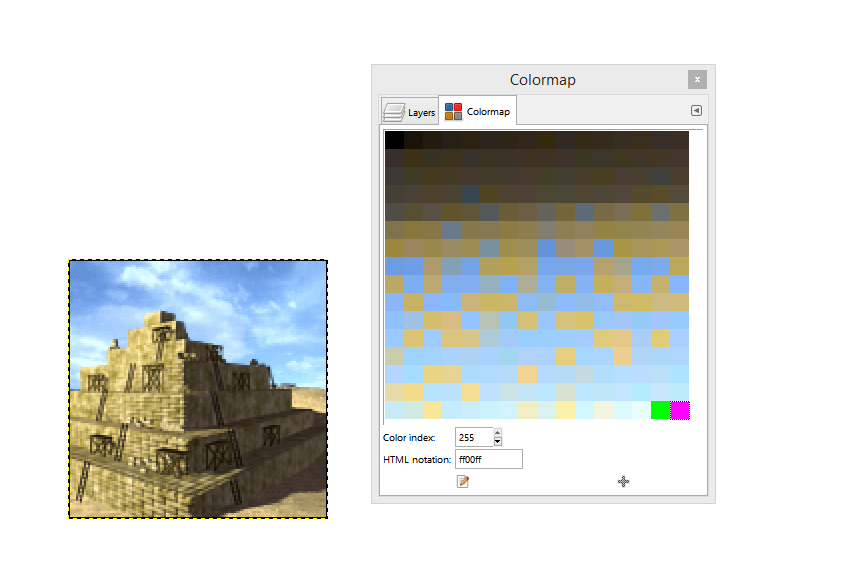
T-mun's Tech Icons

T-mun... Palette indexed Slots are what has been causing your problems.
The same Black Colors were set as the transparent colors using the palette indexed Slots for your Flight Tech. I tried to explain this in my Post #12:
T-mun... The Tech Images use the same Transparency Slots on there Palettes as most of the Graphics Palettes use in the Game. The Magenta and Green Colors are NOT the issue. You can use any Colors you want but those two Slots are transparent.

The Main Reason Magenta and Green are used more often is because they are not usually used for most images. You could use the same colors that are also used in the image IF you know how to set them in the Palette again, indexed as the Transparent Colors.

Other than this, I believe you are using Gimp and it requires some different procedures than other Graphics programs. Here, the Palette is reversed for example. I believe you can get a newer version of Gimp that does not do that.
 
Yes it's Photoshop. I don't know why it shows the palette reversed and I don't know how to put it in an other order.
I know why Civ files use green and magenta, and I know most of the files use transparency slots, what I didn't know is why my large tech icons showed OK with a wrong palette. In fact, if I'm not using pure black (O,O,O) then I can keep black slots in the end of my palette right? No need to correct them as I did yesterday, and I'm still not sure I corrected anything because of the reversed palette...
 
Yes it's Photoshop. I don't know why it shows the palette reversed and I don't know how to put it in an other order.
The palette isn't reversed, it only shows the index numbers in descending order. Other graphics programs like GIMP & PSP show the palette index numbers in ascending order. As long as index slots 254 & 255 contain the colors you want as transparent, then the actual position in the color table is irrelevant.

I use PS almost exclusively and I never really understood why Adobe chose to present it this way. Also, while I love using PS to create and modify graphics, working with palettes as they relate to Civ is not very intuitive. I would recommend using another program to manipulate your palettes. Either a palette editor or another graphics program. I personally use GIMP. It's free and working with palettes is so much easier than PS. I'll do all my graphics work first in PS, save the file as .psd, then open it with GIMP, index the image, make any palette adjustments, and then save as a pcx. Kyriakos also has a good tutorial for GIMP and palettes in the guide section.

In fact, if I'm not using pure black (O,O,O) then I can keep black slots in the end of my palette right?
If there is no black (000000) or any colors very close to black in the image, then yes, you could use black as your transparency colors. In fact, even if there is black in the image you could still use black as the transparency colors, but you would have to make sure that the black in the image is an index number from 0-253. If it's index 254 or 255 then it will show as transparent. As I said previously, why bother messing with this when magenta and green are SOOOO much easier.

Just curious about the TopGun image - wasn't it already indexed with the correct palette to use as a unit Civilopedia pcx? Did you switch it back to RGB and then re-index it?
 
I have checked in Gimp and my icons seem to be OK.

Laurana Kanan: thanks for the info about PS showing the palette in descending order. It's good to know because PS allows me to force only the first colors (which are the last colors of the palette), so if I want to have magenta and green I can only put them here and nowhere else.
Not sure about the TopGun image, I thought it was a splash pic only for the CFC thread, but maybe not. I have to check that. I made it a loooong time ago and can't remember at all.

EDIT: Here's the original file (see spoiler). The Hurricane's Large pedia pic didn't look like this one (not the same angle, and a white background).

Spoiler :
 
Glad you have your images checked out T-mun.

Some years ago Gimp was causing problems for some people and I thought it also showed a descending color palette. Now that I think about it, I believe the problem was saving palettes.
The New version of Gimp is much better. Balthasar has been using Gimp for quite a while.

I always use Paint Shop Pro 9. It is much easier to use concerning palettes and images for the Civ Games.

I also have Photoshop but I prefer PSP for ease of use.

Use any program that works for you. Generally, People use what they are most accustomed to using and basically go with, "If it ain't broke, don't fix it" :)
 
Gimp seems to slow down my computer dramatically and has crashed just when I had finished checking my files, so I guess I will uninstall it. My computer is a bit sensitive to new programs :) I will keep PS now that I know it quite well.
 
You do have to keep saving your stuff as you go along with GIMP, because it will crash if you go too long without saving. On the bright side, that means that I sometimes keep copies of things that I normally wouldn't, only to find that having it comes in handy later.

GIMP has the advantage of being free, and quite capable. Doesn't do as well as others at saving bmp maps. Turns out that any good image-processing program will do the trick for indexing.

This is why Civ III is still the most moddable game available, & why so many folks continue to create things for it: it can be endlessly accessorized! No specific program required.
 
This is why Civ III is still the most moddable game available, & why so many folks continue to create things for it: it can be endlessly accessorized! No specific program required.

Yes, and you do a wonderful job at accessorizing it :)
 
I prefer GIMP for several reasons. As others have said it comes down to which tool best fits your style of production. couple of tricks i learned -

While it's still in RGB mode make a border around your pcx that is the green & magenta. Index it. Trim the borders. You've now got 2 colors in the palette that are nowhere in the image. You may need to rearrange what slot they're in, but they're there.

It is possible in GIMP to tell the program to index to a maximum of 254 colors. It still makes a 256 color image. but you've got 2 empty slots in the palette. I imagine many other graphics manipulation programs can do the same.
 
Interesting... this has gotten off into Graphics programs.
ALL OK... as I mentioned... what ever works for YOU is OK.

If you understand the Palettes and can work with them in YOUR Graphics Program... Cool.

To get back on Topic... Great Tech Images T-mun
 
To get back on Topic... Great Tech Images T-mun

Thank you Vuldacon. I hadn't been working on Civ-related graphics for a while and was a bit rusty... I have used the "force palette" (or whatever it's called) many times when I made the first pieces of my own Interface graphics (still unfinished), and got so used to put the two transparency slots that I just wouldn't think of them after a while, just put them in automatically.
 
T-Mun - OMG! :wow: I can't believe a solution to my PS rearrange color table problem was staring me in the face for years and I never even saw it until I read your comment about "force palette" and something just clicked. When I first started making custom Civ graphics back in '09 I was always frustrated that PS didn't allow you to move colors (e.g. magenta and green) to different locations in the color table so I just gave up and used GIMP instead to do the indexing.

The solution, though, was so simple it's embarrassing. Create and save a custom .act file with magenta and green colors forced into positions 254 & 255. Load that whenever indexing an image/graphic and voilà, the color table is setup perfectly! Now, not only can I eliminate several intermediary steps, but I can ditch GIMP as well! :clap:

It might have been inadvertent, but thank you for the inspiration! :thumbsup:
 
T-Mun - OMG! :wow: I can't believe a solution to my PS rearrange color table problem was staring me in the face for years and I never even saw it until I read your comment about "force palette" and something just clicked. When I first started making custom Civ graphics back in '09 I was always frustrated that PS didn't allow you to move colors (e.g. magenta and green) to different locations in the color table so I just gave up and used GIMP instead to do the indexing.

The solution, though, was so simple it's embarrassing. Create and save a custom .act file with magenta and green colors forced into positions 254 & 255. Load that whenever indexing an image/graphic and voilà, the color table is setup perfectly! Now, not only can I eliminate several intermediary steps, but I can ditch GIMP as well! :clap:

It might have been inadvertent, but thank you for the inspiration! :thumbsup:

:goodjob:
In fact, it's even easier than that. I'm not sure I can explain it clearly and maybe it differs from one version to an other, but I don't even save the palette as a .act file. I just go to Image/Mode/Indexed colors, a popup window apears, I choose Local palette (not sure what's the difference between adaptative/perceptive/selective), and in front of Forced it's written "None", click and select "other", a blank palette opens, choose green and magenta and you're done.

AND NOW... the best feature ever: it keeps those two colors in memory until you choose an other color. Which means you can do a LOT of work without selecting these colors again, just choose "other" and they're in. YAY!


You can also choose the last palette you've created (see picture), which means you can apply exactly the same palette to Large ans Small icons.
 

Attachments

  • Indexed colors.png
    Indexed colors.png
    16.7 KB · Views: 84
:goodjob:
In fact, it's even easier than that. I'm not sure I can explain it clearly and maybe it differs from one version to an other, but I don't even save the palette as a .act file. I just go to Image/Mode/Indexed colors, a popup window apears, I choose Local palette (not sure what's the difference between adaptative/perceptive/selective), and in front of Forced it's written "None", click and select "other", a blank palette opens, choose green and magenta and you're done.

AND NOW... the best feature ever: it keeps those two colors in memory until you choose an other color. Which means you can do a LOT of work without selecting these colors again, just choose "other" and they're in. YAY!
Lol, sorry, I guess I didn't explain that very well. That's what I tried to write up above. I just saved it as an .act so I had a copy on hand since I use forced colors for other projects. I just didn't think about using it for Civ graphics years ago and once I started using GIMP, never thought about it again - that's what was so embarrassing. Also, not all Civ graphics use magenta and green as the default transparency colors. Some use magenta and purple, some use only magenta, and I think I remember one or two that use black.

I don't think I've every used adaptive, but perceptual and selective are similar. I use selective for graphics that will be online since it preserves web colors. I'd stick with perceptual for Civ graphics though. "Other" is "Custom" in my version - same thing though.
You can also choose the last palette you've created (see picture), which means you can apply exactly the same palette to Large ans Small icons.
Just a suggestion - I wouldn't use the same palette for the large and small icons. Reducing your original image to 128x128 and reducing your original image to 32x32 is going to produce two different palettes when indexed. Applying the large palette to the small would cause some color oddities in the image.
 
Lol, sorry, I guess I didn't explain that very well. That's what I tried to write up above. I just saved it as an .act so I had a copy on hand since I use forced colors for other projects. I just didn't think about using it for Civ graphics years ago and once I started using GIMP, never thought about it again - that's what was so embarrassing.

Oh... ok, sorry :lol:

Just a suggestion - I wouldn't use the same palette for the large and small icons. Reducing your original image to 128x128 and reducing your original image to 32x32 is going to produce two different palettes when indexed. Applying the large palette to the small would cause some color oddities in the image.

It's just that the small icon uses less colors, so your palette will be very poor and will have to be completed by unused colors. Basically, since you use the same image for both files, they have a lot of colors in common, and I have never had any problem doing so.
 
It's just that the small icon uses less colors, so your palette will be very poor and will have to be completed by unused colors. Basically, since you use the same image for both files, they have a lot of colors in common, and I have never had any problem doing so.
They might have "similar" colors, but more likely than not none of them will be the "same" because of the difference in the amount of interpolation that PS has to do between the two sizes. At 32x32 you're still conceivably looking at 1024 unique colors created by a bicubic algorithm designed to retain as much detail as possible. That should be more than enough to create a palette of 254. So unless the original image itself was color poor I can't see why you'd need to add unused colors to the palette. :dunno:

In any event, at 32x32 the differences are subtle and most people would probably not even perceive it even when comparing. Here's two small tech icons - the first uses the same palette as the large icon and the second uses its own palette:
:lol: *nearly identical*
I guess it comes from me being a tech designer, but I can tell the one on the left looks a little off. But, if you're happy with your results it doesn't really matter. I'll stop derailing your thread now! :mischief:

Hugh... my eyes hurt and I see very little difference. At that size, honestly, it's hard to tell!
 
Top Bottom