Z-Advisors -- True People

Zyxpsilon

Running Spider
Joined
Oct 29, 2009
Messages
3,250
Location
On Earth
EDIT(17-01); New alternate "GreyScale" package is now available in reply #13 below.

EDIT(13-01); Updated to second version with three new buttons for the DiploCorner and a more colorful TimerMeter.

Here's what this tiny graphics package is all about...
UPDATED with the full set of 7 advisors per category (one for each Eras), as seen further down below in reply #3.
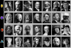
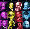
ADVISORS..., new!
Library Link *** DELETED.

Changes the "Comic strip style Vanilla versions" advisor(s) images to real persons with
a "gouache" art design in mind (similar to what Firaxis did with most icons in the game itself.
Also, the re-coloring process of these pictures is tied up with the concept tags (Economic/Yellow, Foreign/Magenta, Military/Red, Science/Cyan).


Easy, quick. Enjoy!

*****

If you have any requests, comments, etc -- feel free to post here!
 

Attachments

  • Advisors_snap256.png
    Advisors_snap256.png
    196.9 KB · Views: 3,983
I wondered when someone does something this kind. Good work!

A bit of salt though. Is there really no economist before Smith? It will be weird to see him in classical/medieval era.
There should be pictures of earlier merchants or rulers good in economy. Marco Polo? King Midas ;) ? (he is a mythological figure, but probably based on a real person...)
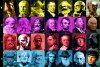
Also, it would feel weird to me to have Charlemagne as an advisor. One of the greates Emperors in the west - a mere advisor?
Same goes for Napoleon and Julius Cesar. There are great generals that were not rulers. For classical period you may use Scipio Africanus (though it will be of course harder to find a picture), for medieval period Belisarius or Jan Zizka
Belisarius would be good for both classical & medieval period (lived in VI CE), but I think he might be already used as one of the great generals.
That reminds me - one more argument to get rid of Napoleon - imagine him advising you in the game where you fight against the France..
 
Thanks... but let me tell you - it has already grown way beyond the current three "standard" people!

I have solved the seven eras switching problem through a quick edit of Roger Bolsius' AdvisorImageInclude.lua file and all these DDS will be correctly loaded from his mod in their own Art/Folder. Can't reach him anywhere to ask for proper permission to alter his work, but i doubt he'll be upset about it.

I should have it all ready in a few days.
While you or anyone wait, i'll be coming back to post a thumbnail of the new stuff later on today.

PS; as for the Bonaparte & Caesar coincidence, i was quite aware of it at first and figured nobody would really care. I'll see what i can do & provide alternatives too once ready. Which is to say, i'll also take (if i can) requests or special demands from anybody else, btw.

..... soon,,

--- that was fast, so here they are, as usual LR-TB;

Economic: Tutankhamon, Solon, Robin Hood, Smith, Marx, Friedman, C3P0 (just for fun, btw)
Foreign: Socrates, Cleopatra, Charlemagne, Périgord, Abraham Lincoln, King, Jean-Luc Picard (STNG, the best diplomat in SciFi shows)
Military; Zeus, Caesar, King Arthur, Bonaparte, William Blake (I know he's a poet - but think), Patton, Darth Vader
Science; Maya talisman, Aristotle, Leonardo DaVinci, Isaac Newton (replacing Galileo), Darwin, Einstein, Spock (STOS Vulcan)

I thought it was appropriate to end this series of new advisors by keeping some photographic reality for the last... and, i wouldn't dare altering in any way the pharaoh golden (as in rich, very rich) tomb mask!

So later for the final upload for these.
 

Attachments

  • Advisors7_snap.jpg
    Advisors7_snap.jpg
    367.5 KB · Views: 1,612
A mod like this would be good if it were Civ-Specific.

For example, Germany would have Einstein as the science advisor, but France would have Louis Pasteur and America would have Thomas Edison.
 
True, but can you imagine the huge amount of work involved for just 15 different Leaders, each having 4X7=28 advisors?!?
A whopping total of 420 images to rescale at 180x220 pixels, all possibly filtered with gouache concepts, parsed through a DDS plugin to save every last of them.
Then, there is the issue of re-coding the main Lua/Xml files for advisors to account for the currently played Leader.

I *AM* patient... but not --that-- patient.

Nothing stops anyone from having some (if not many) of their own though.
 
Hi, knowing a bit about illustration here's a few tips, take it with a pinch of salt and reflect on them :

1- Try to always always always use original materials, you are using materials that are not yours. The reason why it's important to use original materials is to have the maximum degree of control. Stock images are big no-no always (unless you are in a rush or if you can pull it off, I'm sad to say that this is not the case)

2- Always aim to have a uniform visual language for a group of illustrations. Mind the first point about controlling your illustration as well. It is a terrible idea to have photos for the last one, it breaks suspension of disbelief. Also Robin Hood is by all means is not within the language (everyone else is not interacting with the viewer, and you took it from another illustration). Other characters are made of stone, others are looking at the viewer, some are looking at the distance. It's sort of a mess. You really have to encompass every single parameter before hand (there can't be an odd man out within the group). Also, and again, I stress that you actually illustrate this using an specific medium, not compile different images made with different mediums (medium is everything).

3- Never use Photoshop filters.

4- There are smarter ways to use color coding than monotone.

I am a Graphic Designer specializing in Illustration, the reason why I'm telling you this is because I've already been told all of these things to the death in college and I'm seeing here a defined concept that could be good if you work it correctly, but as it stands it looks fan made (it could look like it's made with AAA standards).

Think about what I said if you can.
 
I am always open to constructive criticism and suggestions... i made my choices and will consider your comments if & when necessary.
Now on to the "reasoning";

-- Uniformity? My aim was to re-create the gouache design already present in most vanilla assets but with a sense of Economic(Y), Foreign(M), Military(R), Science(Cyan) consistency. The Future Advisor versions were more a wink to SciFi concepts and there was absolutely no way in hell i would even have tried "ruining" each of these splendid pictures of excellent actors such as Leonard Nimoy aka-Spock!

-- Monotone or filters... i had some decisions to take and after making some extensive work on a number of test concepts that's what i ended up with. I use Gimp exclusively. Cuz, it's free.

Art is & always will be a matter of personal taste while - i have to honestly admit - the weird Civ fan in me simply does what he likes the most.

Sooooo Thanks, i respect your opinions.
 
Have it your way, but if there is one thing that you pay for when going to an art program is for feedback on your work.

Unless you actually illustrate them, you can't say that you applied a gouche aproach to the illustrations (taking stock photos and aplying a filter is just lazy, I'm sorry). You either color them yourself or you don't, anything in between is kitsch. The aproach makes sense, that is true, but the real graphic designers at Firaxis drew all the in-game illustrations from scratch (the photos were used as reference).

For the design rationale that the designers used for Civ 5 I recommend you listen to the podcast on art, in which they explain the why they used WPA as an inspiration for the technologies art (to give the feel of progress). The rationale of color coding them according to it's color is rather simplistic, you shouldn't do the very first idea that comes into your mind, you should do the 5th idea or the 7th idea, mostly because the first idea will be the one everyone probably already had.

If you are working with color coding, there are better options to monotone, you can work with a pallete that goes specifically within a tone and still have it color coded, you can even work with a handful of colors that have the same grey, but going monotone is too obvious.

The Sci-fi advisors are a debatable idea, I get the wink, but it's both lacking uniformity and it's hard to keep a straight face when you have historical figures lined up with Mr. Spock. But if you are making sci-fi advisors I recommend comming up with them yourself. Using the creative works of others just doesn't have the right tone (not to mention Darth Vader and Mr. Spock don't live within the same universe... or copyright... or at all, why are they lined up with Martin Luther King?, Dr. King is real!, catch my drift?). If you really want to have Sci-fi advisors that are based on the characters you selected, then you should illustrate characters inspired by them, it's a smarter aproach that will not get you a copyright infriction (because then it's a parody).

I get that you use Gimp, but it really doesn't matter (though you should switch to photoshop when you have the chance), you could use elements, alchemy, painter or paint for all I care, it's the design skills that are important, not the program (hence why it's always a terrible idea to use filters).

Art is a matter a personal taste, Design is not: either you design it well or you don't.

Keep it up though, you have the drive to design, I'm not telling you all this because I get a kick out of being mean, I see great potential. But Graphic Design and Illustration are demanding professions that rely 100% in feedback by your peers, I am giving you feedback, you can take it or not. But before replying study what the designers at Firaxis did and compare it to what you did.
 
Yup, but that's the whole point with a "True People" mod... someone needs to use some Historical figures (to be not only fair but accurate also!) and when the future comes into consideration, there's nobody real enough to even include -- thus, the sort_of Parody (i'll admit) with Sci-Fi characters.

Sepia, Greyscale, pure photographic reference images, pixelized, filtered - i tried plenty. It's the source material that enforces a choice... again, if the TRUE factor must have meaning.

Creativity on the other hand would certainly be a rational option in *another* kind of Mod (Say for a Z-Advisors_Fictional Characters) but haven't Firaxis design staff done it already with two "Comic-Strip-Styling" (IMHO) women & men?

I went for solidly obvious alternatives with Newton, Einstein, Patton & most everybody else. Sure, the Maya Talisman or Zeus face might seem somehow incoherent in the grander scheme of things -- very small details to me.
 
I think you had a really good idea to begin with here, and I agree with you, I'm not a fan of WPA (ok, I am a fan, but it was poorly done in Civ 5, with the rising sun brushes in the back).

There's a lot of good choices here, to have advisors that are specific to the eras with color coding and a gouache feel was a step in the right direction and actually it makes more sense for Civ 5. How to process the idea is the tricky part: how to color code correctly and originally, how to deal with characters that are not specific to certain civilizations, how to actually illustrate them, etc.

I have been working for months on a Doom inspired 17 part illustration, and every time I scale it back little by little, because I want to see it done at some point. I think you had a good design with the first delivery of the proyect, there was a good uniformity and the concept was distilled well enough, the second was trying to put all eggs into one basket and the visual language got dispersed among too many stock photos, which had different styles, qualities and types of characters (fictional and historical). This second aproach is the one that truly needs more work in order to make the proyect make sense as set.

I do feel that in moding, mod makers should put more love into the graphical part, that they should study the original visual codes and try to use them (or at least go to identifont.com and try to see what font was used). I would suggest you keep working on this, because it's a good idea that needs more work in it's expanded form.

"I went for solidly obvious alternatives with Newton, Einstein, Patton & most everybody else. Sure, the Maya Talisman or Zeus face might seem somehow incoherent in the grander scheme of things -- very small details to me."

Be careful of the details, midichlorians and Jar Jar Binks turned the Phantom Menace from an ok-movie into a pile of garbage. The devil is not in the details, but in the amount of ambition that requires said details, if you expand your proyect, make sure it still makes sense and can still control it.
 
Ya know, you might be right after all... let's see if i can patch up a secondary "non-official" alternate version (while trying to follow through your general suggestions as much as possible) that i'll simply zipup in a subsequent post below. For anyone to grab, since the only step necessary is to simply drag/drop such new files straight into the usual mod folder.
Let's see, 7 Eras, 4 categories... yup, 28 - only. :)
Thanks again with your kind help.
 
Sooooo (OrsonM), how's that for design_packaging consistency?

I went for plain'ol'reliable B/W's photographic principles, absolutely no filtering, some fine-tuning with contrast/brightness stability, no obvious blurring effects to ruin their reality, balanced as much as i could within each Eras, still plenty of real people and a few minutes_hours of dedicated time in *Free* Gimp.

Added or changed... Pythagoras, Socrates, Aristotle, Cleopatra, DaVinci.
Re-Introduced... Future versions with Bill Gates(M$_filty rich), Jim Bohlen (Green Peace co-founder), Bruce Lee (Martial Arts superstar) and Stephen Hawkings (The Universe).

Now, if you'll just excuse me i've got some important things to attend to - namely; Eras_Corner, UI_Green (+ others!) recolorings, LeoPaRd concept & development, 1upT tricky re-coding & even some more.

PS; Anyone willing to grab these new files is welcomed to do so... all you need to do is drag & drop everything in the Art folder of the installed MOD to replace the initial Gouache/Colors set.
 

Attachments

  • Advisors7-Greys_snap.PNG
    Advisors7-Greys_snap.PNG
    162.3 KB · Views: 919
  • Advisors_Greys(v2).zip
    407.4 KB · Views: 311
Sorry my man, still not there. That's not visual consistency, and you took the fun out of the original idea.

I'd suggest either commiting fully into it or just, you know, going back to the earlier projects. A full commitment into a project means about 20 to 40 hours to finish the entire thing.

Here's a few illustration guides and tips, hopefully they'll help you more with this.

http://www.michaeldashow.com/tips.html

If you are really interested on how to improve this, you know, tell me, I might be able to help you more, but I'm not sure of how much commitment you want to put on this.
 
Fine, have it your way!
I'm committed to *MY* stuff entirely... if it doesn't suit someone's idea of a "professional" design in as much as what Vanilla offered - again - they're all most welcomed to fix their own better Advisors.
Opinions are to be taken gently (even by me) for what they really are; observations. As for the "Still a lot of work to do here..." comments you seem to obsess about, lemme insist, it's an opinion. Just stop, i got it earlier within your very first interventions here & in the Z-Eras thread.

My initial premise was to simply alter the Comic-Strip-Like Advisors to something **I** wanted to have on my UI. If others were to enjoy it as much, good. If not, too bad - life goes on.

Absolute perfection has never been something i consciously aim for. To the contrary, i trust instinct (or possibly artistic skills, no matter how you or anyone else might perceive my results) to lead me into some fair enough designs or concept.
My freedom of expression (or creativity potential) is at stake. People hate or like as usual -- I couldn't care less either ways (Although, someone nice enough bothered giving a positive reaction in the Downloads section of comments which was certainly appreciated.) for an extremely simple reason; Mod done, next.

I was trying to make a point (silly, i know - but you asked!) with the B/W version so, you didn't get it. Fine, too bad... i'm goin' fast forward full-steam ahead, damn the Torpedoes!

PS; Thanks for the link, went there & already downloaded some PDF just for curiosity sakes.
 
You made the black and white version as a joke?

That's a bit of a waste of my time here my man, you are either professional or you are not. I know about design, I know about Illustration and what I had to say here was not just a filler comment about how nice this was. I gave you feedback like I probably would have to a fellow designer. I guess now I know better.
 
You made the black and white version as a joke?

NO.
If you know so much about design & illustration - give us all the privilege to witness your artistic skills by proving it with some MODs of your own.
In the meantime, just watch me - cuz, i'm not through yet with plenty of other things.

The only fellow designers i learned to respect were teaching at FAS (Connecticut) in the early 70's and they're probably (well, such as in positive influences) responsible for this Site (That is Spiderman rescaled in a 64x48 pixels box for a cEvo Unit on the left side of its banner, btw) design & that MOD (Gosh, i loved X-Com games) for GalCivII & maybe even all the art (my bunk walls have Oil paintings, Aquarels, sketches, college port-folios, etc) & drawings i managed to crank out over the years.

I... too, may know better.
 
HaHa! Funnisest sh!t I have ever read. Is this MOD seriously worth the 5000 hours you guys just spent debating these isues! WOW! lighten up! Its a friggin' game!
 
Top Bottom