Kerfuffle
King of the Whale Sharks
 Completed Maps
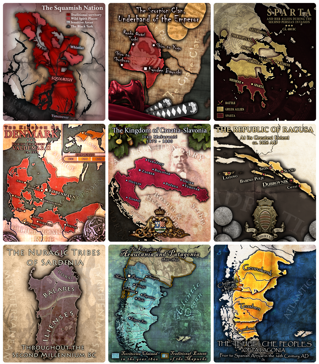
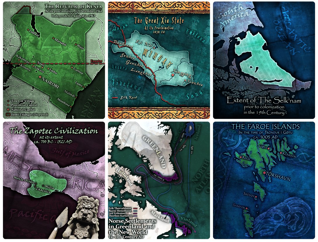 Completed Maps
 )
)
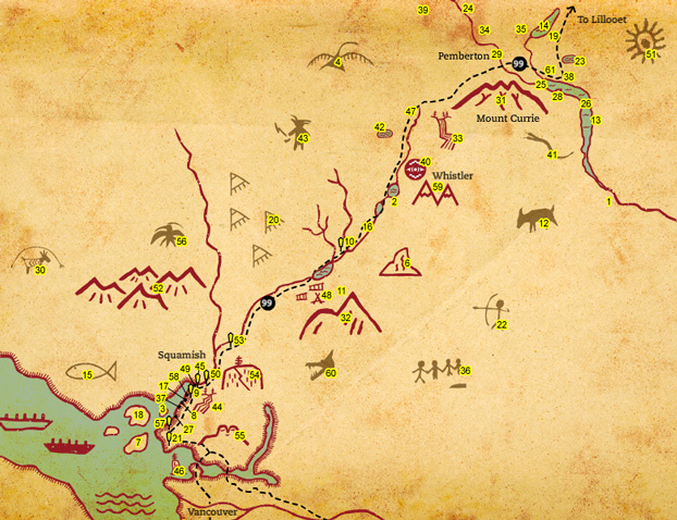
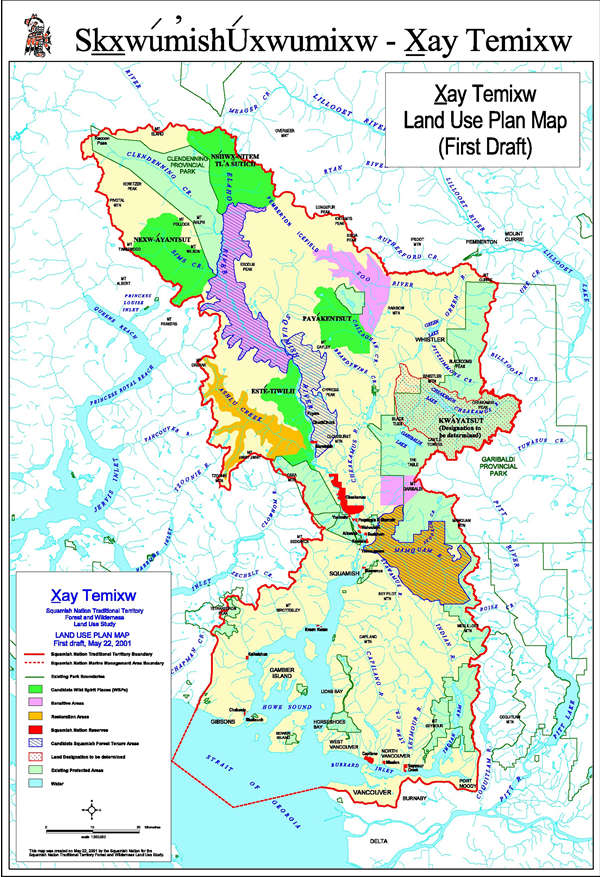
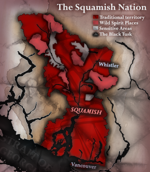
I could really use some help with the map for our upcoming Squamish mod. I have some source images I can send you if that'll help. Your Croatia map is incredible, btw.

One thing - there doesn't seem to be a drop shadow effect (or at least much of one) under the land in the map - it really makes a lot of difference. Other than that, fantastic work!
(Also, just because I can - don't suppose you could try your hand at a Mercia map? Just for no particular reason, you know.
 . Is there a particular time period or leader you have in mind? (You can pm that info to me if you don't exactly want to reveal that yet)
Sweet! We definitely need a map for Greenland.
---
I guess just exclude the Early Voyages and Europe for the most part, but it should serve as a good guide.
 This one may take a while longer than the others since I have different ideas for the map floating around in my head already.). I can also post some of the earlier files if you want to take a look at them as well (there's some tweaks and stuff that may look better than the current version and I can continue developing those ones if you like).
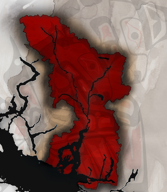
Looks really good! I also found this topographical map that could help add some texture/river location info:

 ))
))
")
Out of curiosity which Uni are you at in Sydney?
Just came to say you make very good maps!
Nice colour composition and I like that you used a leaf as a texture for the Squamish map.
Keep it up!