You are using an out of date browser. It may not display this or other websites correctly.
You should upgrade or use an alternative browser.
You should upgrade or use an alternative browser.
[RD] Daily Graphs and Charts II: Another 10,000 to come.
- Thread starter Cutlass
- Start date
I think we've found something that doesn't immediately break down into red vs blue, right?
The mix is definitely odder than many that you see. It's a trend partially like red blue, but with more mixing.
Lohrenswald
世界的 bottom ranked physicist
rip thread
here's from an experiment I did that I reported on in an exam I just did

It's about a "car" sliding down a slope.
X-axis says "angle [radians]" (of the slope), y-axis says acceleration. The blue one says "theoretical value" (meassuered from slope) the red one says "meassuered with stop-watch" (and length of the slope) and the yellow one says "meassured with doppler shift" (fairly complex process)
that they don't overlap is bad and I don't know why they don't
here's from an experiment I did that I reported on in an exam I just did
It's about a "car" sliding down a slope.
X-axis says "angle [radians]" (of the slope), y-axis says acceleration. The blue one says "theoretical value" (meassuered from slope) the red one says "meassuered with stop-watch" (and length of the slope) and the yellow one says "meassured with doppler shift" (fairly complex process)
that they don't overlap is bad and I don't know why they don't
hobbsyoyo
Deity
- Joined
- Jul 13, 2012
- Messages
- 26,575
Red and blue can be understood as essentially overlapping, depending on the confidence levels given to the error bars of the red line. A stopwatch is going to be a pretty bad measurement technique if operated by hand, so I would expect your confidence level to be pretty low for any given measurement, meaning that it is plausible that the 'real' measurement could be at the extreme ends of the error bars rather than clustered closely to the measured data points. Another way to look at it -
Let's say in one instance you have a computer trigger the stopwatch as the car passes. In this instance, we would still have error bars on the measurement, but we would be fairly confident that the 'real' measurement would be very close to what was actually measured rather than out on the error bar. This is because generally computers are stable and we do not expect much variation in how they measure things even as we still leave open the possibility of uncertainties.
Now in another instance you have a person measure the car with a stopwatch. In this instance, we do not expect the person to be very precise or repeatable. In this case we would say that we have low confidence in the measurements such that we would not be surprised if the 'real' measurement was actually way out on your error bar rather than very close to the actual measurement.
There are more formal, precise ways to explain confidence but they're beyond my understanding.
For Doppler shift, it is again almost overlapping the predicting value except in the last measurement. In this case you could either claim there are unknown variables either in your prediction itself or in the Doppler shift measurement technique.
I'm just spitballing though and I could be entirely wrong.
Lohrenswald
世界的 bottom ranked physicist
That sounds pretty reasonable. And it was a person meassuring with the stop watch yea (though not me)
I do kinda believe there were unknown variables of some kind, here's a figure for the last measurement

x-axis says time in seconds and y-axis says velocity in m/s. The velocity is calculated by the most dominant frequency meassured at each point in time in relation to the frequency meassured when at rest. The two spikes is related in some way with the car crashing to the bottom of the slope. At this angle (which I think was a bit more than 10 degrees) it bounced up a bit which is why there are two spikes I'm pretty sure.
Anyway the point is that we kind of expected the velocity to increase linearly from it was let go off until it crashed (because just gravity pulled it down), but as you can see the line isn't straigth
I do kinda believe there were unknown variables of some kind, here's a figure for the last measurement
x-axis says time in seconds and y-axis says velocity in m/s. The velocity is calculated by the most dominant frequency meassured at each point in time in relation to the frequency meassured when at rest. The two spikes is related in some way with the car crashing to the bottom of the slope. At this angle (which I think was a bit more than 10 degrees) it bounced up a bit which is why there are two spikes I'm pretty sure.
Anyway the point is that we kind of expected the velocity to increase linearly from it was let go off until it crashed (because just gravity pulled it down), but as you can see the line isn't straigth
hobbsyoyo
Deity
- Joined
- Jul 13, 2012
- Messages
- 26,575
Oh yeah, that makes a lot of sense. Depending on how narrow your measurement device's field of view is, it can totally pick up on the velocity of a part of the car rather than the average velocity of the entire vehicle itself. So as you say, you hit a bump and the bumper flairs up a bit and the device adds that bit of bumper velocity to the vehicle's average velocity as it can't tell between the two.
")
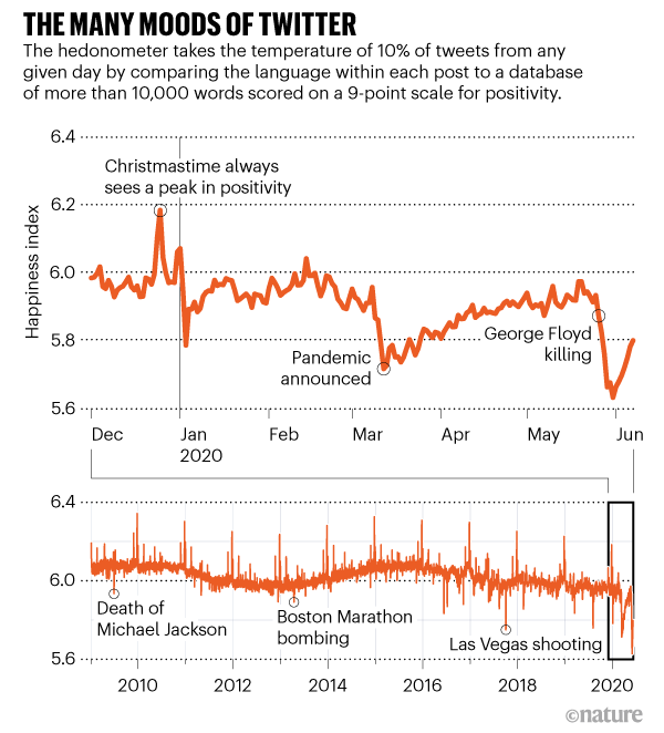
From Nature. I am not sure who "announced" the pandemic, we have been talking about it since the new year.
On March 11 the WHO declared officially that Covid-19 was a pandemy.
As getting mustard and ketchup after you finished your meal
The dip on the graph starts a couple of days earlier. But that still fits that the WHO did either prepare the PR to come with that statement and/or fits that the WHO was forced by newsmedia attention to declare it pandemic.
That newsmedia surge I guess from the rapidly rising deaths in Italy.
gay_Aleks
from the river to the sea, Palestine will be free!
it's a bit funny, doesn't this mean there's like ~70% of the population outright disbelieving the press in the U.K
I think it does, from the same article, 28% of the UK says "I think you can trust most news most of the time":it's a bit funny, doesn't this mean there's like ~70% of the population outright disbelieving the press in the U.K

Q6_1. Please indicate your level of agreement with the following statement: I think you can trust most news most of the time.
Base: Total sample in each market ≈ 2000, Taiwan = 1027
Disbelieving some significant sector, more likely. You have ‘sides’ one of which includes the Telegraph, Mail, Mirror, Sun, etc. while another includes the Independent and Grauniad, and so on.it's a bit funny, doesn't this mean there's like ~70% of the population outright disbelieving the press in the U.K
Paul in Saudi
Emperor
9-11 victims. It is rather large.

Spoiler for image :
Last edited by a moderator:

The Missouri-Ohio-Mississippi drainage is simple huge.
Similar threads
- Replies
- 78
- Views
- 3K
- Replies
- 3K
- Views
- 96K