- Home
- Forums
- CIVILIZATION IV
- Civ4 - Creation & Customization
- Civ4 - Project & Mod Development
- Civ4 - Fall from Heaven
- FfH2 Modmods, Scenarios, and Maps
- Master of Mana Xtended Mod
You are using an out of date browser. It may not display this or other websites correctly.
You should upgrade or use an alternative browser.
You should upgrade or use an alternative browser.
[Project]Flavoured City Screens
- Thread starter Sephi
- Start date
Valkrionn
The Hamster King
What are you using to make these? I'd like to eventually merge them, but will need quite a few new images. 
 will probably do. Didn't you also want to merge my arcane UnitAIs?
 Jabie
Wanted in Monte Carlo...
Wow. This looks really impressive.
xienwolf
Deity
probably a grey area.
unfortunatly there is no way to display a transparent picture in the center. (I tested it and it looked pretty good, but you couldn't click anymore to change which plots are worked by the city.)
I had thought that at first when redesigning the HUD, but the only way I could get the scale to work out properly for the top section lining up with the two side sections (which extend full top to bottom) was to have the image extend all the way to the bottom. I eventually realized that base Civ does the same thing. The secret is just to flag HITTEST_NO_HITTEST, or whatever it is called, for the DDS employed over that area. Then the user clicks right through it to the tiles below. If you wanted, you could even have the image not be 100% transparent in that section.
added pictures for Amurites (hopefully find a better one day) and Mazatl
hopefully. There is lots of potential, I am just lacking pictures :/
that quite interesting Xienwolf. Did you find a way to set the dds flag? Might be interesting in the future")
Looks great.
I bet people will come up with even better and more background pictures in time.
hopefully. There is lots of potential, I am just lacking pictures :/
that quite interesting Xienwolf. Did you find a way to set the dds flag? Might be interesting in the future
Hansebenger
KingKäs
- Joined
- Jun 18, 2009
- Messages
- 39
Mazatl:
Spoiler :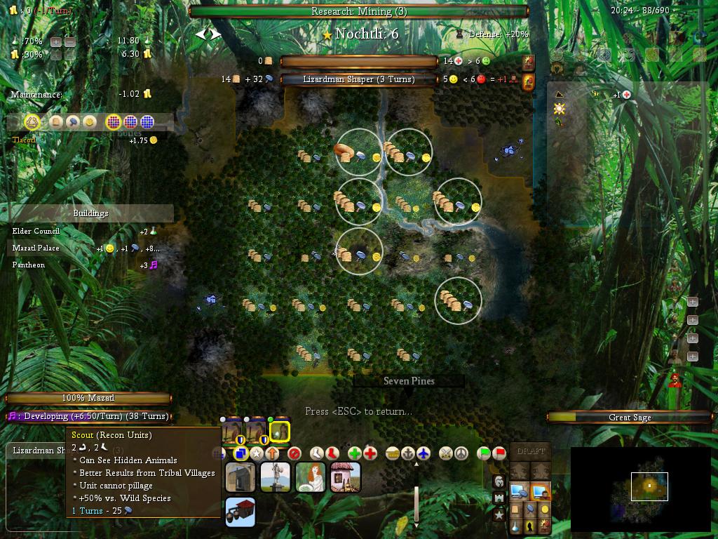
Are the Mazatl included in this mod ? Which module do I have to load for them ?
Valkrionn
The Hamster King
Haha, I was actually wondering the same thing. Hadn't seen anything about merging them in to WildMana yet.
xienwolf
Deity
Not sure what you mean by "set the dds flag" but here is what is used in FfH to place the center panel in the City Screen:added pictures for Amurites (hopefully find a better one day) and Mazatl
hopefully. There is lots of potential, I am just lacking pictures :/
that quite interesting Xienwolf. Did you find a way to set the dds flag? Might be interesting in the future
Code:
        screen.addDDSGFC( "InterfaceTopLeftBackgroundWidget", 'Art/Interface/Screens/Default/City_Top_Center_Background_Panel.tga', HUD_City_Left_Panel_Width, HUD_City_Top_Panel_Height, xResolution - HUD_City_Left_Panel_Width - HUD_City_Right_Panel_Width, yResolution - HUD_City_Bottom_Center_Height - HUD_City_Top_Panel_Height, WidgetTypes.WIDGET_GENERAL, -1, -1 )
        screen.setHitTest( "InterfaceTopLeftBackgroundWidget", HitTestTypes.HITTEST_NOHIT )
        screen.hide( "InterfaceTopLeftBackgroundWidget" )
As you see, the Y dimension is Y Resolution minus the top and bottom panel, so stretches full screen length. If you open the FPK and look at City_Top_Center_Background_Panel.tga you'll see there is a large blanked out section which overlays where the city and workable tiles will appear. I could have used a dds instead of a tga with everything else being exactly the same, the reason I chose to use a TGA instead of DDS is the silly restriction on the dimensions being a multiple of 4 or whatever it is for DDS files.
thanks Xienwolf. Maybe the restriction of dds being a multiple of 128 is for speed reasons. Or they like to do things funny.
The Mazatl aren't included yet, but soon they will.
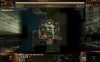
This is the new financial advisor for the sidar (every civ gets a unique one)

The Mazatl aren't included yet, but soon they will.
This is the new financial advisor for the sidar
(every civ gets a unique one)Spoiler :
Attachments
Fafnir13
King
Has the Mazatl unit art improved at all? I tried FF a long time ago and found their models rather jarring. That and their swamps spawned at an annoyingly slow rate.
Anyways, certainly a good background for their city screens. Nice and leafy.
Anyways, certainly a good background for their city screens. Nice and leafy.
I have changed how the swamps spawn. The random spawns are still slow, but jungle and wetlands grow much faster if other jungle wetlands or swamps are nearby. So as Mazatl you still want to move towards Jungle as fast as possible while most other civs try to keep away from the jungle.
new financial advisor for the sidar
Debt collection from out of nowhere!
Lord Tirian
Erratic Poster
Hmmm... there's something I sort of dislike about the flavoured cityscreens - they don't look a lot like an interface.
I love the FfH2 interface to bits, because it has fantasy decors, borders, progress bars and all these things - but it's still very "interface-y" (which is essential for an interface, I think). Dune Wars also has a new city screen, which has a desert theme, but uses a sky as header, an arch for the map view etc. to sort of make clear "what's what". The flavoured city screens here tend to look a bit too much like landscape, where you happen to have an interface.
I think some "interface-y" elements to line out the various areas better could help the overall look & feel.
Cheers, LT.
Some I like, some I do not. I prefer the more "indoorsy" types. So even for the "outdoorsy" civs, like the Doviello or Ljosalfar, I still think an "indoorsy" theme would be better, perhaps the inside of a yurt decorated in lavish animal skins, illuminated by a few candles or an indoor campfire. Something to give the ambiance of being inside one of the buildings you see on the city screen, making plans at night.
I might be convinced to conjure up some 3d images if you are having trouble finding them..
I might be convinced to conjure up some 3d images if you are having trouble finding them..
Hmmm... there's something I sort of dislike about the flavoured cityscreens - they don't look a lot like an interface.
I love the FfH2 interface to bits, because it has fantasy decors, borders, progress bars and all these things - but it's still very "interface-y" (which is essential for an interface, I think). Dune Wars also has a new city screen, which has a desert theme, but uses a sky as header, an arch for the map view etc. to sort of make clear "what's what". The flavoured city screens here tend to look a bit too much like landscape, where you happen to have an interface.
I think some "interface-y" elements to line out the various areas better could help the overall look & feel.
Cheers, LT.
That's a good point (although i do not know exactly what you mean with interface-y). I agree in Dunewars it is solved quite, but they don't have 20+ civs
I added some Elements back to the cityscreen.
Spoiler :
@Neomega
I can use ALL material you got. For many civs I was happy to find anything at all.
Attachments
Jenaelha
fields of Elanor
The civ flavour is a good idea. At times I wish I could see the leader art during the game, too, to help re-enforce my role playing.
xienwolf
Deity
I contemplated replacing the Civ Flag with the Leader Image. Would be pretty dang easy to do, and personally I'd rather see my pretty face than an icon. Except in the case of Decius, it'd still inform me which civ I am playing as just as readily. May be worth looking at for one of the Player Option slots if Sephi doesn't already have plans for them.
Fafnir13
King
I prefer the flag. It connects you to the little flags on your units without any level of uncertainty. Leaving it to the diplomacy options seems fine to me.
As for the new backgrounds, there's a way to turn them off using the special interface thingy, right? They look nice and shiny, but (as Lord Tirian said) they don't look like an interface. I think the major problem is that all the extra bits (the bars, lines, border of random boxes of info) don't mesh with the background image. If it was possible, adjusting the color of those items to match the civs theme would help to bring it all together.
As for the new backgrounds, there's a way to turn them off using the special interface thingy, right? They look nice and shiny, but (as Lord Tirian said) they don't look like an interface. I think the major problem is that all the extra bits (the bars, lines, border of random boxes of info) don't mesh with the background image. If it was possible, adjusting the color of those items to match the civs theme would help to bring it all together.
Similar threads
- Sticky
- Replies
- 234
- Views
- 16K
- Replies
- 0
- Views
- 663
- Replies
- 8
- Views
- 4K