2K Greg
<span style="font-weight:bold; text-decoration: un
- Joined
- May 24, 2010
- Messages
- 370
You'll have to excuse me for using two exclamation points and then another exclamation point later all in a single thread title, but the fact of the matter is that I am actually that excited to reveal this one to you guys. The first time I saw this feature in an early build of the game, I think I might have actually made this face: 
This is, almost without a doubt, my favorite thing about the interface in Civ V. It's just that awesome. Here's the article:
http://www.civilization5.com/#/community/feature_strategic_view
And since people really appreciated it last time, here is the article for you iPhone dudes:

This is, almost without a doubt, my favorite thing about the interface in Civ V. It's just that awesome. Here's the article:
http://www.civilization5.com/#/community/feature_strategic_view
And since people really appreciated it last time, here is the article for you iPhone dudes:
Spoiler :
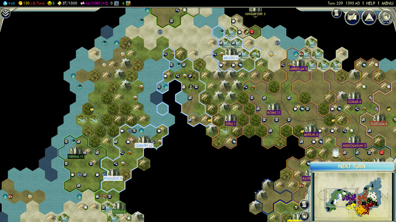
I am very excited to reveal some screenshots of a really cool feature in Civilization V that has not been shown anywhere else. I present to you "Strategic View."
What is it, you say? Strategic View allows you to view your empire in a very clean, easy-to-read fashion. By default, each hex has icons for special resources, improvements, and any units in the tile. You can also customize the view by selecting only a single icon to be shown. So, if you want to get an overall view of how your military units are deployed, you can turn on the option to only show units and see the information you need without any extra noise.
In addition, you can enable different "overlays" in Strategic View to make it even easier to find what you need. For example, turning on the "unit type" overlay to have each hex colored based on if the unit in its square is melee, ranged, artillery, and so on.
Check out the screenshots below for examples of how this awesome feature looks in the early, middle, and late game and post your questions and comments about Strategic View in the Civilization V 2K Forums
Screenshots


 You got my expectations up with your description, but seeing the screenshots was like looking back to the 1990's, why?


