Dark_Jedi06
"Deus ex Machina."
- Joined
- Jul 19, 2006
- Messages
- 1,451
Editing the GameFonts.tga File with Photoshop
 A tutorial by Dark_Jedi06
Introduction
There are currently two other tutorials on this site that I am aware of that involve the editing of the dreaded GameFonts file, one with DTXBmp and another with Photoshop. My goal with this tutorial is to provide a detailed set of instructions on how to create images within the GameFonts file that are intended to flow with the original images created by Firaxis. This tutorial by smeagolheart initially introduced me to using Photoshop to modify the GameFonts file, however with this tutorial I hope to elaborate on some of the methods he used as well as providing new ones, including editing the alpha layer (as opposed to simply copying an already exisiting alpha image).
My goal is to hopefully help those modders out there with access to Photoshop and use this tutorial as a way of giving back to the CivFanatics community; which though I have rarely posted on, I have still nonetheless enjoyed much of the custom content produced by its members and lurked to no end. Throughout this tutorial I will assume some basic knowledge and familiarity with Photoshop on the part of the reader.
I. Setting up Photoshop
Begin by starting up your version of Photoshop (I am using CS3). We will first address some interface issues that will make editing the GameFonts file easier.
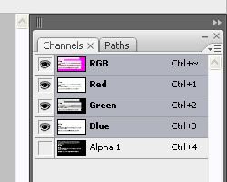
Under the "Window" drop down menu ensure that the "Channels" option is selected. As a personal preference I would also suggest having the "Layers" option enabled as well as it makes it much easier to select and manipulate layers.

Enabling the "Channels" option will it make it easy to switch between the normal RGB channel and the Alpha channel. With it enabled, there should now be a new pane at the right of your workspace that looks like this:
II. Acquire the GameFonts File
The GameFonts is a TGA file located at:
Civilization IV > Beyond the Sword > Assets > res > Fonts
There are two files here, GameFonts and GameFonts_75. The latter is just a smaller version of the images in the original GameFonts and show up when you hover over something in the Civilopedia. GameFonts_75 cannot be made by resizing the original GameFonts file so don't even bother, you have to repeat this process.
Copy both files into your mod's directory and make sure to maintain the proper file structure. Now we're ready to go to work, but first some important caveats:
1. The integrity of the purple borders and the cyan dot must be maintained without exception. Even the slightest shift in color will break nearly the entire file. This why you should edit only one image at a time, run your mod and ensure that everything is working before moving on to another image.
2. If you are creating a new "block", so to speak, and not just editing an already existing image, then you must make sure to place the cyan dot to the right of this new image in the exact location as the others. This is best achieved by copying and pasting an already existing one.
III. Creating the Image
First off, you need an image for your new resource, corporation, etc. The choice you make is vital as a lot of images just won't turn out nice. I would first try to harvest icons from other games (I will be displaying a use of icons from Heroes of Might and Magic V that I am currently working with in conjunction with a personal fantasy mod), if that fails then Google Images is your next best bet. Still, I would search for images that are already icons, this is because they are likely already detailed at a small size and crisp around the edges.
Once you've found your image, you're ready to proceed. I will be using this image from Heroes V to replace the icon for culture:

The first step is to cut away the background and make the edges as clean as possible. This is achieved through various techniques that depend upon the image itself.
Magic Wand Tool
This is the quickest method. The magic wand allows you to select the area around the image and simply delete it. You will generally want to set the settings for the Magic Wand as such:

The biggest variable is tolerance. The closer to 0 tolerance is the less the selection will "bleed" into other colors. In the image I am using, a tolerance of 0 means only the lighter brown will be selected, and the darker brown spots will not. Toy with the proper tolerance that will get the edges of your image as crisp as possible. In some cases you may have to manually remove certain areas where the Magic Wand removes too much or too little.
My image now looks like this:

Other Techniques
In areas where you may have to do some manual editing, the Lasso Tool is helpful, especially when the image is pixelated. The smaller the image is the easier it is to simply hand-draw with the normal Lasso, however the Polygonal Lasso works well on straight edges and the Magnetic Lasso works on curvy or irregular edges.
Now that we have the image, copy and paste it into the GameFont.tga file. Make sure to keep the original open, that way it can be recycled for the GameFonts_75.
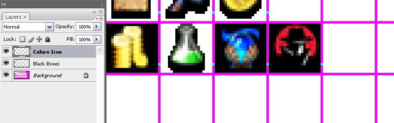
With the image now in the GameFonts file, create a new layer labeled somewhere along the lines of "Black" or "Black Boxes". This layer will serve to create a black background for your new icon. With this layer selected, use the Select tool to create a box that exactly covers the interior dimensions of the particular area you've decided to edit. Using the Fill tool, fill the area with black.

Now select your image on its separate layer. Under the "Edit" drop down menu go to Transform > Scale, scale the image down such that it fits in the box with a little wiggle room. The purpose of this is that we will be creating a shadow underneath similar to that of the Firaxis images (remember, seamless integration!). It should look something like this:
The image itself is pretty much finished now. The behind the scenes work with the Alpha layer will give it the desired effect. You can try toying with Smart Sharpening or other Filters to improve the image.
IV. Creating an Alpha Image
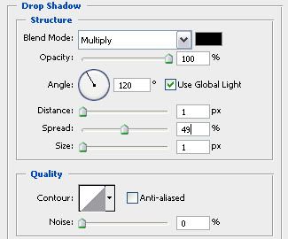
This is the important step that will give the icon a transparent background and a shadow effect like Firaxis accomplished. Start by selecting your now re-sized image and create a Duplicate Layer, name this layer "Alpha Image" or something along those lines to avoid confusion. Select the duplicated layer and under the "Layer" drop down menu select Layer Style > Drop Shadow and input the following values:
This is important! Zoom in very, very closely and inspect your work. If all has gone right, then when you zoom in your image shouldn't look any different, the black drop shadow should disappear into the black background. However. if you see even an a smidgen of that shadow overlaying the purple border then you have a problem.
To fix this, select both layers (the original and alpha) and see if you can maneuver them within the box such that the shadow no longer overlaps the purple border. If you can't, then you'll have to undo back to the original image and shrink it to a smaller size.
If the above is not the case then you are free to proceed.
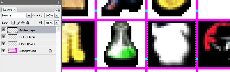
Select the alpha layer and create a new blank layer above it. In the Layer pane, hold down CTRL and select the alpha layer and new blank layer. Then right click on them and select "Merge Layers". This serves to remove the drop shadow as an effect and makes it part of the image.
With the newly merged layer selected, once again return to the "Layers" drop down menu, select Layer Style > Color Overlay this time. Leave the Blend Mode and Opacity alone and simple select pure white as the overlay color. Hit okay and return to the workspace. Once again check if any white is overshadowing the purple border.
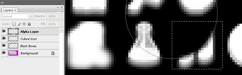
Create another blank layer and once again merge it with the Alpha layer (now overlayed with white) by the same process as used earlier. This once again removes the Color Overlay as an effect and instead makes it part of the image. With the Alpha layer selected, use the Selection tool to draw a box that fulfills the inner dimensions of the purple box, like so:
Use CTRL + C to copy the image, then, without deselecting, go to the Channels Pane at the right and select the "Alpha 1" layer. Everything now becomes black and white and the purple borders have disappeared, hence why maintaining the selection box is so essentially! If you are editing an existing icon, select your brush with the color black and paint over the existing alpha image.
Still maintaining the selection, you now have the area bounded by the purple completely black. Use CTRL + V to paste your previously copied image, the selection now confines itself to the outline of the image you just pasted. There are now some minor things to make sure the alpha is positioned right.

Don't deselect! Switch back to the RGB in the Channels Pane and check whether the selection outline lines up with the Alpha Layer from earlier. Odds are it doesn't. If that's the case, with the selection still in place, select the "Move Tool" and return to the Alpha 1 Channel. Using the arrow keys, nudge the image until its placed in exactly the same position as the RGB layer. Make sure you only move within the confines of the purple box (check this by noting the location of the selection in the RGB Channel and its relation to the purple lines).
The alpha is now set and should be in the proper position. Return to the RGB Channel and delete the Alpha layer; you should now only see your image. Save the image as a Targa (bottom of the file menu) and take a deep breath.
V. In-game Results
Now start up Civilization with your mod and locate your new icon, usually in the Civilopedia. Does everything check out? Are there purple squares where other icons used to be? If there are purple squares you've made a mistake; go back and check the integrity of the purple lines and cyan dots. If they check out, then you may have screwed up the Alpha Channel. If that's the case, then it's best to start from scratch. Always keep a PSD file just for this purpose, and don't overwrite it until you are sure the new icon has been added error-free. That way you can return to the file just before you began making the addition and start again.
Here's how mine came out, as well as a few other examples using this method (and other icons gathered from Heroes V):


Obviously still with the regular game content, my modding hasn't progressed much further yet with this one to edit the units and buildings and such.
VI. GameFonts_75 & Conclusion
The process for editing GameFonts_75 is exactly the same. The only obvious difference is that you must shrink your source image to a smaller size. Other then that, just continue to follow the tutorial.
I hope everyone has found this tutorial to not only be helpful, but clear and concise. Please raise any questions if you desire clarification and I will promptly seek to improve the language of the tutorial. I also hope that it didn't turn out to be redundant of the few other tutorials on editing the GameFonts file, as far as I can tell this is a sound technique that I have never seen put into writing on CivFanatics. The results compliment the style of Firaxis's icons very well, however the most important part is deciding on a good source image to start with.
A tutorial by Dark_Jedi06Introduction
There are currently two other tutorials on this site that I am aware of that involve the editing of the dreaded GameFonts file, one with DTXBmp and another with Photoshop. My goal with this tutorial is to provide a detailed set of instructions on how to create images within the GameFonts file that are intended to flow with the original images created by Firaxis. This tutorial by smeagolheart initially introduced me to using Photoshop to modify the GameFonts file, however with this tutorial I hope to elaborate on some of the methods he used as well as providing new ones, including editing the alpha layer (as opposed to simply copying an already exisiting alpha image).
My goal is to hopefully help those modders out there with access to Photoshop and use this tutorial as a way of giving back to the CivFanatics community; which though I have rarely posted on, I have still nonetheless enjoyed much of the custom content produced by its members and lurked to no end. Throughout this tutorial I will assume some basic knowledge and familiarity with Photoshop on the part of the reader.
I. Setting up Photoshop
Begin by starting up your version of Photoshop (I am using CS3). We will first address some interface issues that will make editing the GameFonts file easier.
Under the "Window" drop down menu ensure that the "Channels" option is selected. As a personal preference I would also suggest having the "Layers" option enabled as well as it makes it much easier to select and manipulate layers.
Enabling the "Channels" option will it make it easy to switch between the normal RGB channel and the Alpha channel. With it enabled, there should now be a new pane at the right of your workspace that looks like this:
II. Acquire the GameFonts File
The GameFonts is a TGA file located at:
Civilization IV > Beyond the Sword > Assets > res > Fonts
There are two files here, GameFonts and GameFonts_75. The latter is just a smaller version of the images in the original GameFonts and show up when you hover over something in the Civilopedia. GameFonts_75 cannot be made by resizing the original GameFonts file so don't even bother, you have to repeat this process.
Copy both files into your mod's directory and make sure to maintain the proper file structure. Now we're ready to go to work, but first some important caveats:
1. The integrity of the purple borders and the cyan dot must be maintained without exception. Even the slightest shift in color will break nearly the entire file. This why you should edit only one image at a time, run your mod and ensure that everything is working before moving on to another image.
2. If you are creating a new "block", so to speak, and not just editing an already existing image, then you must make sure to place the cyan dot to the right of this new image in the exact location as the others. This is best achieved by copying and pasting an already existing one.
III. Creating the Image
First off, you need an image for your new resource, corporation, etc. The choice you make is vital as a lot of images just won't turn out nice. I would first try to harvest icons from other games (I will be displaying a use of icons from Heroes of Might and Magic V that I am currently working with in conjunction with a personal fantasy mod), if that fails then Google Images is your next best bet. Still, I would search for images that are already icons, this is because they are likely already detailed at a small size and crisp around the edges.
Once you've found your image, you're ready to proceed. I will be using this image from Heroes V to replace the icon for culture:
The first step is to cut away the background and make the edges as clean as possible. This is achieved through various techniques that depend upon the image itself.
Magic Wand Tool
This is the quickest method. The magic wand allows you to select the area around the image and simply delete it. You will generally want to set the settings for the Magic Wand as such:
The biggest variable is tolerance. The closer to 0 tolerance is the less the selection will "bleed" into other colors. In the image I am using, a tolerance of 0 means only the lighter brown will be selected, and the darker brown spots will not. Toy with the proper tolerance that will get the edges of your image as crisp as possible. In some cases you may have to manually remove certain areas where the Magic Wand removes too much or too little.
My image now looks like this:
Other Techniques
In areas where you may have to do some manual editing, the Lasso Tool is helpful, especially when the image is pixelated. The smaller the image is the easier it is to simply hand-draw with the normal Lasso, however the Polygonal Lasso works well on straight edges and the Magnetic Lasso works on curvy or irregular edges.
Now that we have the image, copy and paste it into the GameFont.tga file. Make sure to keep the original open, that way it can be recycled for the GameFonts_75.
With the image now in the GameFonts file, create a new layer labeled somewhere along the lines of "Black" or "Black Boxes". This layer will serve to create a black background for your new icon. With this layer selected, use the Select tool to create a box that exactly covers the interior dimensions of the particular area you've decided to edit. Using the Fill tool, fill the area with black.
Now select your image on its separate layer. Under the "Edit" drop down menu go to Transform > Scale, scale the image down such that it fits in the box with a little wiggle room. The purpose of this is that we will be creating a shadow underneath similar to that of the Firaxis images (remember, seamless integration!). It should look something like this:
The image itself is pretty much finished now. The behind the scenes work with the Alpha layer will give it the desired effect. You can try toying with Smart Sharpening or other Filters to improve the image.
IV. Creating an Alpha Image
This is the important step that will give the icon a transparent background and a shadow effect like Firaxis accomplished. Start by selecting your now re-sized image and create a Duplicate Layer, name this layer "Alpha Image" or something along those lines to avoid confusion. Select the duplicated layer and under the "Layer" drop down menu select Layer Style > Drop Shadow and input the following values:
This is important! Zoom in very, very closely and inspect your work. If all has gone right, then when you zoom in your image shouldn't look any different, the black drop shadow should disappear into the black background. However. if you see even an a smidgen of that shadow overlaying the purple border then you have a problem.
To fix this, select both layers (the original and alpha) and see if you can maneuver them within the box such that the shadow no longer overlaps the purple border. If you can't, then you'll have to undo back to the original image and shrink it to a smaller size.
If the above is not the case then you are free to proceed.
Select the alpha layer and create a new blank layer above it. In the Layer pane, hold down CTRL and select the alpha layer and new blank layer. Then right click on them and select "Merge Layers". This serves to remove the drop shadow as an effect and makes it part of the image.
With the newly merged layer selected, once again return to the "Layers" drop down menu, select Layer Style > Color Overlay this time. Leave the Blend Mode and Opacity alone and simple select pure white as the overlay color. Hit okay and return to the workspace. Once again check if any white is overshadowing the purple border.
Create another blank layer and once again merge it with the Alpha layer (now overlayed with white) by the same process as used earlier. This once again removes the Color Overlay as an effect and instead makes it part of the image. With the Alpha layer selected, use the Selection tool to draw a box that fulfills the inner dimensions of the purple box, like so:
Use CTRL + C to copy the image, then, without deselecting, go to the Channels Pane at the right and select the "Alpha 1" layer. Everything now becomes black and white and the purple borders have disappeared, hence why maintaining the selection box is so essentially! If you are editing an existing icon, select your brush with the color black and paint over the existing alpha image.
Still maintaining the selection, you now have the area bounded by the purple completely black. Use CTRL + V to paste your previously copied image, the selection now confines itself to the outline of the image you just pasted. There are now some minor things to make sure the alpha is positioned right.
Don't deselect! Switch back to the RGB in the Channels Pane and check whether the selection outline lines up with the Alpha Layer from earlier. Odds are it doesn't. If that's the case, with the selection still in place, select the "Move Tool" and return to the Alpha 1 Channel. Using the arrow keys, nudge the image until its placed in exactly the same position as the RGB layer. Make sure you only move within the confines of the purple box (check this by noting the location of the selection in the RGB Channel and its relation to the purple lines).
The alpha is now set and should be in the proper position. Return to the RGB Channel and delete the Alpha layer; you should now only see your image. Save the image as a Targa (bottom of the file menu) and take a deep breath.
V. In-game Results
Now start up Civilization with your mod and locate your new icon, usually in the Civilopedia. Does everything check out? Are there purple squares where other icons used to be? If there are purple squares you've made a mistake; go back and check the integrity of the purple lines and cyan dots. If they check out, then you may have screwed up the Alpha Channel. If that's the case, then it's best to start from scratch. Always keep a PSD file just for this purpose, and don't overwrite it until you are sure the new icon has been added error-free. That way you can return to the file just before you began making the addition and start again.
Here's how mine came out, as well as a few other examples using this method (and other icons gathered from Heroes V):
Obviously still with the regular game content, my modding hasn't progressed much further yet with this one to edit the units and buildings and such.
VI. GameFonts_75 & Conclusion
The process for editing GameFonts_75 is exactly the same. The only obvious difference is that you must shrink your source image to a smaller size. Other then that, just continue to follow the tutorial.
I hope everyone has found this tutorial to not only be helpful, but clear and concise. Please raise any questions if you desire clarification and I will promptly seek to improve the language of the tutorial. I also hope that it didn't turn out to be redundant of the few other tutorials on editing the GameFonts file, as far as I can tell this is a sound technique that I have never seen put into writing on CivFanatics. The results compliment the style of Firaxis's icons very well, however the most important part is deciding on a good source image to start with.
")
 .
.