- Home
- Forums
- CIVILIZATION IV
- Civ4 - Colonization
- Civ4Col - Creation & Customization
- Civ4Col - Project & Mod Development
- Inactive Projects
- Civ4Col - Religion and Revolution
You are using an out of date browser. It may not display this or other websites correctly.
You should upgrade or use an alternative browser.
You should upgrade or use an alternative browser.
[Religion and Revolution]: Working on Screens
- Thread starter raystuttgart
- Start date
raystuttgart
Civ4Col Modder
Great, I will check this evening. ")
raystuttgart
Civ4Col Modder
Very nice. 
Only 2 small corrections maybe:
One first screen of "Route Planning" -> Citynames should have the same smaller font as on other screens
In screen "Warehouse" -> The number of stored yields is not readable. It is 1... instead of 100
(I think there should be enought space for being able to read the number with that font size.)
Otherwise the screens are perfect !
Attachments
raystuttgart
Civ4Col Modder
Hi Robert,
I started fixing Gamefonts, so that icons in Advisor Screen "Buildings" would be displayed correctly.
But then I figured out, that we still haven't really decided on our yields.
Adding or removing icons from the line of yields will confuse the lines below again.
So before I will rework Gamefonts over and over again, maybe we should first decide about our yields.
(I opened a thread here.)
Just for demonstration, I added a screenshot.
(I stopped, I did not totally finish.)
Attachments
raystuttgart
Civ4Col Modder
Otherwise "100" will be displayed "1..". What do you think?
Actually I thought, that there should be enough space in the Column to display "100".

(Is it maybe only a problem of the inner spacing of a column ?)
Robert Surcouf
Civ4Col Modder
Oh yes, maybe you're right. I'll check !
Robert Surcouf
Civ4Col Modder
I don't know how to fix the spacing problem for now... However I've found some other mistakes that I have corrected. And I also improved the General State (culture rate and culture level text).
I've also found some nice cross symbols in Legends of Revolution mod (it's a Bts mod). I don't know if we can use them though... Any way, I will send you those files ASAP.
I've also found some nice cross symbols in Legends of Revolution mod (it's a Bts mod). I don't know if we can use them though... Any way, I will send you those files ASAP.
raystuttgart
Civ4Col Modder
Hi Robert,
I just took a look at your improvements of the Advisor Screens.
(General -> Tab 2)
Very good work !
I just took a look at your improvements of the Advisor Screens.
(General -> Tab 2)
Very good work !
Jayhawks
Chieftain
OMG thats ridiculous lol, but cool at the same time. I hope you got some serious food modifiers for all those buildings, considering there's only 8 workable tiles, 9 if you include the city tile. I ask because I know this is based off of TAC, which is stingy with its food compared to vanilla Col.
So you were part of the TAC team originally. One can only assume you had a falling out over some fundamental aspects of your visions. I can ask but you obviously don't have to answer. What were some of the conceptual differences? Adding to that, where do you hope to take Religion and Revolution that TAC didn't accomplish? I'm sure the list is long, but if you can paint me a lucid concise vision that would be cool.
I mean more resources, buildings, etc is cool and all, but is the gameplay gonna be different? I personally don't care what resource I produce. Its all just cash for military in the end. I will produce all coats if thats what the game gives me. I guess what I'm saying is, the resources don't really matter if there's not a fundamental change in the application of those resources. Like Ivory enabled war elephants in Bts. I ask because I saw something that looked like ivory in your pics, which might not make sense for north america but whatever, you get the idea.
I guess what I'm looking for is some kind of mission statement if you have thought about it that way yet...
raystuttgart
Civ4Col Modder
Robert Surcouf
Civ4Col Modder
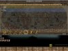
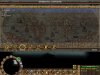
I've added a third row in Europe screen. The problem is yield boxed sometimes appear over waiting units or are below screen lower edge... (depending on your screen resolution)
So, I tried to reduce those yield boxes. Here's the result:

(screen resolution, my default resolution: everything is ok!)

(screen resolution: 1600*900, maximum resolution for me... doesn't look as good...)
So, I tried to reduce those yield boxes. Here's the result:
(screen resolution, my default resolution: everything is ok!)
(screen resolution: 1600*900, maximum resolution for me... doesn't look as good...)
Robert Surcouf
Civ4Col Modder
I'll send you the files. Could someone try it with extra-large resolutions?
If XResolution is higher than 2000, things might not look great...
If XResolution is higher than 2000, things might not look great...
Gomer_Pyle
Prince
- Joined
- Aug 25, 2008
- Messages
- 389
I can try with my max which is 1920x1080 (Full HD). Files uploaded?
raystuttgart
Civ4Col Modder
No third row in Europe-Screen, please. 
I only wanted 3 "Scrolling"-Screen in Advisor-Screens with Yields.
Sorry if there was a misunderstanding.
(I thought you maybe wanted to improve something else in Europe-Screen.)
The 2 rows in Europe-Screen are just perfect !
(2 rows really look much much better.)
3 rows in Europe-Screen totally destroy the concept "Raw in Upper Row, Corresponding Produced in Lower Row" ...
Robert Surcouf
Civ4Col Modder
Indeed, there has been a misunderstanding!
Never mind...
I'll work on the Domestic advisor screen, then !
Hopefully I've fixed a few things ... So it wasn't for nothing!
Never mind...
I'll work on the Domestic advisor screen, then !
Hopefully I've fixed a few things ... So it wasn't for nothing!
raystuttgart
Civ4Col Modder
Indeed, there has been a misunderstanding!
Sorry again, if you had a lot of unnecessary effort.

I'll work on the Domestic advisor screen, then !
But please only work on the once that are related to Yields.
(Our list of Special-Buildings is not that clear yet.)
I would image all 3 "Scrolling"-Screens for the yield-related Advisor-Screens to generally look like this.
So in all 3 "Scrolling"-Screens you would have the cityname in first column.
Afterwards 18 yields (which would be different in each of the 3 "Scrolling"-Screens).
(54:3 = 18; 54 will be our final number of tradable yields if nothing changes.)
Robert Surcouf
Civ4Col Modder
Very well!
Here you go:

I'll send the updated file !
Here you go:
I'll send the updated file !
raystuttgart
Civ4Col Modder
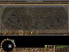
About Europe-Screen:
Would it be possible to do the following small changes ?
1. Shift the 2 rows of yields a little lower.
(Currently the feet of the "colonists waiting on dock" are covered.)
2. Shift the 4 "colonists waiting on dock" a little to the left.
(The "Buy"-Button is currently a little covered.)
Or maybe betterdunno :
Shift "colonists waiting on dock" higher and more to the left.
Edit:
Is it possible to get the font of numbers for prices of the yields just a tiny bit smaller ?
(Especially if we later on add the last 2 Yields "Yield_Swords" and "Yield_Gunpowder", this might be necessary.)
Would it be possible to do the following small changes ?
1. Shift the 2 rows of yields a little lower.
(Currently the feet of the "colonists waiting on dock" are covered.)
2. Shift the 4 "colonists waiting on dock" a little to the left.
(The "Buy"-Button is currently a little covered.)
Or maybe better
dunno :Shift "colonists waiting on dock" higher and more to the left.
Edit:
Is it possible to get the font of numbers for prices of the yields just a tiny bit smaller ?
(Especially if we later on add the last 2 Yields "Yield_Swords" and "Yield_Gunpowder", this might be necessary.)
Robert Surcouf
Civ4Col Modder
Great!
The modifications I've done will make this easier to do...")
But again... Someone will have to test high resolutions (there may be slight differences).
And yes thank you Gomer Pyle !
The modifications I've done will make this easier to do...
But again... Someone will have to test high resolutions (there may be slight differences).
And yes thank you Gomer Pyle !
Gomer_Pyle
Prince
- Joined
- Aug 25, 2008
- Messages
- 389
What is that icon for money? Crown with a red tie on it? I find this very weird. What is wrong with the old icon?
Similar threads
- Replies
- 0
- Views
- 143
- Replies
- 9
- Views
- 1K
- Replies
- 1
- Views
- 391