Sorry, I don't know if this has been answered already, in a bit of a rush. But based on reading the styling guide thread, it looks like user-end CSS tweaks (without using something third-party like Stylish) are out-of-bounds, it's all palette-based stuff.
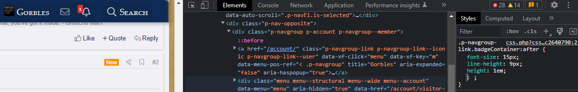
If that's true, is there anything that can be done with the readability of the notifications / alerts badge? I have a rather mainstream 1080p resolution and it is nigh-unreadable at a glance (this is a 5):

If that's true, is there anything that can be done with the readability of the notifications / alerts badge? I have a rather mainstream 1080p resolution and it is nigh-unreadable at a glance (this is a 5):
 .
.
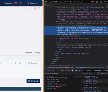
 so... that's weird, no?