Better Civilopedia (UI)

Better Civilopedia (UI) 2.2

Infixo

Deity
Joined
Jan 9, 2016
Messages
4,034
Location
Warsaw
Infixo submitted a new resource:

Better Civilopedia (vanilla, R&F) - More information in Civilopedia!

Supports all languages.
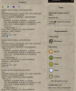
Description
- Bigger window.
- Remembers last visited page.
- Remembers history, prev/next buttons.
- Table of Units with key statistics.
- Overview of Historic Moments.
- Alliances and Dedications.
- Optional: Shows modifiers for each object.

Mod homepage on CivFanatics.

Optional: Modifiers
The modifiers can be switched off via an option in BetterCivilopedia_Database.sql file. In line with BCP_OPTION_MODIFIERS set the number to 0 (zero) to do so....

Read more about this resource...
 
Well.. i like it, specially those new Units Tables as direct references. Took off the "Modifiers" system though (( Too much of a Data rush! :) )) .. thanks for the SQL option.

The newest height is a bit taller than expected (or preferable for me) since it overlays the top bar, sooooo if i were to make a simple edit in its XML (CivilopediaScreen) file like this;
-----------
<Container Anchor="C,C" Size="1024,1050" ConsumeMouse="1">
-----------

And just change that single value to 800 for example -- everything else (scrollers, banners, etc) would follow through that custom relative container calibration, right?

PS; Yup that tiny adjustment works as needed!
 
Last edited:
Yeah.. after some HUD foolproofing steps, i've finally settled for 925. Good balance.

Been also thinking about other adjustments to re-organize a few tricky UI principles.

-- Every "sections" of details (drop-down stack of Info boxes on the right side) currently have descriptive headers (Traits, etc) that grab a whopping 20/40 pixels each. Much of these are self-explanatory and if removed would offer spare room to put more (visually rapid if anything) info in the same lengthy areas.
-- Those are assembled strangely too. What do i care about quotes inserted with audio when the real purpose of such Pedia framework is to give facts. Costs & gameplay details should be listed on top first rather than last.
-- Separating your new Units tables with color-coded Era references would somewhat help detection of grouped elements. Even their individual Icons could use such distinctions. Navy/Blue, Green/Support.. etc.

(PS: I once had created such a thematic system for Civ5 with ZN-Eras.. linked in my sig)

Anyhow.. there's always a few tricky ideas to think over in that BIG device & if you ever can, try making it accessible in the opening menu please.
 
Anyhow.. there's always a few tricky ideas to think over in that BIG device & if you ever can, try making it accessible in the opening menu please.
Pedia uses in-game database to fetch and show data. This database is either not available in main menu, or might be not properly initialized. That's the reason why .modinfo uses FrontEnd actions and InGame actions, they access different databases.
 
- Changed: The window adjusts to the screen size, the top bar is not covered.

Not here on my 4k monitor. Normally.. it would re-calibrate down to 1920x1080 according to Win10/OS DPI scaling. But that new principle of yours must be tackling the relative values as C/C on a presumed 40 pixels (80) gap to leave room between the top banner and the actual Civilopedia popup edge (as defined by the container).
925 was perfectly fine before.
Strange stuff.
 
Heyo mate what's the difference between this and real civilopedia

EDIT: n/m I see you discontinued it and replaced it with this.
 
I have a lot of strange text in my version of Better Civilopedia - I dont know if its a feature or a bug?

BetterCivilopedia.jpg
 

Attachments

  • upload_2019-2-26_21-22-4.png
    upload_2019-2-26_21-22-4.png
    993.1 KB · Views: 153
If I set both to off in the options file, civ shows an error in the database.log.
“no such thing as “0” table” ... or something similar
Pls. post BetterCivilopedia_Database.sql with your changes and entire database.log and modding.log.
 
Back
Top Bottom