You are using an out of date browser. It may not display this or other websites correctly.
You should upgrade or use an alternative browser.
You should upgrade or use an alternative browser.
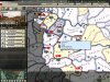
Does anyone else find the screen "cluttered"?
- Thread starter I_batman
- Start date
Zhahz
PC Gamer
I_batman said:Is it just me, or do others have this issue?
It's just you.
I strongly suggest learning the keyboard shortcuts and using alt-i (no interface) - it's the only way to play.naterator said:alt-i removes the interface completely. ctrl-i minimizes it.


Sisiutil
All Leader Challenger
Ah, NOW I see what you're getting at. Please forgive my earlier sarcasm, though everyone took it well (so nice to be on a board with adults even if I don't always act like one).
It's not just you.
That is a definite limitation I don't know of a way around. When there are a certain number of units on the same tile, the game screen is incapable of displaying all of them in a coherent way. It only seems to come up late in the game when most civs' industrial capacity makes it possible for them to build that many units. Even the reduced displays don't seem to help much.
That ellipsis in the list is annoying, since there's no way to expand it. Using the scroll buttons along the bottom gets annoying too. Also, my computer is a little less powerful than yours, and it sometimes gets bogged down with a stack like this.
Do you have screenshots of other games that do this better?
I have to admire a man who is unabashedly old school.Zombie69 said:Actually, i'd rather have it text based than have the bloated useless 3D engine we have now. But Civ 1 graphics would be just perfect.
P.S. I still like, and still play, Pac-Man and Pong.
acidsatyr
be water my friend...
- Joined
- Mar 12, 2006
- Messages
- 1,166
ROFL!!!Zombie69 said:I agree that 3D is the biggest flaw of the entire game, bigger even than the stupid AI. I would pay good money for someone to mod the game with nothing but Civ 1 graphics, units being little pictures in boxes, etc.
Thank you for great laugh

DrewBledsoe
Veteran QB
Ctrl-I plays with a min interface , max screen, there's another command to play with no interface at all..all are listed somewhere...damn thats not very helpful when I don't have game running and cant remember, sorry will edit post when I've checked properly
Edit:- Alt-I plays with no interface at all, max screen, toggle scores is on the lower right hand buttons, all these and more are to be found if you click "hints" in the civliopeia...they really should be highlighted with greater emphasis, as some are invaluable to know and some are just incredibly useful...I won't comment on 3D vs 2D because thats another thread guys")
Edit:- Alt-I plays with no interface at all, max screen, toggle scores is on the lower right hand buttons, all these and more are to be found if you click "hints" in the civliopeia...they really should be highlighted with greater emphasis, as some are invaluable to know and some are just incredibly useful...I won't comment on 3D vs 2D because thats another thread guys
I_batman
Emperor
Thanks to all who gave suggestions about using alt-i, ctrl-i, and learning short cuts. Just the two first simple commands I recognize will make this more enjoyable for me.
I am sure another of my pet peeves of recognizing the various promotion icons will pass as I play more.
And Sisiutil, I will post another screen shot that I feel is more distracting, but I think at this time the point is moot.
That being said, a night at the pub forces me to post it tomorrow.
I am sure another of my pet peeves of recognizing the various promotion icons will pass as I play more.
And Sisiutil, I will post another screen shot that I feel is more distracting, but I think at this time the point is moot.
That being said, a night at the pub forces me to post it tomorrow.
Sahkuhnder
Delusions of grandeur
How many have tried playing the game on a small screen, like a standard 15" laptop vs. playing on a 19" widescreen LCD set at 1440 x 900 (which civ4 supports)?
The game can seem cluttered on the first one and be just right on the second.
The cost of a big LCD monitor isn't that much anymore. Perhaps this would, or will eventually, solve the problem for many players.
The game can seem cluttered on the first one and be just right on the second.
The cost of a big LCD monitor isn't that much anymore. Perhaps this would, or will eventually, solve the problem for many players.
I_batman
Emperor
Sisiutil said:That ellipsis in the list is annoying, since there's no way to expand it. Using the scroll buttons along the bottom gets annoying too. Also, my computer is a little less powerful than yours, and it sometimes gets bogged down with a stack like this.
Do you have screenshots of other games that do this better?
Sorry Sisiutil:
I read your question again this morning, when there was a little less alcohol floating around in my brain.
If you mean other games that I think handle unit stacks better, I would say that Hearts of Iron definitely does. But that game is far different that Civ IV, since it is intensely strategy oriented, and just about zero graphics oriented.
I may dig up a screen shot of one of my games in that, but the relevance is minimal.
Hearts of Iron has 1/10 of the "clutter" of Civ IV, primarily becuase the graphics are 1/100 of that of Civ IV.
I have stated to a few friends that if some genius could merge Civ III graphics capability with the HoI game engine, it would indeed be the perfect war game.
Now, the Civ series is much more than a war game, so I think my thoughts on this hybrid game would only be of use in war game mods.
And it would be a mightmare to code.
Zombie69
Emperor
- Joined
- Nov 22, 2005
- Messages
- 1,902
I_batman said:I have stated to a few friends that if some genius could merge Civ III graphics capability with the HoI game engine, it would indeed be the perfect war game.
Personally, i would prefer the Civ 4 game engine with minimalist 2D graphics, but to each his own. You intrigue me though, and i'll check out that "Hearts of Iron" you talk about. Anything with simple graphics and good strategy has to be good.
I_batman
Emperor
Sisiutil
All Leader Challenger
Thanks, I_batman. That's very useful for the sake of comparison. It's a little hard to make sense of the screenshot without having played the game, but one thing that jumped out at me was the tabs. I like that idea, of taking something I'm used to from regular applications like Firefox or Excel and incorporating a similar interface in a game.
It would be handy to have a similar feature available in the city screen. If fact, if you want clutter, just look at Civ IV's city screen. It would be useful to have the city screen tabbed--say one for tile assingments, another for military units and defense, another for the build queue, another for the resources being used, and so on. You can then focus on each area rather than trying to sort through the visual overload for the relevant detail you're after.
As to the issue you raised: it looks like a unit stack is kept simple--is that what the "2/7" refers to in the upper left corner of the map? I wonder if Civ could incorporate something like that.
What I'm thinking of is treating unit stacks like cities, interface-wise. You see a simplified display of the stack on the map, like cities. If you hover the mouse over the stack, you get a simple summary of its characteristics--how many units, how many of each type, perhaps. But not the plethora of detail you do now.
Then there's an option, again like a city, to go into a "stack screen" where you can see the details of each unit. Rather than cluttering up the main screen with often incomplete information.
I_batman
Emperor
Sisiutil said:Thanks, I_batman. That's very useful for the sake of comparison. It's a little hard to make sense of the screenshot without having played the game, but one thing that jumped out at me was the tabs. I like that idea, of taking something I'm used to from regular applications like Firefox or Excel and incorporating a similar interface in a game.
It would be handy to have a similar feature available in the city screen. If fact, if you want clutter, just look at Civ IV's city screen. It would be useful to have the city screen tabbed--say one for tile assingments, another for military units and defense, another for the build queue, another for the resources being used, and so on. You can then focus on each area rather than trying to sort through the visual overload for the relevant detail you're after.
As to the issue you raised: it looks like a unit stack is kept simple--is that what the "2/7" refers to in the upper left corner of the map? I wonder if Civ could incorporate something like that.
What I'm thinking of is treating unit stacks like cities, interface-wise. You see a simplified display of the stack on the map, like cities. If you hover the mouse over the stack, you get a simple summary of its characteristics--how many units, how many of each type, perhaps. But not the plethora of detail you do now.
Then there's an option, again like a city, to go into a "stack screen" where you can see the details of each unit. Rather than cluttering up the main screen with often incomplete information.
Yes, I like your thinking about simple unit information showing up on the screen, and then having the simple data on one level, detailed info when you hover or click on it.
As for the 2/7, what that refers to is 2 air units, 7 land units in that province.
The blue icons you see represent air bases in those provinces.
BTW, when you talk about tabbing and layers of detail, every one of those units on the left can be bored down 2 more layers of detail.
If you note, Saarbrucken has an 18 under the division icon. Now, count how many units show in the left hand window.
And what you are looking at is a 12 division army, a 3 division army, and 3 solitary divisions.
I could go on for quite some time about all the things this game has that I wish Civ IV could incorporate, but we are talking about massive, massive programming changes.
Like I said before, HoI is a vastly different game theme than Civ, but there are some some things Civ could learn about clean interfaces and screens from HoI.
Sisiutil, if you liked Rocoteh's Civ III Operation Barbossa or WWII-Global scenarios, you would love HoI.
Zombie69
Emperor
- Joined
- Nov 22, 2005
- Messages
- 1,902
Sisiutil said:It would be handy to have a similar feature available in the city screen. If fact, if you want clutter, just look at Civ IV's city screen. It would be useful to have the city screen tabbed--say one for tile assingments, another for military units and defense, another for the build queue, another for the resources being used, and so on. You can then focus on each area rather than trying to sort through the visual overload for the relevant detail you're after.
Personally, i much prefer the way it's presented now than what you propose. Since i always check all my cities every turn, it's good that i can see everything at a glance in each one, rather than having to look at all the tabs to make sure i didn't miss anything.
Sisiutil
All Leader Challenger
True, that's pretty much the way the Civ city screen has always worked, and is probably why the designers didn't change it, even with all the clutter.Zombie69 said:Personally, i much prefer the way it's presented now than what you propose. Since i always check all my cities every turn, it's good that i can see everything at a glance in each one, rather than having to look at all the tabs to make sure i didn't miss anything.
wiseguy101
Warlord
The Great Apple said:The game is pretty 2D - just you can zoom in and out. There's no rotation to worry about.
I'd suggest increasing the amount of players per map - more players means you'll have less cities, and less units to worry about. You could also try increasing the screen resolution so you can fit more on.
I agree with you there. The game isn't really that 3D. When you get into flying camera mode, the game seems much more 3D, but the normal mode doesn't seem that 3D to me.
Rince
King
I_batman said:I don't want to make a Civ IV forum an advertisement for another game, but since a couple people asked for my concept of an uncluttered screen, and I suggested Hearts of Iron II...........
The screen may be uncluttered but the game controls of HOF2 are quite confusing. So it is not a good example for a good GUI (I know you didn't claim it to be).
As for CIV4, at first i found the screen cluttered too. I could barely see the units on the terrain. But after a few game the player's brain somehow figures out how to filter the information and everything becomes very clear, IMHO.
And i don't see why in 2D this would be any different.
So my suggestion to the OP would be to play some more and reserve judgement for later.
Greetings,
Rince
I_batman
Emperor
Rince said:The screen may be uncluttered but the game controls of HOF2 are quite confusing. So it is not a good example for a good GUI (I know you didn't claim it to be).
As for CIV4, at first i found the screen cluttered too. I could barely see the units on the terrain. But after a few game the player's brain somehow figures out how to filter the information and everything becomes very clear, IMHO.
And i don't see why in 2D this would be any different.
So my suggestion to the OP would be to play some more and reserve judgement for later.
Greetings,
Rince
Well, I do admit that that when I toggled off the player scores, that helped a fair bit.
I do also agree that the brain will learn to filter out extraneous info over time.
But I did not start this thread on my very first game.
This was my third game, that is reaching conclusion, and the last two have been on the biggest map possible, with the maximum amount of starting civ's, so I have been staring at the screen for some time. (19 inch LCD)
Perhaps some of the problem is that I am rotating through 3 games, given that I am playtesting a yet to be released Civ III scenario for someone, plus playing HoI occasionally.
Hell, sometimes I will have one game going on my laptop, and Civ IV on my desktop at the same time.
The brain does not really get a chance to get used to one interface that way.
That being said, I still prefer the Civ III controls/interface/graphics over Civ IV.
Zebra 9
Emperor
I like the CivIII Interface better to it was less clutered.
I Like the 3D.
I Like the 3D.
Similar threads
- Replies
- 16
- Views
- 1K
- Replies
- 20
- Views
- 2K