classical_hero
In whom I trust
Should we try and create a team banner, like the way Team K.I.S.S. has? If you think so, then why don't you post your suggestions here.
 ... could you post a 4th design incorporating both ...

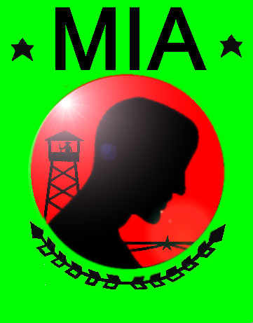
I agree, the bottom color with flare would be awesomefe3333au said:Excellent work ... I like bottom one ... buuuut there is something sexy about the lens flare
I also think words would just clutter the image
ybbor
btw: Anyone know what s.o.d. stands for ??? ... can't wait to smash some gaps into Kiss' smile
")
 ... looks like M.I.A. has found it's artist ...
fe3333au said:If you want T.N.P. have it under the razor wire brocade (bottom floral pattern in the green)
fe3333au said:btw: Anyone know what s.o.d. stands for ??? ... can't wait to smash some gaps into Kiss' smile
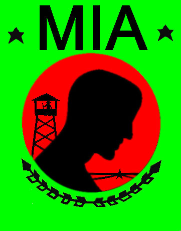
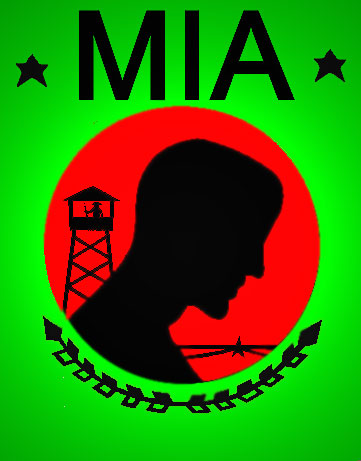
With out the dots would be good. I do like what you have made with the letters down the bottom. Perhaps you could emboss the letters, to see what it looks like. So could you prepare one flag without the dots first, then one also without the dots, but with the letters MIA and TNP embossed.ybbor said:like this?
Which reminds me... do you guys want the periods in or not?

")
classical_hero said:With out the dots would be good. I do like what you have made with the letters down the bottom. Perhaps you could emboss the letters, to see what it looks like. So could you prepare one flag without the dots first, then one also without the dots, but with the letters MIA and TNP embossed.
); but I'll give it a shot. 
ybbor said:4th (my favorite)- more embossing on just MIA (not stars)
I like this the bestybbor said:I have converted #4 into an actual banner I left out the TNP because i could't find a place for it, and because i didn't feel it was necessary for the banner