You are using an out of date browser. It may not display this or other websites correctly.
You should upgrade or use an alternative browser.
You should upgrade or use an alternative browser.
Altered Maps 3: The rise of the Basque Empire!
- Thread starter TheLastOne36
- Start date
- Status
- Not open for further replies.
Huayna Capac357
Deity
It's made by data, not by me.
It's made by data, not by me.
Sometimes common sense is more than numbers.
Huayna Capac357
Deity
But I like numbers. I was using raw data here.
Winner
Diverse in Unity
And it is obvious that Greece is in the worst neighborhood
I love how easy it is to alter reality simply by using lesser number of colors

For example, here is a more accurate map of GDP per capita in Europe (more categories). Suddenly it looks very different.

Imho there are huge differences between countries lumped in the 10k to 20k category At one end you have developing countries and at the other there are developed countries facing a totally different economic reality.
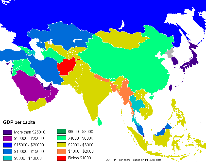
BTW, this is interesting:

China should not be orange, it's style of life is just as unsustainable as the United States.
Well, per capita CO2 emission is "only" a fraction of the United States, for a start.
aronnax
Let your spirit be free

Provinces of Anglican Communion in altering colours.
Winner
Diverse in Unity
I see the plague has spread from Britain around the world. Fortunately it seems that continental Europe remains unaffected 
aronnax
Let your spirit be free
I see the plague has spread from Britain around the world. Fortunately it seems that continental Europe remains unaffected
Its just 77 million people....

Actually I consider myself an Anglican and half of the Anglican world is very liberal (Women Priest, Blessing Gay unions) and the other half is still quite conservative. But on a whole, I think the whole Anglican Church is more forward looking than the Roman Catholics or worst still, the religious right of America.
Winner
Diverse in Unity
Its just 77 million people....
Actually I consider myself an Anglican and half of the Anglican world is very liberal (Women Priest, Blessing Gay unions) and the other half is still quite conservative. But on a whole, I think the whole Anglican Church is more forward looking than the Roman Catholics or worst still, the religious right of America.
Yes, they're the smallpox and ebola
")
aronnax
Let your spirit be free
Yes, they're the malaria and ebola
Fixed it for you... Smallpox is no longer a threat.
aronnax
Let your spirit be free
Oh yeah, as for Anglicanism in Europe


RedRalph
Deity
- Joined
- Jun 12, 2007
- Messages
- 20,708
BTW, this is interesting:
Tehran is surprisingly productive
plarq
Crazy forever
Tehran is surprisingly productive
Why India have some brown spots in the interior, but not Mumbai?
aronnax
Let your spirit be free
RedRalphWiggum, why did Singapore annex Riau from Indonesia in your GDP map?
aronnax
Let your spirit be free
crosspost : Please delete
I love how easy it is to alter reality simply by using lesser number of colors
For example, here is a more accurate map of GDP per capita in Europe (more categories). Suddenly it looks very different.
I may be wrong. but Sicily seems darker than the rest of Italy?
- Status
- Not open for further replies.
Similar threads
- Replies
- 1K
- Views
- 82K
- Replies
- 71
- Views
- 8K
- Replies
- 61
- Views
- 8K