Button thread

Thanks! :D I also made the Voice and Homo religiontech buttons now.
Cool! :goodjob:

I worked through the ones you flagged with a question mark as well. I think they look good, but seeing the aerospace complex... I think I need to get used to that for a while! ;)

I also made the buttons for Social Psych and Factionalism using the Genetics colour, because I think the PK colour works well for it and considering that Memetics are coloured in that colour as well, I'd say you could say that the Genetics theme is sort of a "Humanity", "Bio-Ethics" or "Self-Improvement" theme as well. More fitting than anything else.

I also added a Neural Grafting button using two colours - for computers and genetics. They fit nicely, but I'm afraid it could end up a bit too gimmicky and inconsistent, in that case, tell me and I'll do one with a single colour of your choice (I think Genetics would be a bit more fitting, as it's main concern is "just" adding something to a living nerve).

Furthermore, I made icons for the early Centauri Geology and Hydrology techs with the appropriate colours, both using the planet circle to indicate Centauri. I replaced the hammer with a mineral icon, fits better, I think. The hydrology has a wave from the pressure dome inside. I like it more than just wavy lines, it sort of looks neat!

That also freed up the aquafarm facility icon to be used for the algaeculture tech, but I also included another alternate take on it, in case you want to keep the aquafarm icon for hydrology.

Finally, I converted the Xenoempathy Dome icon - in hope that it can be used for the planet attitude secret project you mentioned in the v11 feedback thread - and in hope that I can persuade you to call it "Xenoempathy Dome" instead of "Centauri Preserve" - because the former sounds way more like something to make Planet pleased with you - the latter sounds like a small park (and I also think that the name is too good to waste). ;)

EDIT: Disregard the Xenoempathy Dome button, it looks too fiddly and thin in-game, ditto for the Tachyon Field in the previous attachment. I need to redo them with a thicker frame (did so for the resonance wobbles of field modulation already).

By the way, do you prefer my or GeoModder's names for the native promos? Just asking, because I'm thinking about some shapes how the promo buttons could look - and knowing the name might help! ;) 
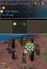
On the other hand, if you're undecided, I could also do more tech buttons - it's fun! :D (I love using the SMAC symbols, they're just so evocative *and* you can use a lot of them in a mix-'n-match fashion!)

Cheers, LT.
 

Attachments

EDIT: Disregard the Xenoempathy Dome button, it looks too fiddly and thin in-game, ditto for the Tachyon Field in the previous attachment. I need to redo them with a thicker frame (did so for the resonance wobbles of field modulation already).
Just finished this - I made all of the tachyon field lines a 2 pixels thicker, which helps a bit with the scaled down icon, I think. For the dome, I didn't change the outer frame (to keep it consistent with all other secret projects), but I removed the extra ring around the heart symbol - looks better now, I think.

Cheers, LT.
 

Attachments

Thanks!

I've used Flagella and Miasma I, II & III.

Re the Xenoempathy Dome, myself I've never been a big fan of that name. The name is just meaningless - it doesn't give any indication or explanation for why that Dome would provide its secret project effects. With Centauri Preserve you at least you have the connection with Lal's quote "for our own survival as a species depends on our ability to strike a balance on this world".

If the secret project was moved higher up the tech tree to Personality Transcription as you suggest, I'd call it the 'Voice of Alpha Centauri' by the way (VoP unfortunately already taken).
Hmm... I always thought it was one of the nicer bits of SMAC not to overexplain stuff with technobabble and leave these bits to your imagination, especially with the more advanced techs - but that's a matter of taste! :)

But "Voice of Alpha Centauri" sounds nice as well (though it looks long, not sure how it would look in the screens - Voice of Chiron or Voice of Centauri may fit better, size-wise).

However, I still like the icon for the dome. ;)

Cheers, LT.
 
Voice of Chiron FTW. IMO. You have a voice, you get a name. :)
 
Downside of Voice of Chiron is that it isn't mentioned in SMAC.
Three names are used in the SMAC interlude:
Voice of Alpha Centauri, but that's rather long.
VoAC, the abbreviation, may be too short and unimpressive.
And Psi Projector, but that may be too bland and also unimpressive. Plus if I were to add a spy mission which temporarily reduces a base's Planet value, I'd call it 'Plant Psi Emitter'. Psi Projector may sound too similar to that.
 
Some further ideas for tech buttons:

The proj017 Cyborg Factory head could serve for Cybernetics.

Unless there are better ideas, the current AdvMilAlgorithms icon in terraform colour for Defense Logistics?

The current Recycling button without the Planet circle and in the enclosed/water/space colour seems good enough to me for Recycling.

Would you be interested in redoing the InfoNets button in the discover theme colour?

Doctrine: Mobility doesn't really belong to any theme, but it does lead to the Centaur theme tech Archeology. So we might as well keep it to in its original explore green colour.

Use the Progenitor Psych icon for Archeology? At least until/if I add a Progenitor Psych tech.

I'll add a Doctrine: Air Power tech in the future. Any ideas what button that tech and the Needlejet tech could have then? Two air themed techs but only one button.
 
Okay, here are the some new tech buttons, I'm going through all of them, because not all are straightforward conversions (and a list is easier to read):
  • Archeology - the Progenitor Psych icon, I think it looks nice and fitting (for now, at least).
  • Atmospheric Processor: This should fit better into Planetfall than the current icon - I re-used the dots from the hologram theatre - this sort of "generates" the weather as the theatre "generates" holograms...
  • Atmospheric Transformation: Rather straight forward - the weather symbol from weather paradigm seems to fit atmosphere stuff. By the way, the tech name is very long - can I suggest changing it to "Atmospherics"? Would fit in quite nicely with the other "-ics", like Photonics, Kinematics, Memetics etc., which I all like a lot.
  • Cloning: I'm using the "applied" chevrons with with the cloning vats heads, looks nice, I think - but the "applied" chevrons are usually used for physics, so you might disagree with the use. Problem is just that using the cloning heads alone alone don't really fit the more square-like ratios of most other buttons.
  • Cybernetics: I feel Cybernetics between Neural Grafting and MMI is a bit strange, so I figured that it's also sort of an "ethics" or "philosophy" tech about machine-human-hybrids (fitting, as it founds The Consciousness as well), so I included a small homage to the "ethics" scale and the Cyber-Ethics button. I know you don't like the techs like "Cyber-Ethics" etc., so I also included a more neutral version. I didn't use the head from the cyborg factory because I noticed that the techs almost never show a head from the front, whereas facilities/projects do that fairly often (compare Rec Commons and Social Psych).
  • Doctrine: Air Power - just the straightforward conversion, I think it still works well.
  • Doctrine: Defense - I like the doctrine names and associate it a lot with the frame... but again, it's a matter of taste. I felt the AdvMilAlg icon looks to aggressive for something that's essentially concerned abot defence, so I used the Citizen's Defense Force shield as center icon - seems to embody the whole concept of a defensive force a bit better (this icon would, of course, work with the current name as well ;) ).
  • Doctrine: Mobility: as requested.
  • Information Networks: as requested.
  • Needlejet: Again, I used the applied chevrons, together with the air triangle. It looks nice, I think and hopefully slightly reminiscent of Gravitonics (because both are about things going UP!), without being to close to be confused. Plus, I didn't want to use the gear symbol again - it's used very often already, and I'd rather keep it in reserve for some other techs (like the various physics techs).
  • Ultraponics: Because I read the thread and the pirate cyan is still too eyecatching! ;)

Of course, I can redo them in another fashion or colour, if you want me to - I also have all the shapes saved as PNGs, so just ask and I can post them too, if you need them for anything. :)

Cheers, LT.
 

Attachments

Some native promos... two for Swarming I + II (could be a flanking replacement), one for flagella (you could interpret the wavy lines either as flagella OR as water, there is some ambiguity on purpose) and the miasma I, II, III.

Cheers, LT.
 

Attachments

  • native_promos.zip
    native_promos.zip
    13.2 KB · Views: 209
  • flagmiasma.jpg
    flagmiasma.jpg
    24 KB · Views: 173
I thought the Ruins could really need a new button/icon - especially as the deer is quite... confusing! I've attached a quick idea I had, what do you think? It'll probably need some changes - so only a quick screen shot.

Cheers, LT.
 

Attachments

  • ruins_prop.jpg
    ruins_prop.jpg
    32.6 KB · Views: 173
I wouldn't actually call the gamefont icon pretty, but that can of course be kinda hard to do at that size. It's recognizable, and that's the most important thing. So the icon looks fine to me.

Same counts for the button. Though I'd be equally ok to have a button showing the nif graphic instead. Like the Manifold Nexus and Garland Crater does.
 
I think it would look better showing 6 "nodes" instead of 8. As it looks now its a bit cluttered (IMHO of course).
 
Oh, gooood idea! I need to try this!
Sadly, this didn't work out - it looks too similar to the pholus ridge resonance wiggles (apart from the colour). After a lot of pixel pushing, this is my newest attempt - I think it looks better and distinct enough to be recognisable. What do you guys think?

Cheers, LT.
 

Attachments

  • ruinstest2.jpg
    ruinstest2.jpg
    42.7 KB · Views: 176
Definitely better.
 
Back
Top Bottom